The system worked, but it didn't scale
Inconsistent components
Working files had many near-duplicate variants. The side navigation alone existed in several slightly different versions.
No real token layer
The colour guidance was a generic template palette that didn't match EatApp's green brand, and values were hardcoded across files.
Slow, repetitive work
One change meant editing many screens by hand.
AI didn't know our design language
AI tools produced generic UI that didn't look or behave like EatApp.
The real blocker for using AI wasn't the AI. It was that the system wasn't structured enough for AI to understand.
Audit → Tokenize → Document → Connect → Generate → Review
Audit the system with AI
Using Claude with Figma MCP, I audited 150+ components for hardcoded values, duplicates and drifting variants. This gave us a clear map of what to fix before building anything new.
Tokenize
I rebuilt the foundations as two layers. Both work in Light and Dark mode, with radius and shadow scales on top. Now one change updates everywhere.
10x+ fasteron token setup, docs and early explorations (my estimate)Primitives
Raw scales, like green-500 or grey-900.
Semantic tokens
Tokens that describe what a colour does.
Document the rules for humans and AI
I used Claude to generate the documentation, written so it works for three audiences. For AI, it all comes together in one file: DESIGN.md.
Component docs with states, props and usage. Dropdowns, Pagination and Layout grids are examples.
A token reference that maps every Figma token to its CSS variable and Tailwind class.
DESIGN.md: explicit do/don't rules that keep generated output on-system.
One file that teaches AI how to use our design system
The system itself was standardized with AI, following a structure Claude came up with. We captured that structure in DESIGN.md: which semantic token to use where, which radius goes on which component, and what never to do.
Then DESIGN.md guided AI on how to use the system, so the designs it generated used the correct components with the correct variables.
- 1AI standardizes the system
- 2Its structure becomes DESIGN.md
- 3DESIGN.md guides AI to generate on-system designs
Connect AI to the real system
With Figma MCP, Claude worked directly with our Figma files and tokens, with DESIGN.md telling it how to use them, instead of guessing. That's the step that fixed the "generic AI output" problem.
Generate new designs from the system
We used Claude and Claude Design to produce complete explorations from prompts, built on EatApp's real components and tokens. Every generation was guided by DESIGN.md, so screens came out using the right components with the right variables.
A modular navigation system
App shell, layered navigation, page structure, and "one shell, many pages," plus a before/after comparison and sidebar states.
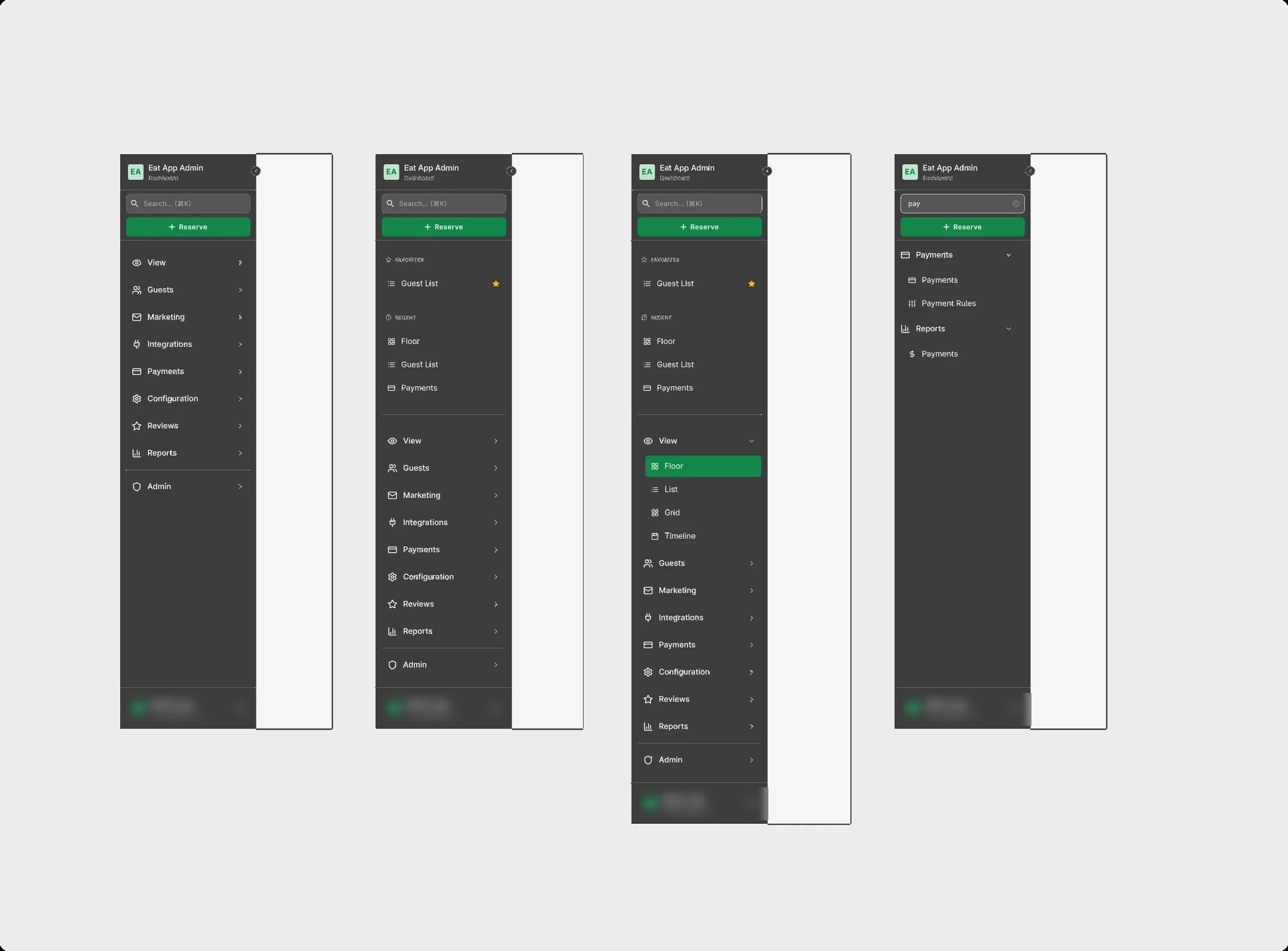
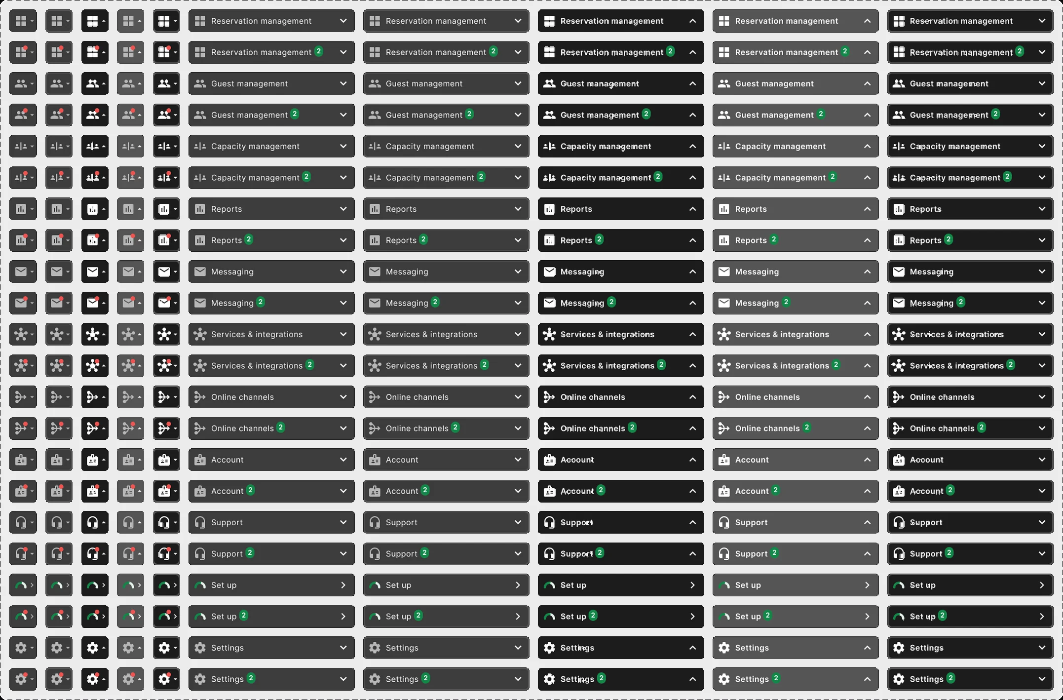
Drag to compare the drifting sidebar variants with the generated sidebar states.
A multi-step messaging campaign flow
Define → Audience → Template → Schedule. Redrawn here without any real data.
An in-app AI assistant concept
Language detection and switching, file upload, and guest message translation, plus the logic behind them.
Language detection & switch
The guest's language is detected automatically and confirmed inline, asked explicitly when unclear, and can be changed at any time via an always-available switcher.
- 01Auto-detect & acknowledge
- 02Explicit ask (fallback)
- 03Always-available switch
The logic behind it
How the assistant decides a guest's language: from the guest's explicit choice down to their history, with settings each restaurant can configure.
Human review before handoff
AI produced the options, and we made the decisions. I stayed in the loop on two things:
UX judgment
I chose the right direction, fixed flows and made sure screens worked for real restaurant use.
Checking for hallucinations before handoff
I verified that every generated screen used real components and tokens, with no invented patterns, before it went to engineering.
One system, from Figma to code to AI
- 150+ components moved into a tokenized, documented system with light and dark modes.
- One source of truth from Figma tokens to CSS variables to Tailwind classes.
- 10x+ faster on token setup, docs and early explorations (my estimate).
- AI output matched EatApp's design language because it was built on the real system instead of generic patterns.
- Designers spent more time on product decisions and less on production upkeep.
Structure first, AI second
Structure first, AI second
AI is only as good as the system you give it. Tokens and rules did most of the heavy lifting.
Write docs for AI, too
Clear do/don't rules are the difference between on-brand output and generic output.
AI speeds up exploration, humans own the decisions
The value came from generating many options and judging them well.
A review step is non-negotiable
Checking for hallucinations before handoff makes AI output safe to ship.