Introduction
Online shopping has revolutionized retail, but for customers in Armenia, access to international stores like Amazon remains a challenge. Many rely on freight forwarding services like Globbing, which requires extra steps like registering shipments, paying separate fees, and handling customs manually.
This project aimed to eliminate those barriers by creating a one-click shopping experience — allowing users to browse international products with full transparency on pricing, shipping, and customs fees, and purchase instantly.
My role
As the sole product designer, I was responsible for:
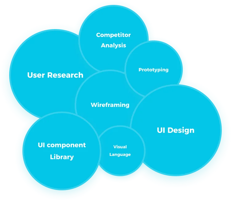
- 01User Research & Competitor Analysis
- 02Wireframing & Prototyping
- 03UI Design & Visual Language
- 04UI Component Library
Beyond design, I worked closely with engineers, project managers, data teams, and customer service to ensure alignment across all stakeholders, keeping the team informed and the product vision cohesive.
Problem statement
In Armenia, shopping from international stores is difficult. Customers rely on freight forwarding services, which require manual shipment entry, unclear fee calculations, and complex customs handling.
This process is confusing, time-consuming, and especially overwhelming for older users. Ably fills this gap by offering a direct, one-click shopping app with transparent pricing, standardized product data, and an intuitive, accessible design.
Challenges with existing solutions
Solution goals
Process & approach
Research & discovery
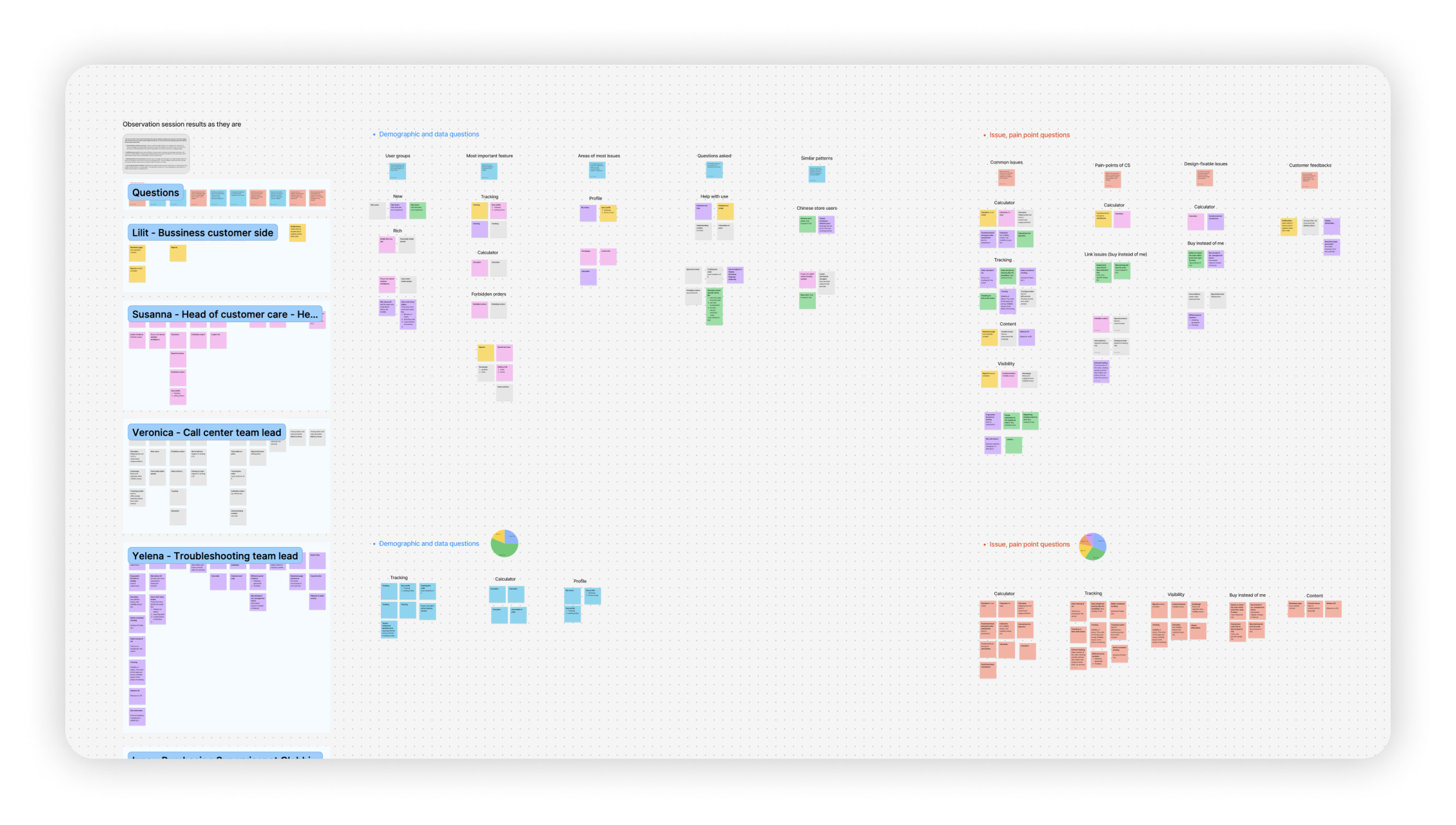
Understanding the pain points of online shoppers was critical. While existing solutions like Globbing work well for some, many users — especially older ones — found them too complicated. Research revealed that:
- Users don't want to manually enter package details.
- Unclear pricing leads to hesitation and frustration.
- A simple, fast, and transparent shopping experience is in demand.
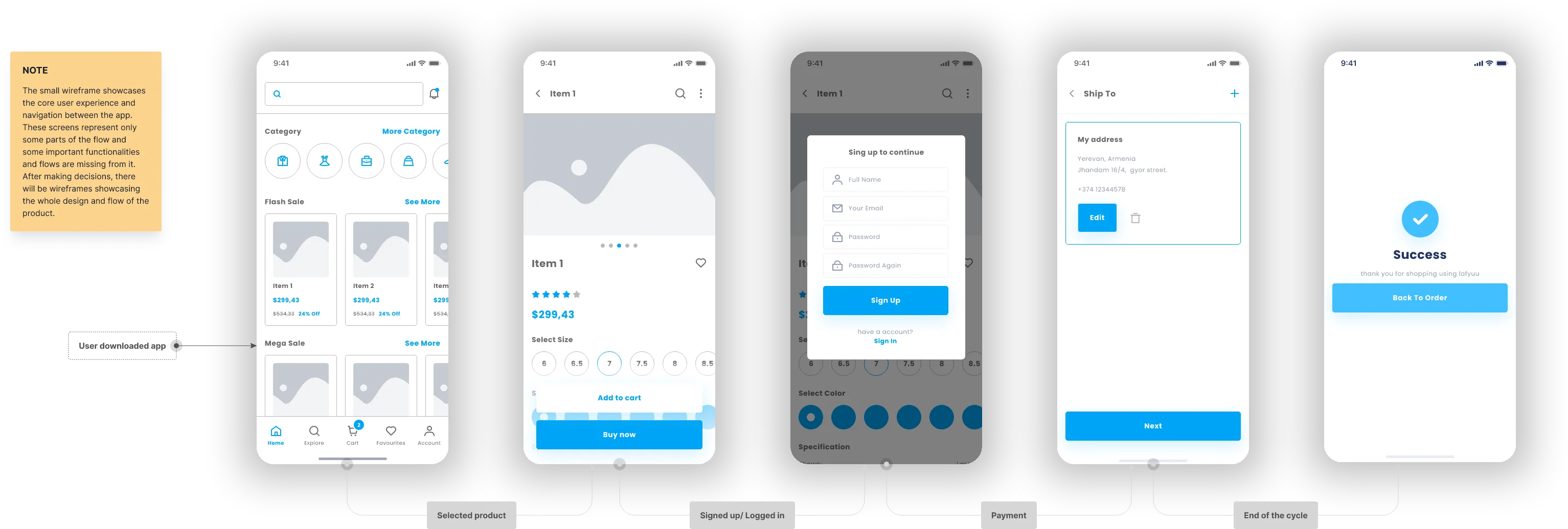
Wireframing & iterations
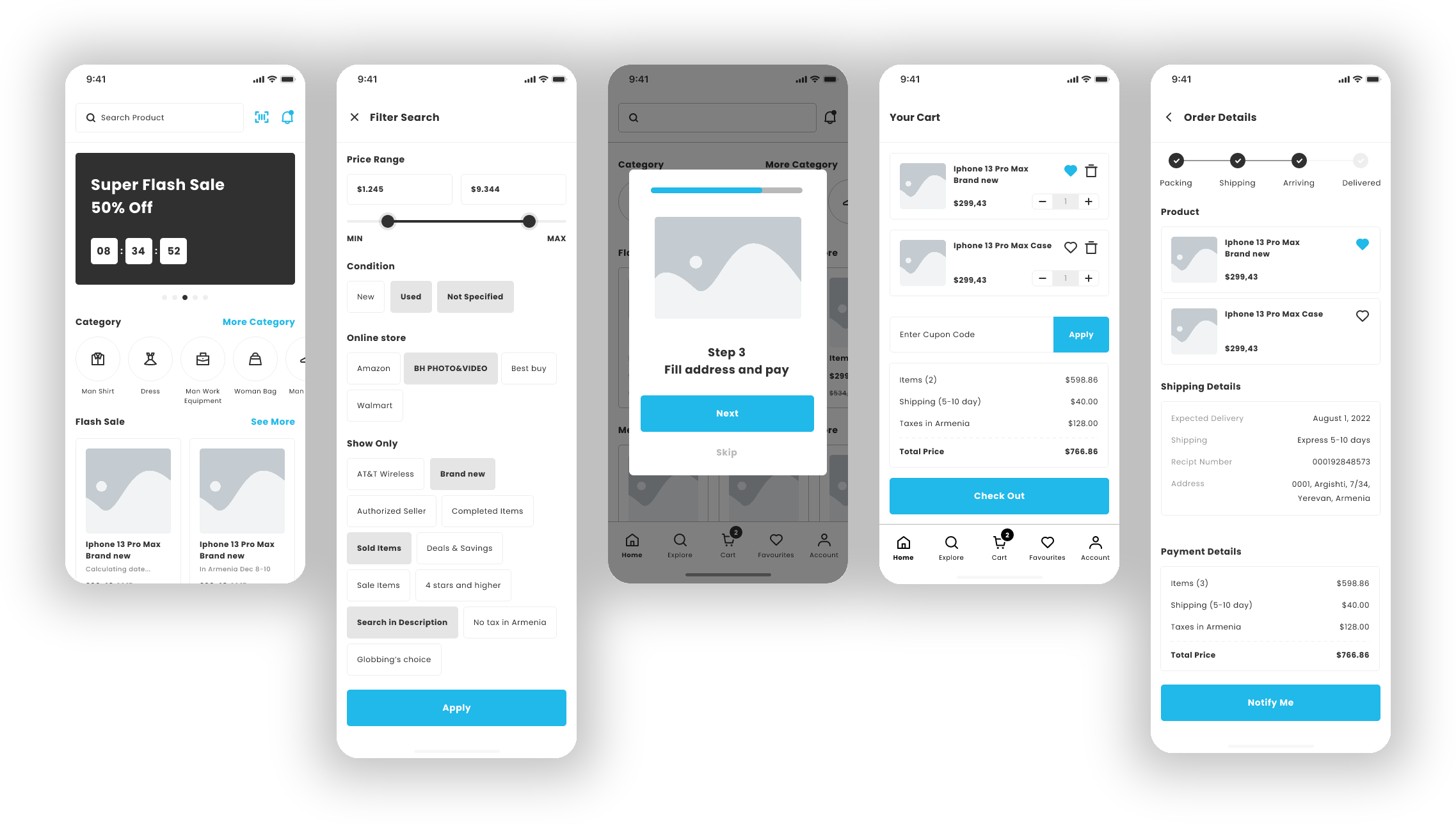
The design process went through multiple stages of refinement:
- 01Low-fidelity wireframes — focused on layout and user flow.
- 02Mid-fidelity wireframes — added more structured interactions.
- 03High-fidelity prototypes — refined UI components and user journey.
Each iteration improved the simplicity, accessibility, and clarity of the platform.
Stakeholders
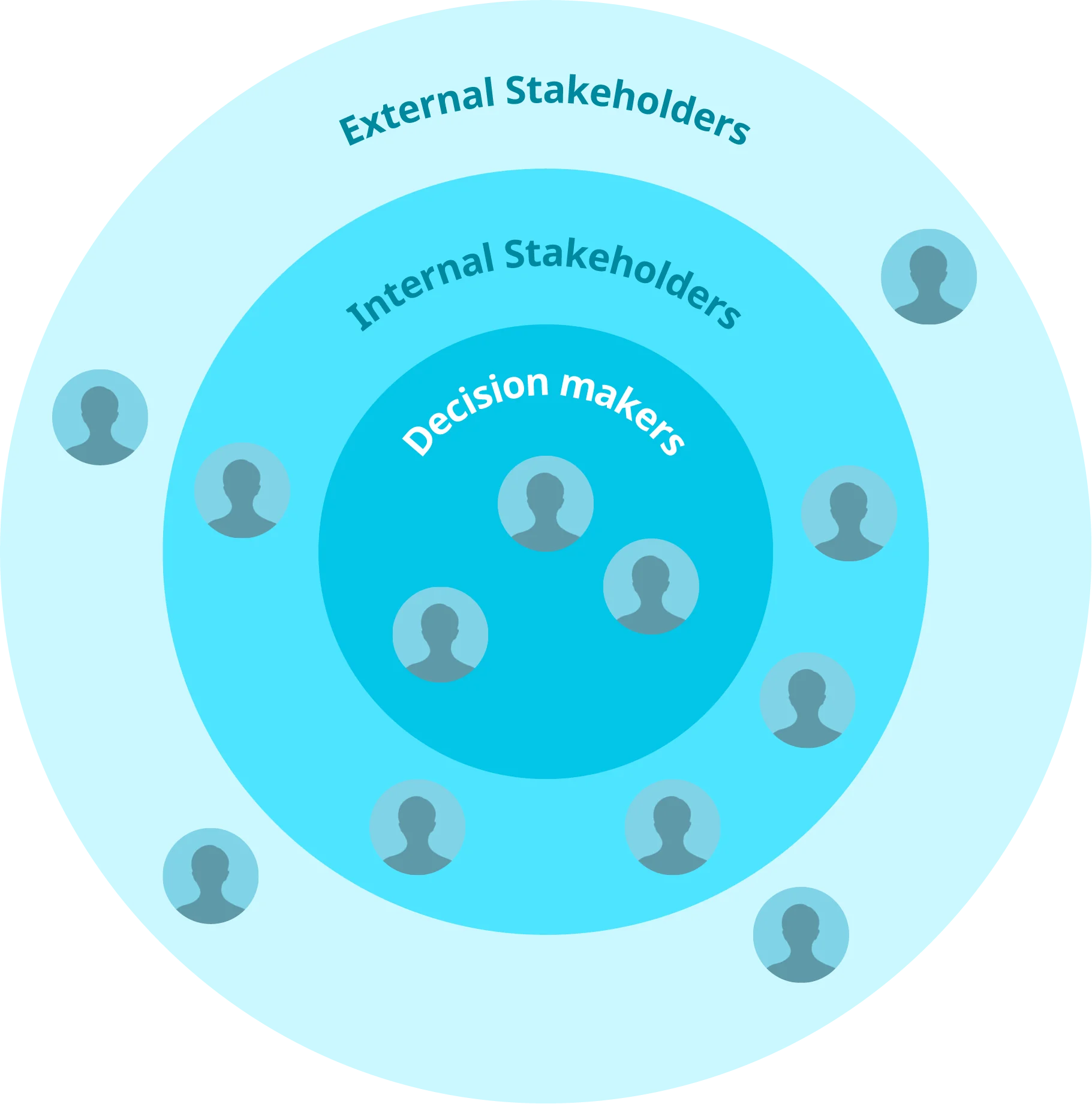
I worked closely with project managers, engineers, data analysts, and customer success teams from discovery to launch, ensuring design decisions aligned with business goals and technical feasibility. Regular syncs kept scope and timelines agile, while iterative feedback loops helped solve challenges like data standardization and pricing transparency.
Beyond the core team, I collaborated with leadership, marketing, and sales to ensure design supported business strategy and user needs. Design handoff wasn't one-directional — I provided detailed specs, design documentation, and ongoing QA support, staying involved through implementation. This cross-functional alignment fostered shared ownership, resulting in a cohesive, user-centered experience.
Design solutions
Design library components
A modular approach with clearly defined tokens for colors, typography, and effects.
Consistent UI elements
Standardized components such as buttons, cards, and input fields ensure uniformity across the platform.
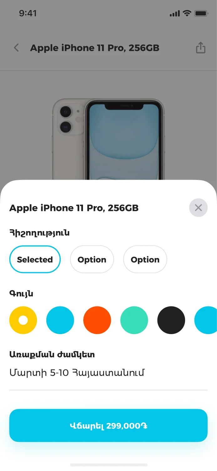
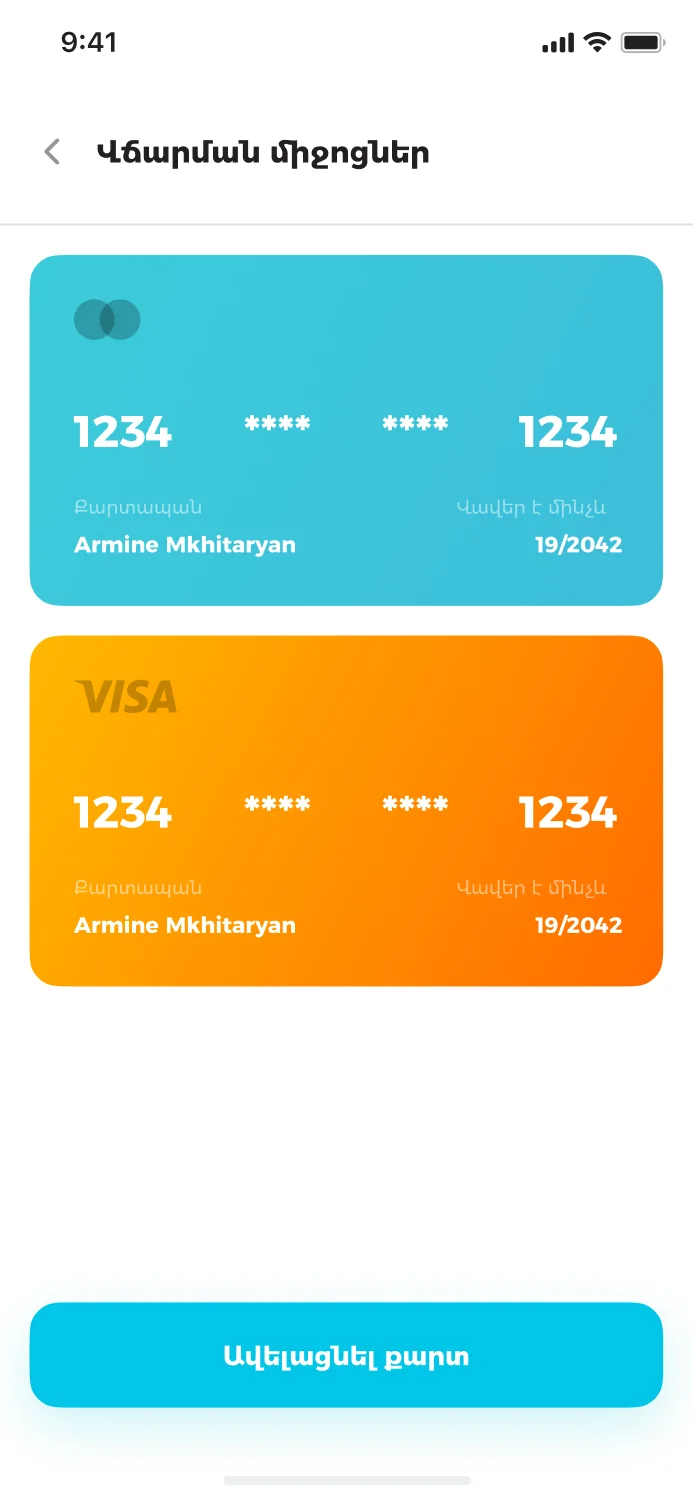
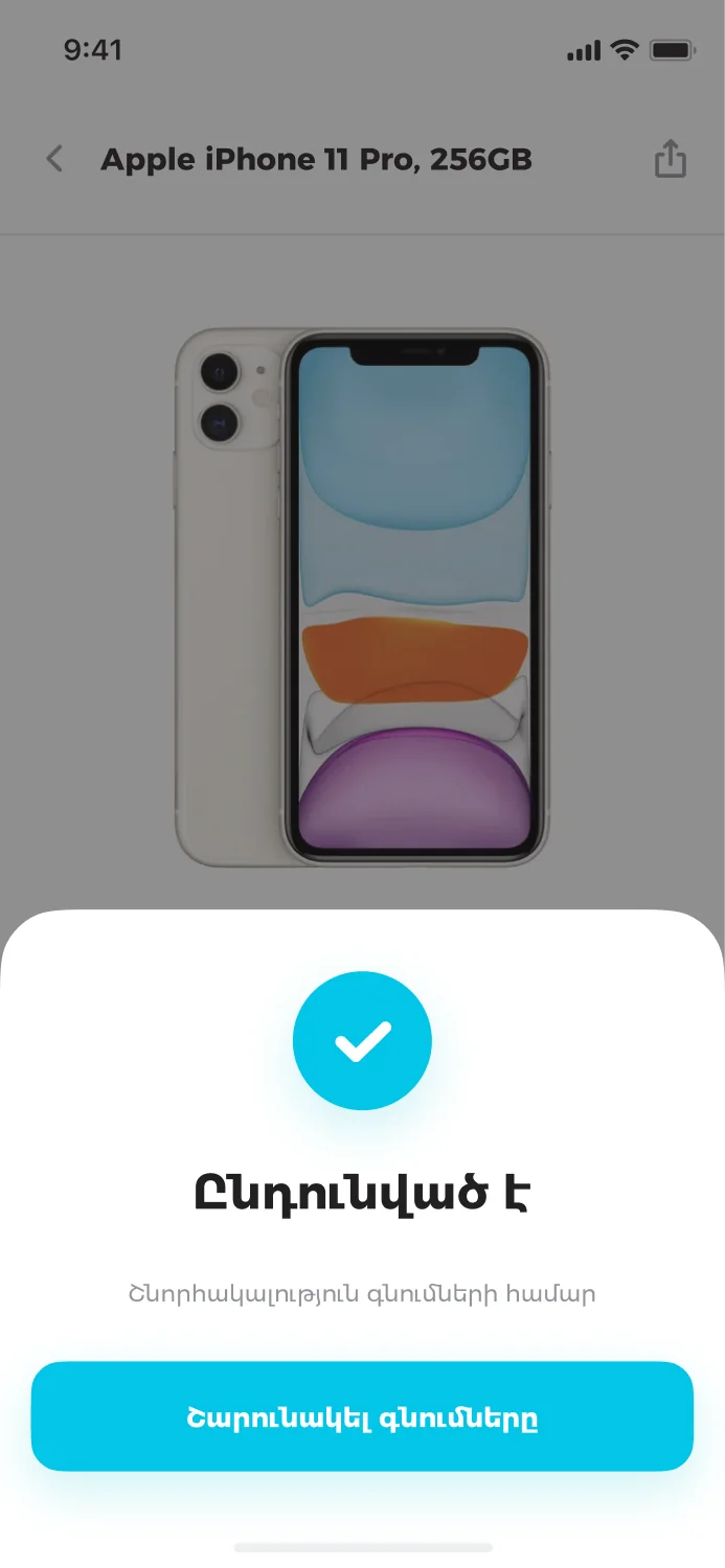
Simple checkout 1, 2, 3
- No manual input — users only select a product and click buy.
- All costs included upfront — item price, shipping, and customs appear before checkout.
- Secure & fast transactions — payment is completed in a single step.
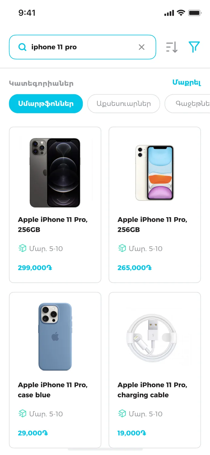
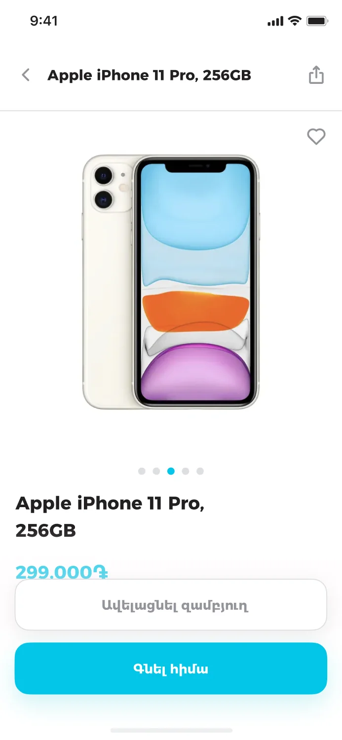
Unified product display
- Standardized information — regardless of the source store, product details follow a consistent format, ensuring a smooth and familiar shopping experience.
- Automatic translations — product descriptions are automatically translated with a click, removing language barriers and making it easier to understand what is being purchased, especially on unfamiliar foreign marketplaces.
- Category & search enhancements — advanced categorization and search allow users to find and compare products effortlessly. Smart filters and recommendations help streamline decision-making, reducing the time spent searching for the right item.
Elderly-friendly UI/UX
- Large, readable fonts and simple navigation reduce cognitive load.
- Step-by-step guidance ensures a smooth shopping experience.
- Minimalist UI reduces distractions and confusion.