Introduction
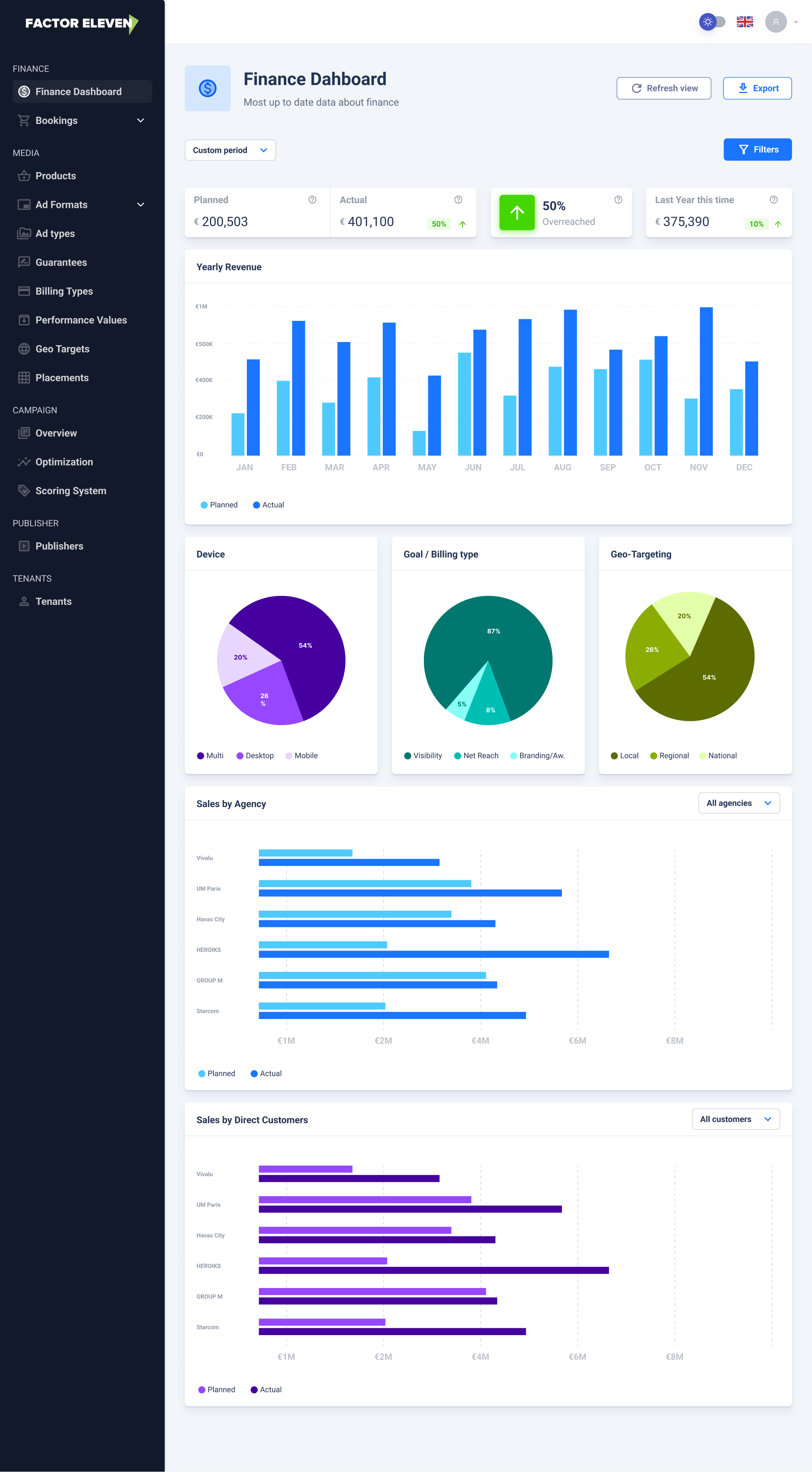
Factor Eleven needed a centralized internal tool to track and manage key financial metrics. Before this project, financial data lived across various spreadsheets and tools, leading to inefficiencies, lack of transparency, and poor decision-making alignment. My task was to design a clean, intuitive financial dashboard that made complex data simple, accessible, and actionable for our internal team.
My role
As the sole designer on this project, I led the process from discovery to wireframing:
- 01Ran discovery sessions with finance and leadership to understand pain points
- 02Audited existing tools and data structures
- 03Created early sketches and wireframes to explore layout and visual hierarchy
- 04Facilitated feedback loops with stakeholders
- 05Delivered clear, developer-friendly handoffs
Problem statement
Factor Eleven's finance team was tracking critical company metrics — such as burn rate, MRR, CAC, and runway — across multiple spreadsheets and legacy tools. This fragmented workflow resulted in inconsistent data interpretation, delays in reporting, and a heavy reliance on manual updates.
Leadership and operational teams had limited visibility into the company's financial health, often struggling to access or interpret the data they needed. Despite the strategic importance of these metrics, there was no centralized, reliable source of truth to support timely and informed decision-making.
Key challenges


Stakeholder collaboration
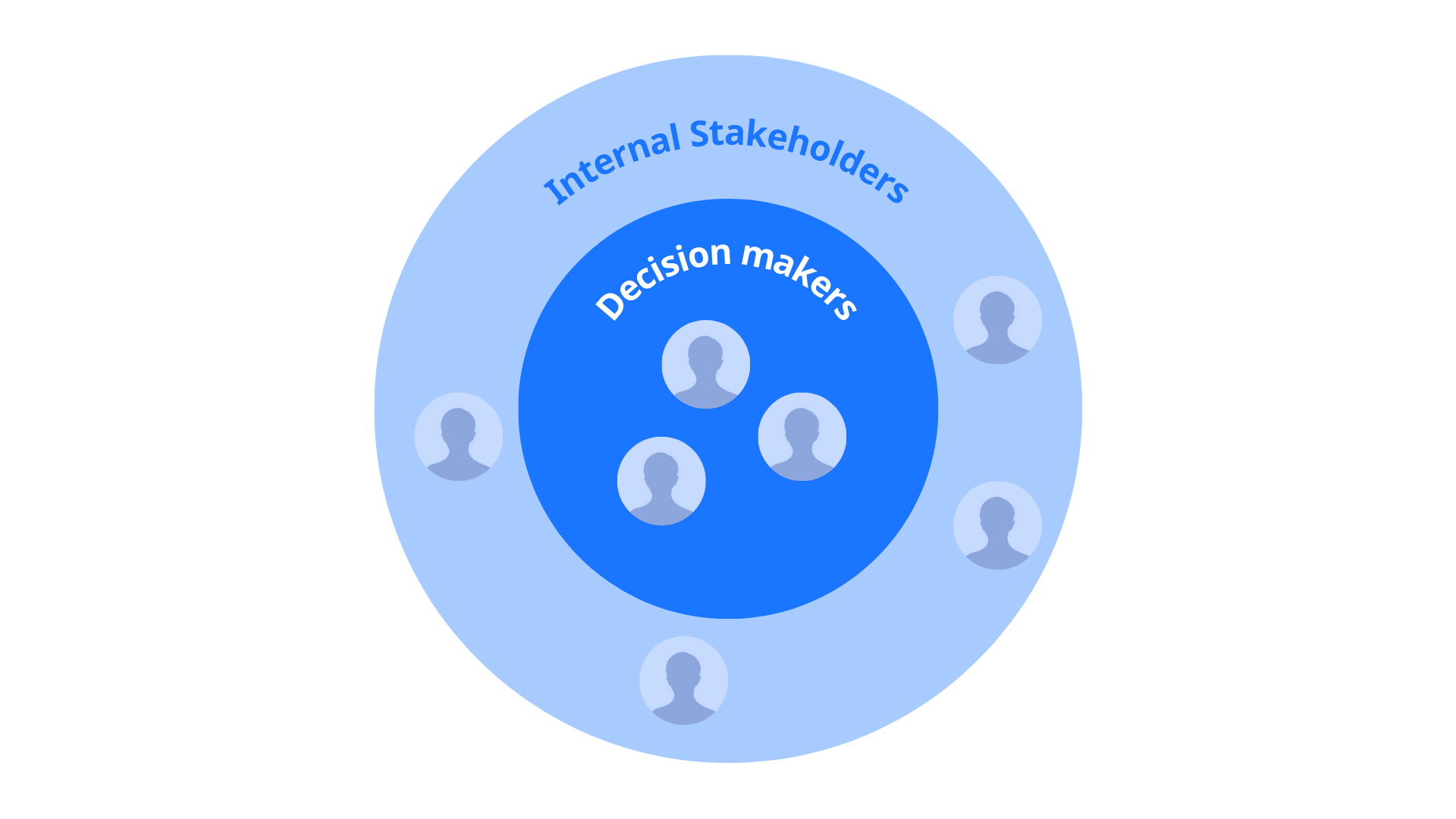
Key collaborators included:
- CFO & Finance Team — for data accuracy and metric definitions
- CEO & Leadership — to understand decision-making workflows
- Engineering Lead — to align on technical feasibility and data constraints
We maintained tight feedback loops through Figma comments, async Loom walkthroughs, and weekly design syncs.
Solution goals
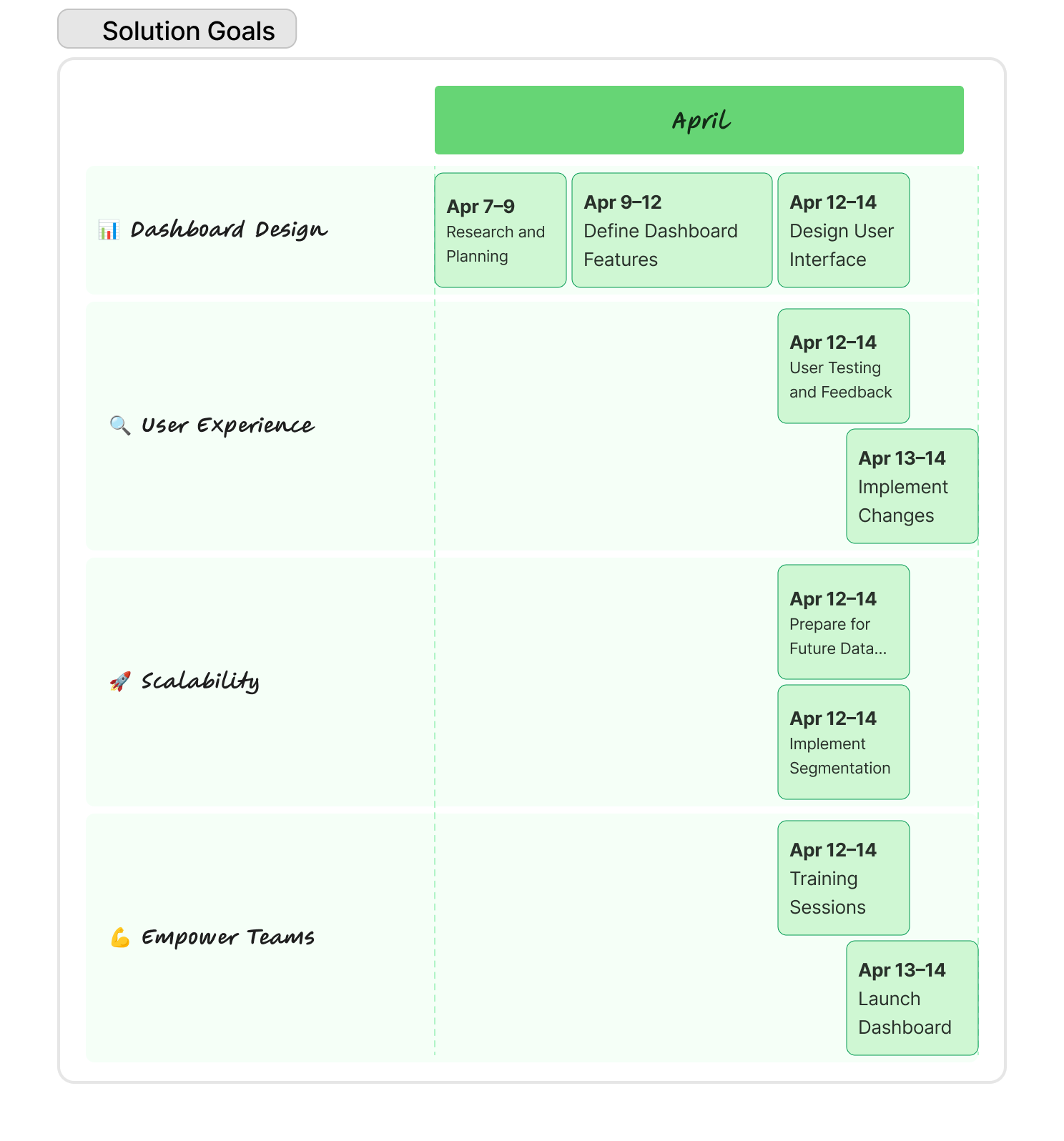
Design a centralized, self-serve dashboard that visualizes the company's financial performance in a way that is:
- Accurate, real-time, and reliable
- Intuitive for both finance professionals and non-finance stakeholders
- Easily scalable for future data layers and segmentation
The overarching goal was to empower cross-functional teams to make confident, data-driven decisions — without relying on constant finance team support.
Process & approach
Research & discovery
To ground the design in actual team needs, I conducted qualitative and contextual research:
- 1:1 stakeholder interviews — with finance, ops, and leadership
- Shadowed weekly reporting routines — to understand pain points
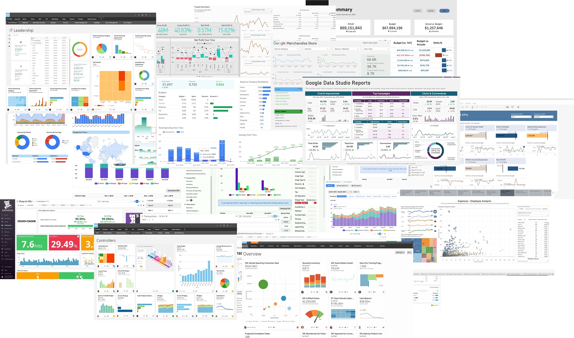
- Audited existing reports & tools — to see how financial data was currently managed
- Benchmarked comparable tools — like ChartMogul, Baremetrics, and custom internal dashboards from Stripe & Intercom
Insights revealed a universal pain around information overload, lack of clarity on trends, and absence of shared understanding between teams.
Wireframing & iterations
Initial wireframes explored two layout systems:
- A modular card-based system — for drag-and-drop flexibility
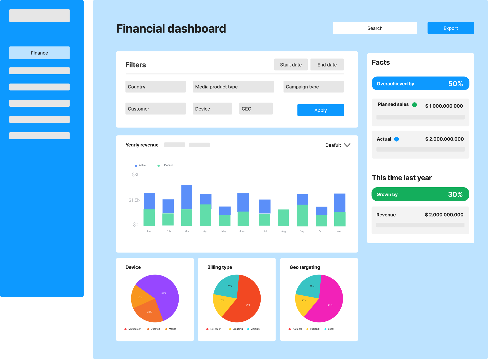
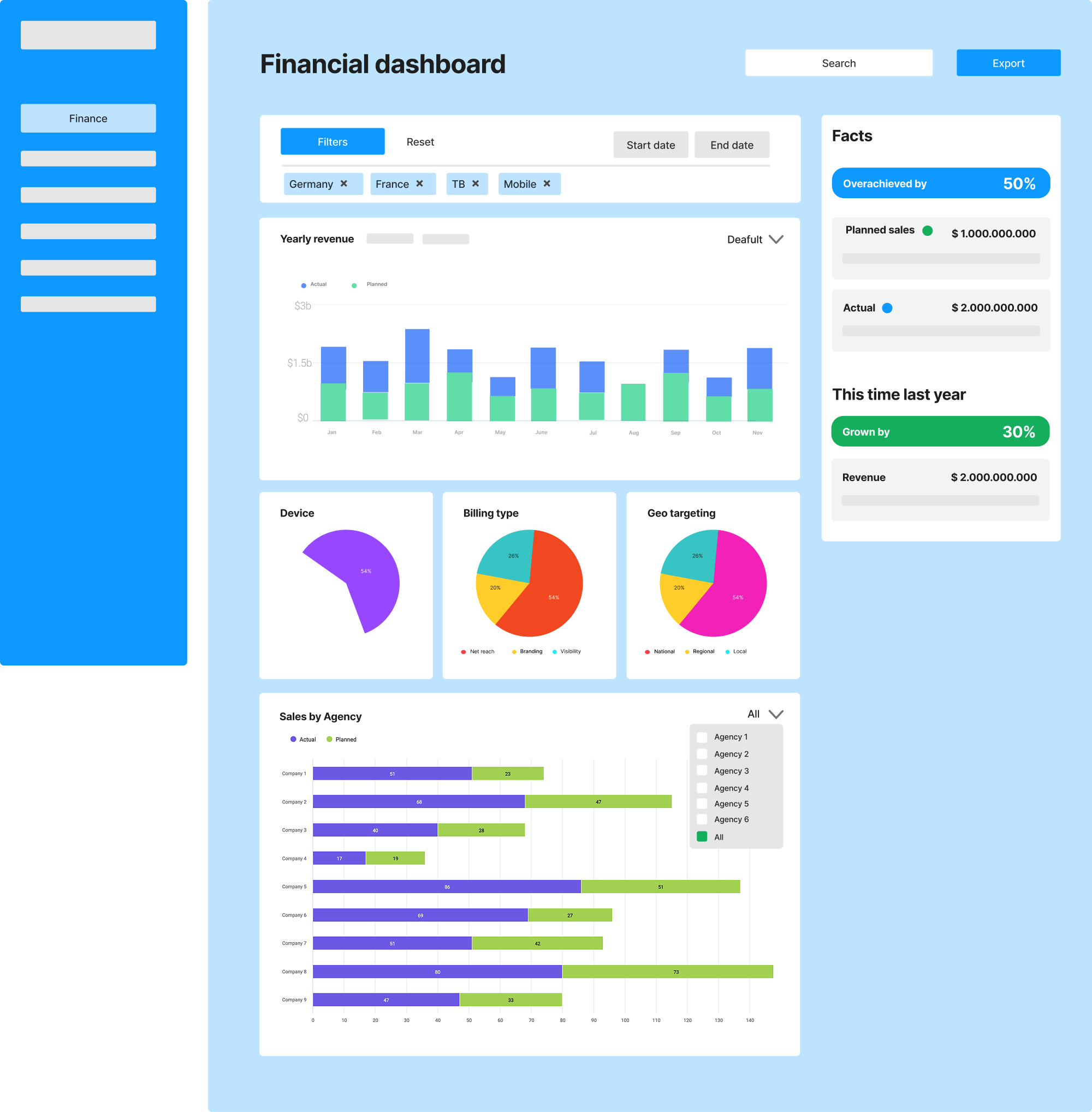
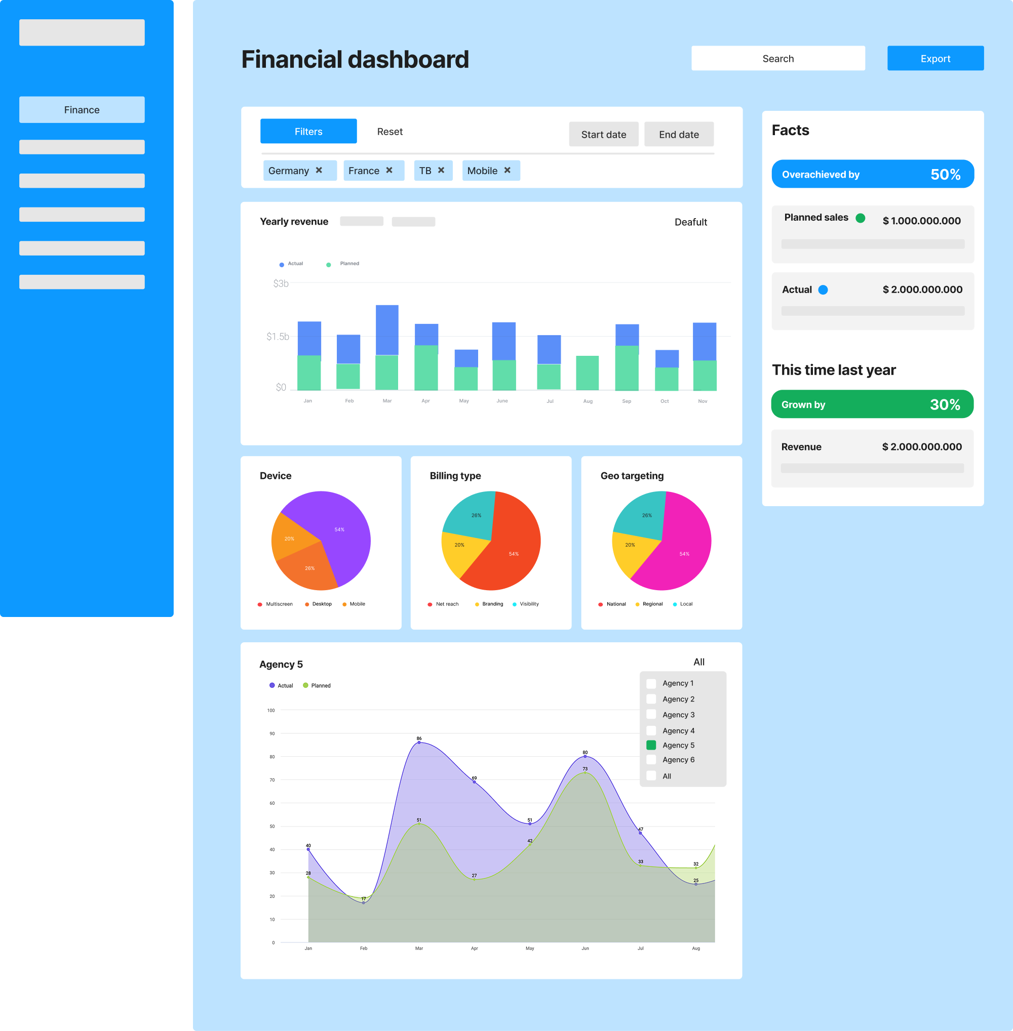
- A page-level hierarchy — with grouped metric zones (e.g. “Revenue”, “Spending”, “Efficiency”)
After stakeholder reviews, I combined the clarity of grouped zones with the flexibility of reusable components. I also introduced the following UX patterns:
- Color-coded KPIs (WCAG approved) for quick risk scanning
- Trend lines with contextual explanations
- Collapsible detail views for secondary data
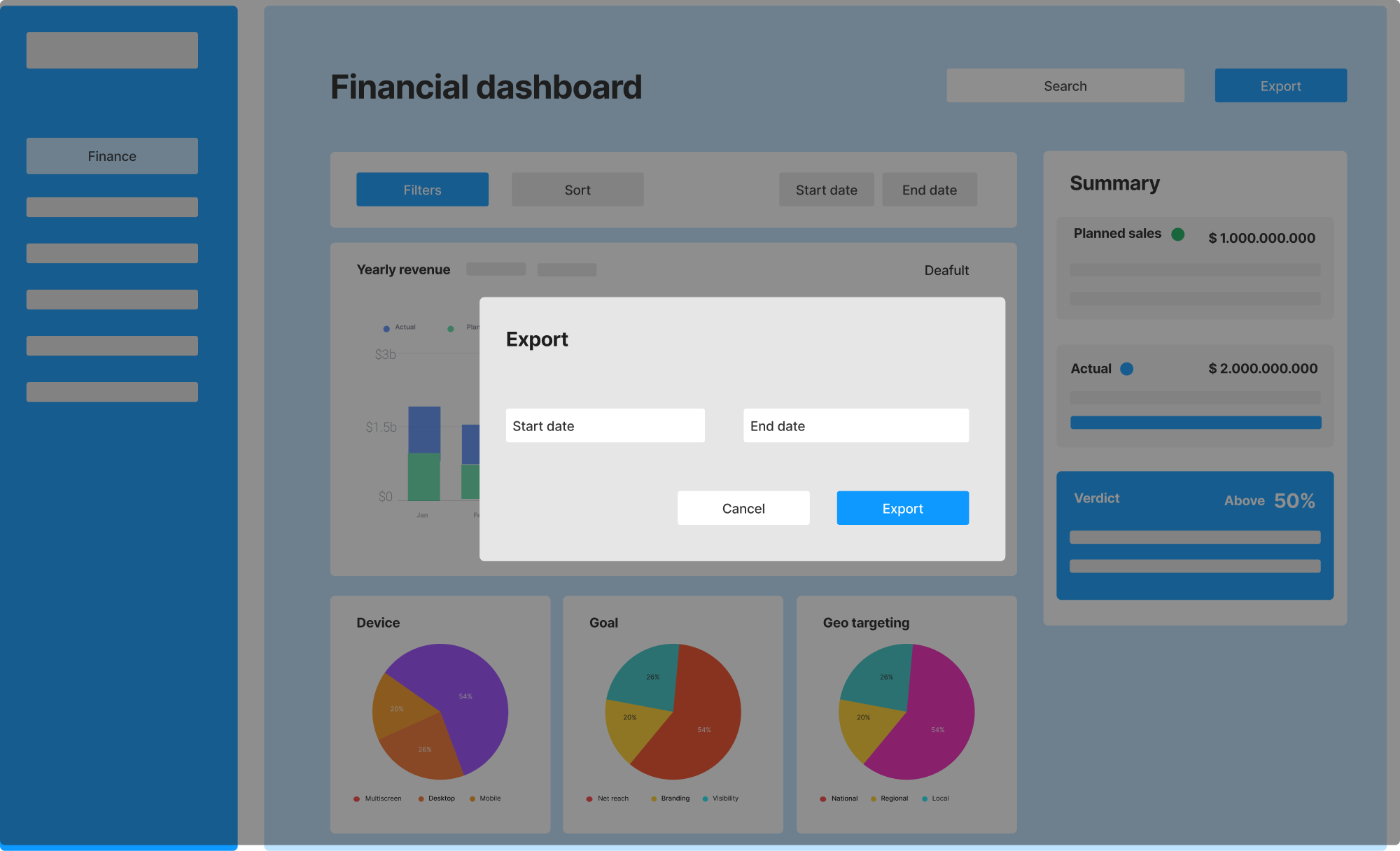
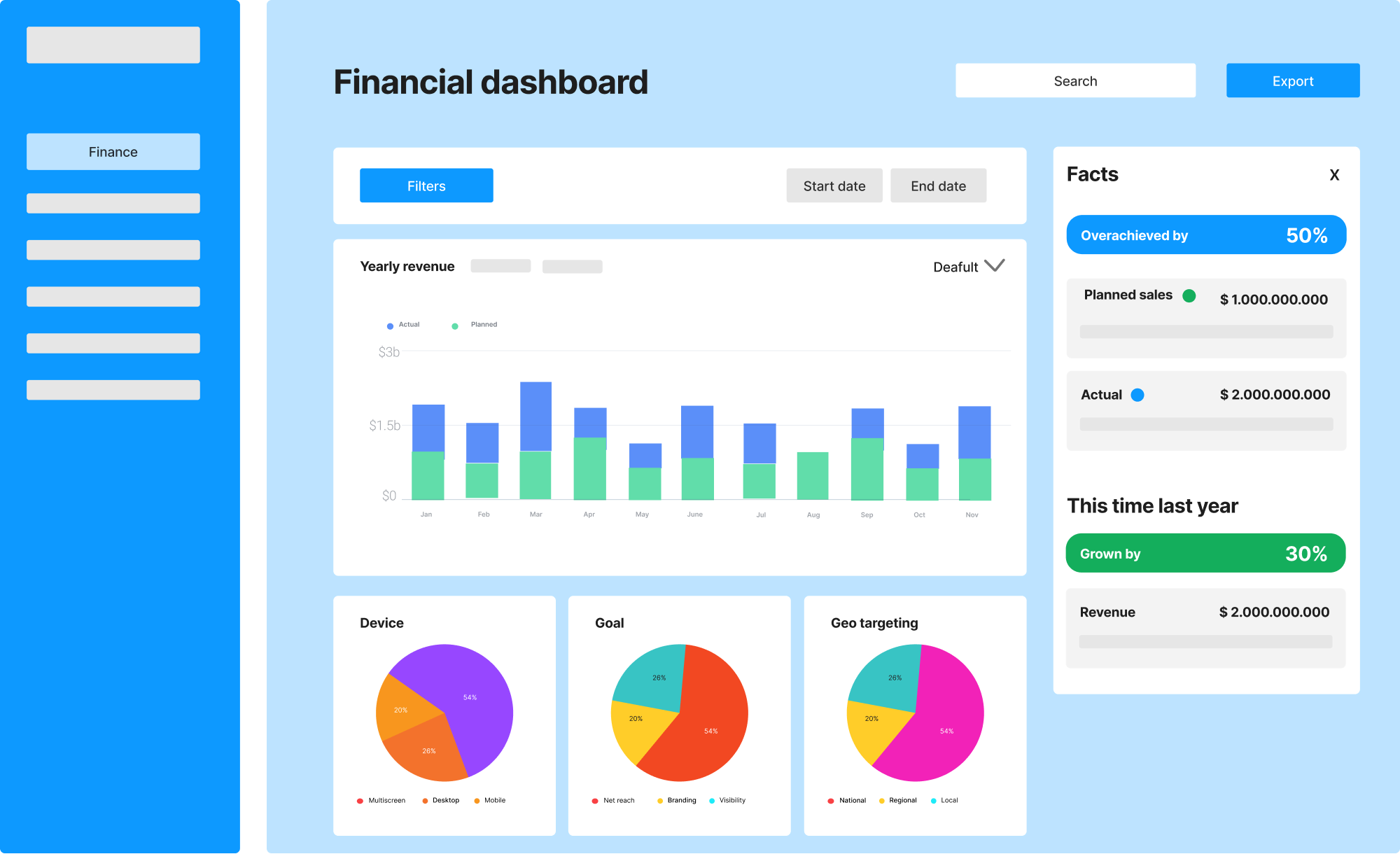
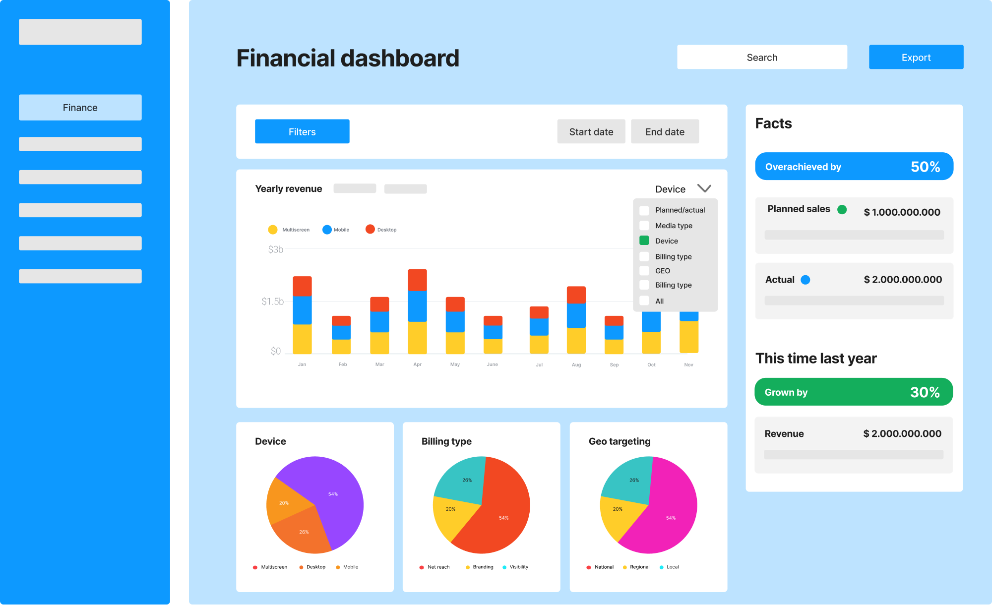
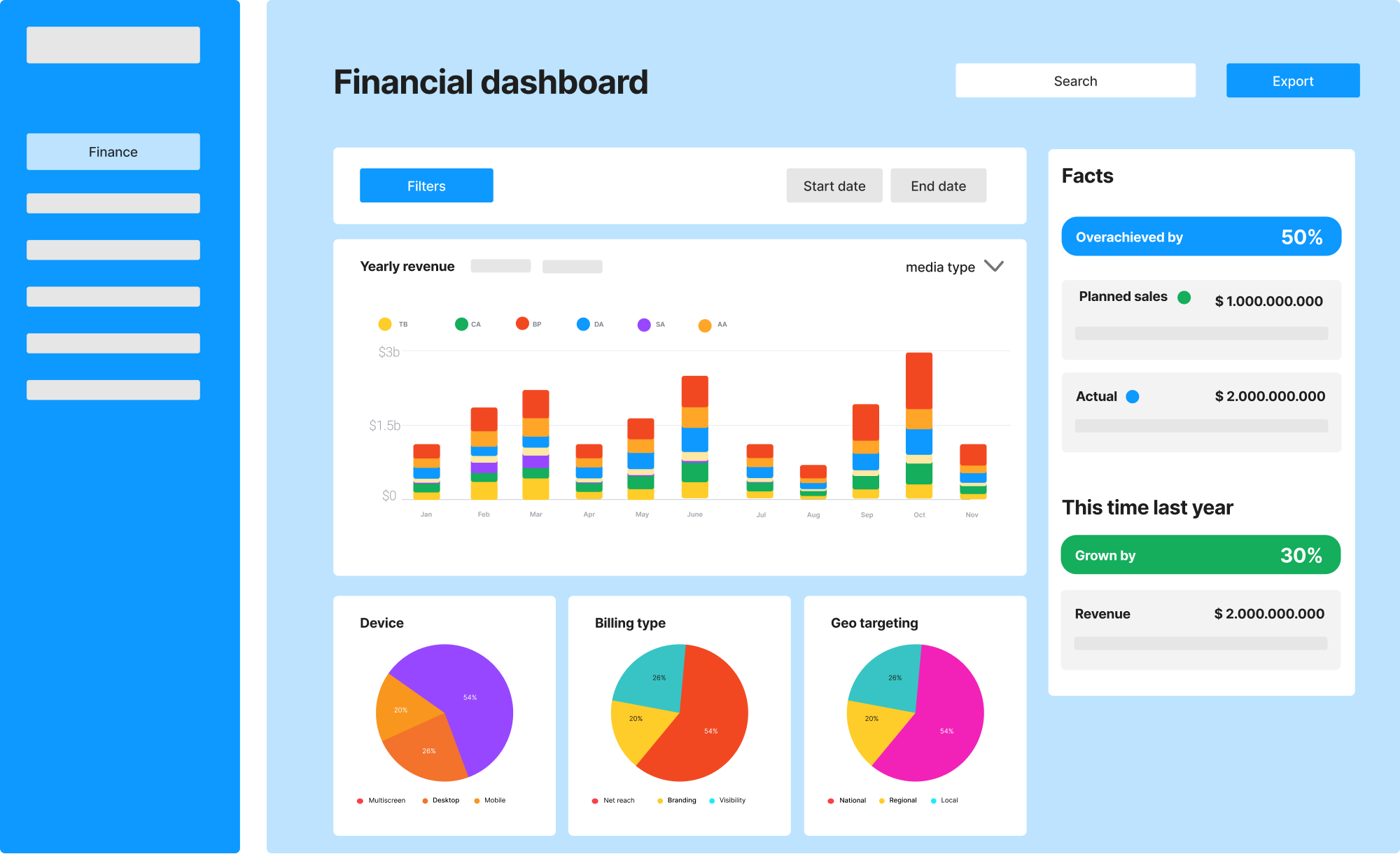
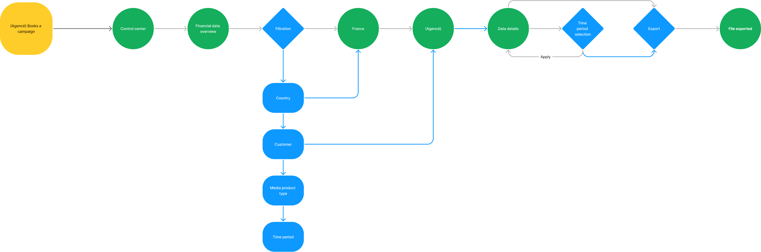
MVP user journey
Design solutions
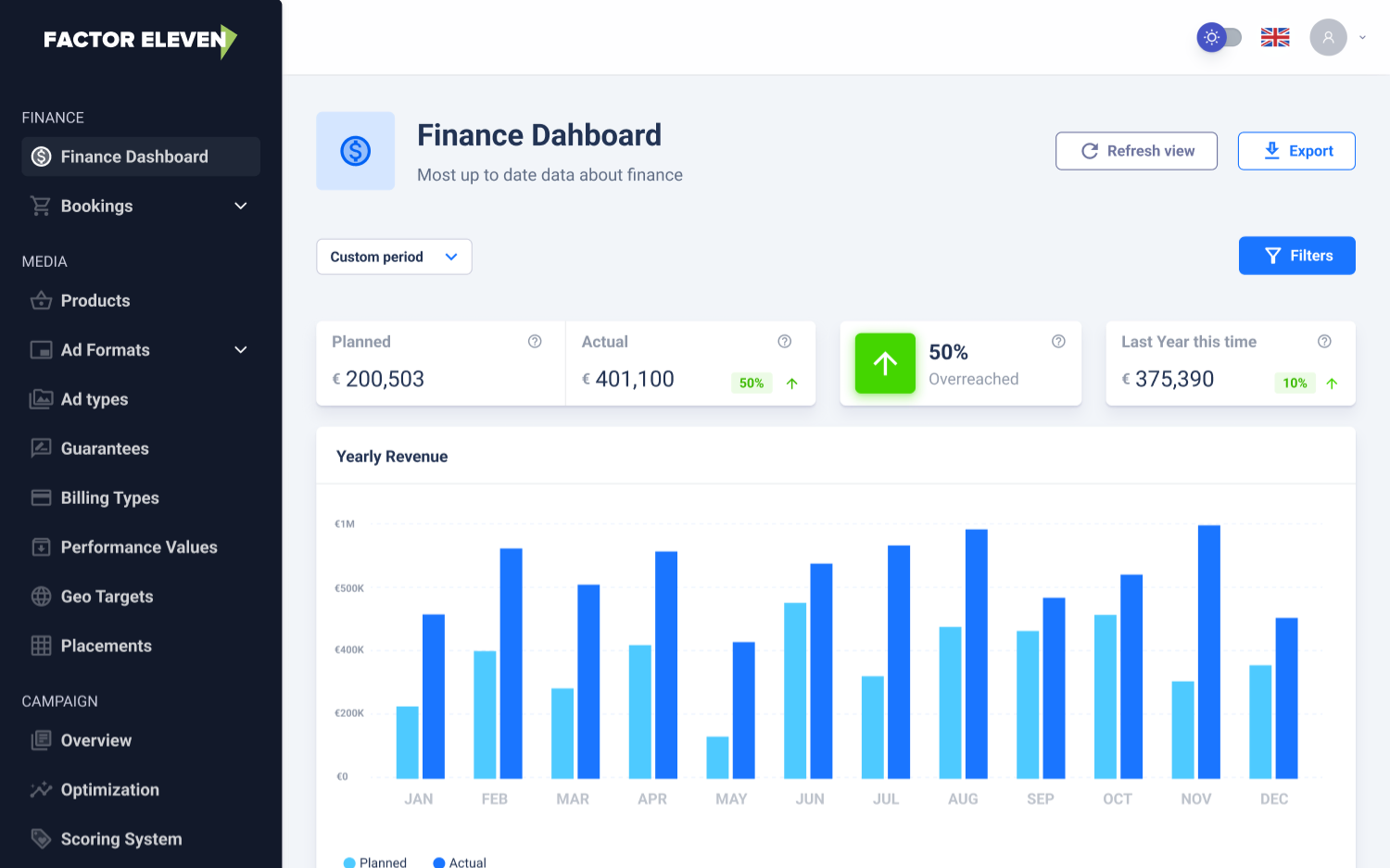
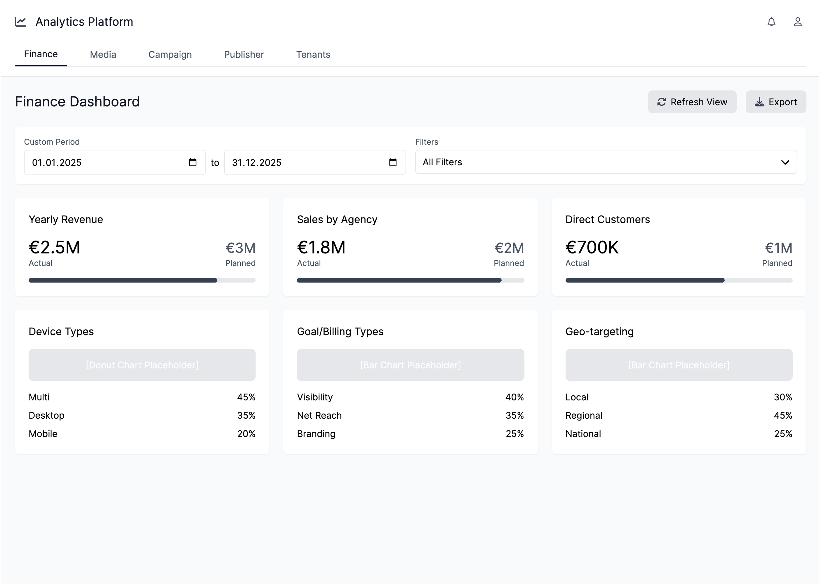
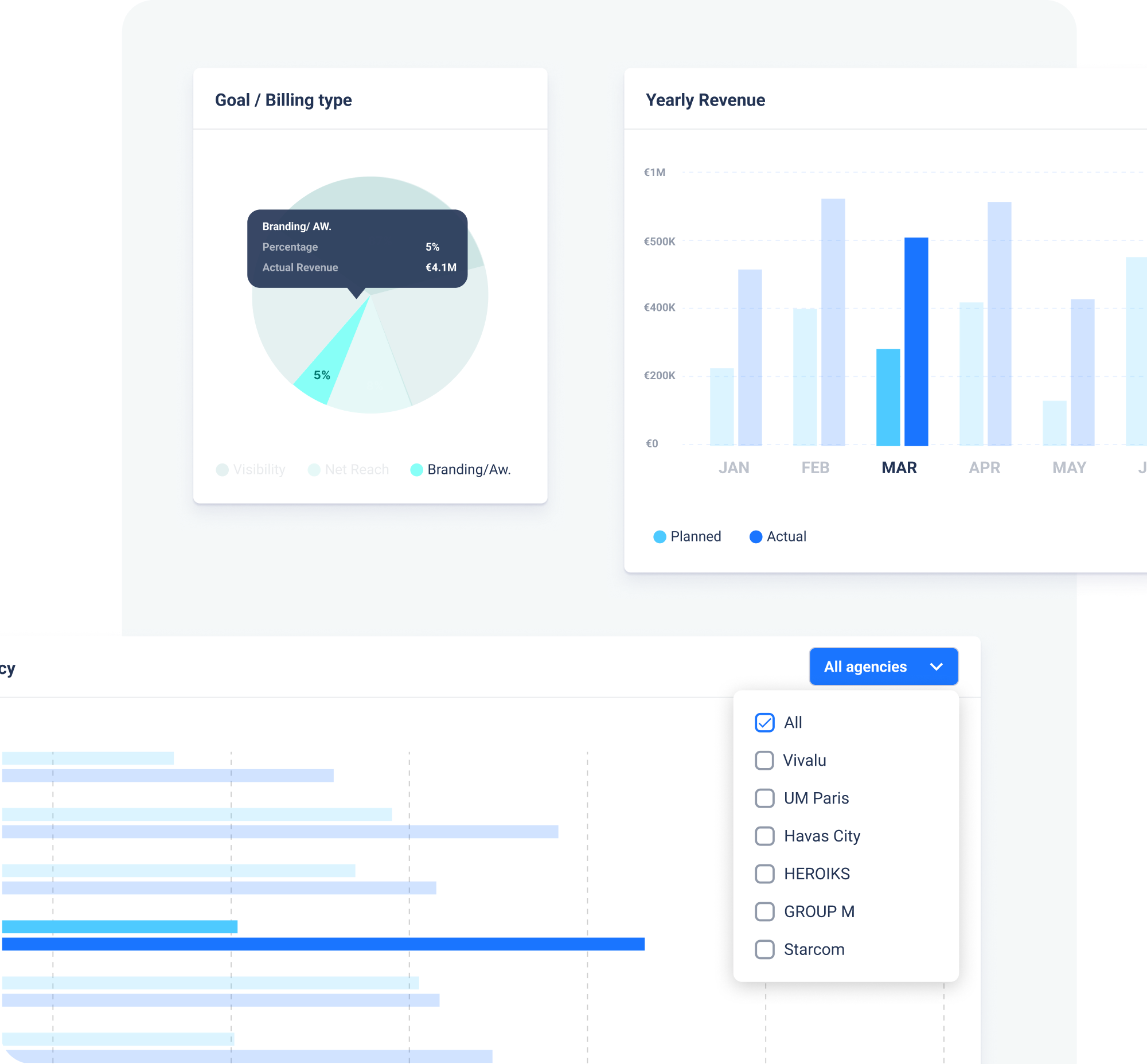
Real-time, immediate revenue insight & metrics.
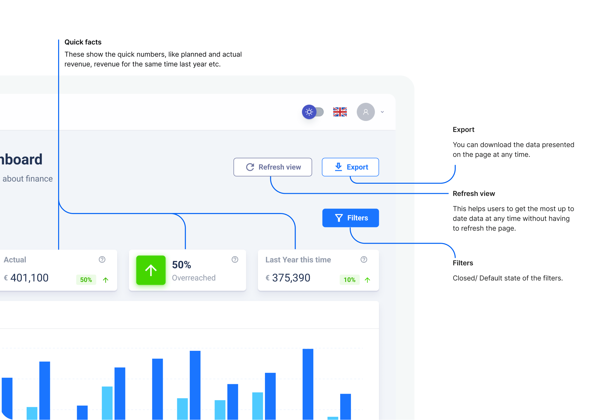
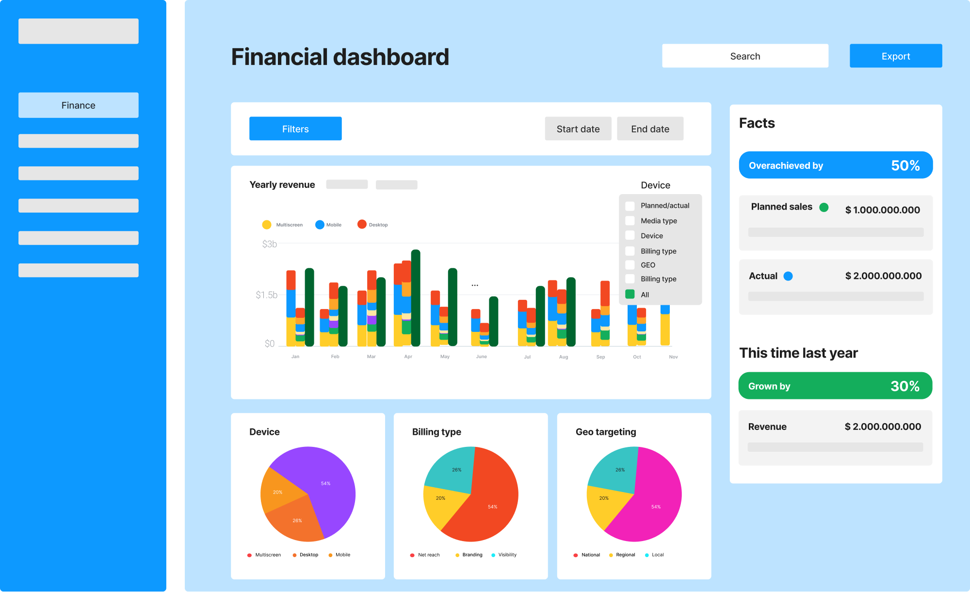
Granular and high-level campaign evaluation tools.
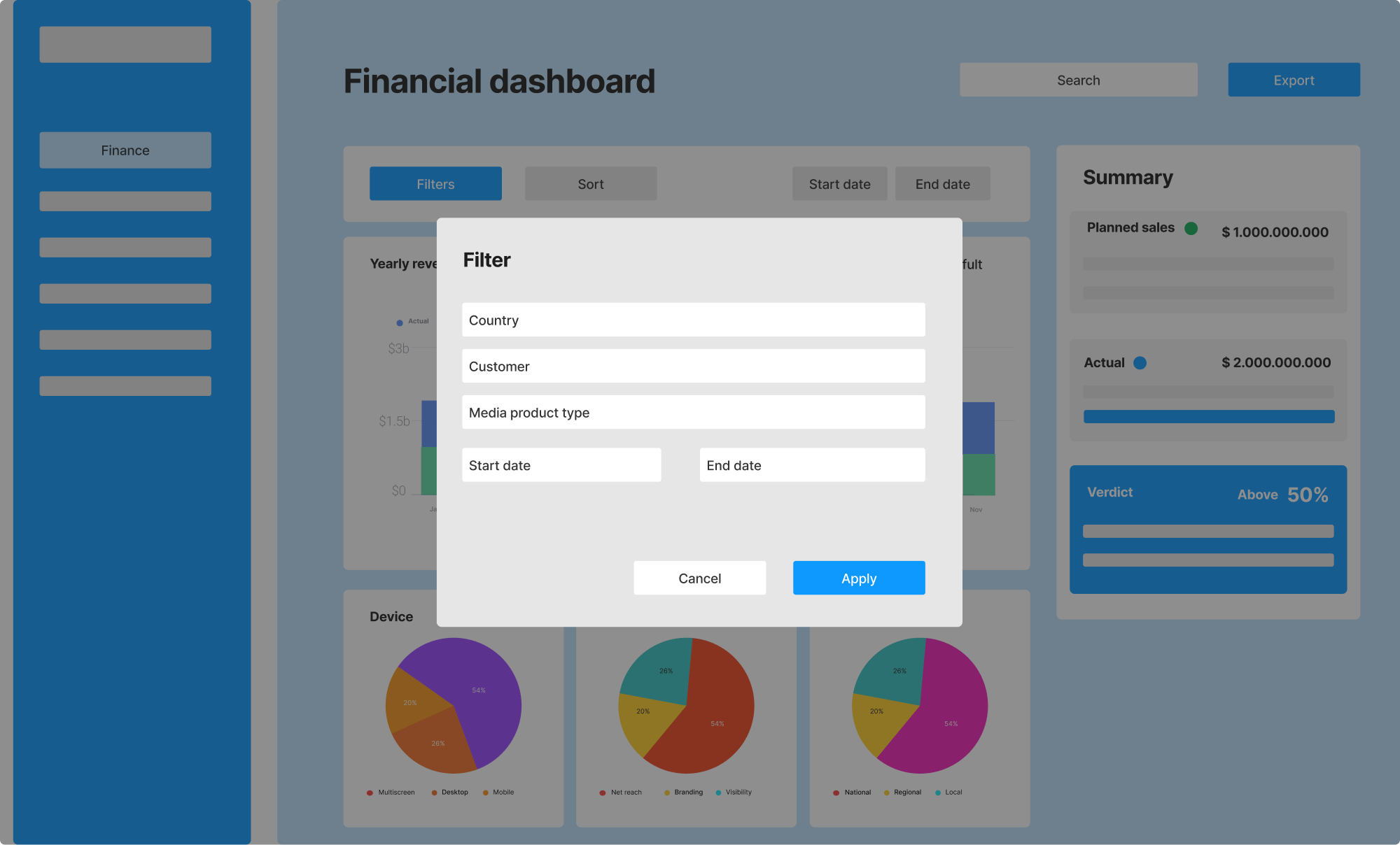
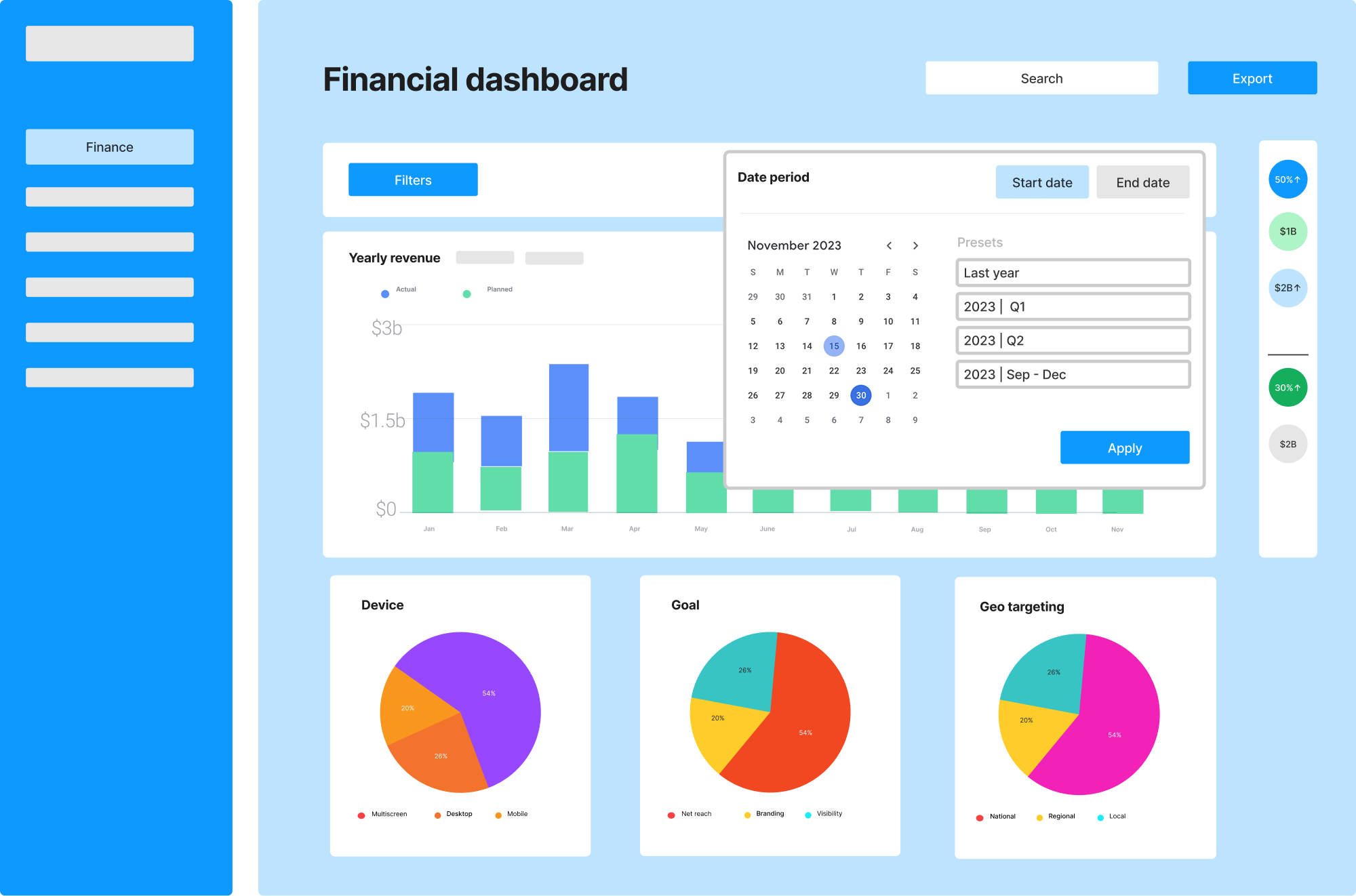
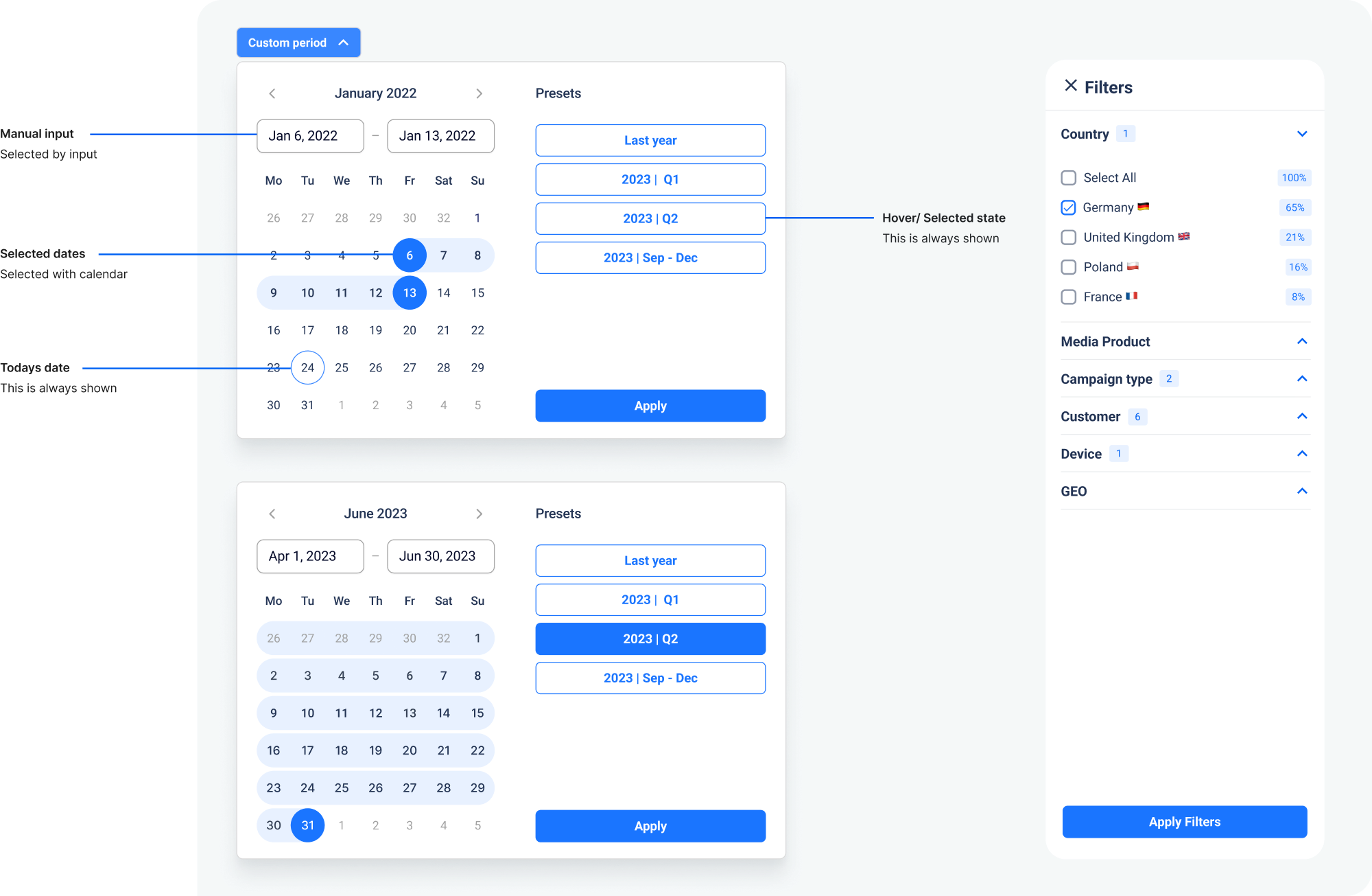
On-demand data access & dynamic date ranges. Easy filtration and export.
Final designs
The final design was delivered as a developer-ready Figma file with clear layout structures, organized components, and defined styles. I created reusable KPI cards, modular data visualizations, and interaction guidelines to ensure consistency across the dashboard. Each design element was annotated with usage notes, and edge-case scenarios were accounted for to support smooth development handoff. The system was built with scalability in mind, allowing for future data layers and role-based dashboards to be added seamlessly.