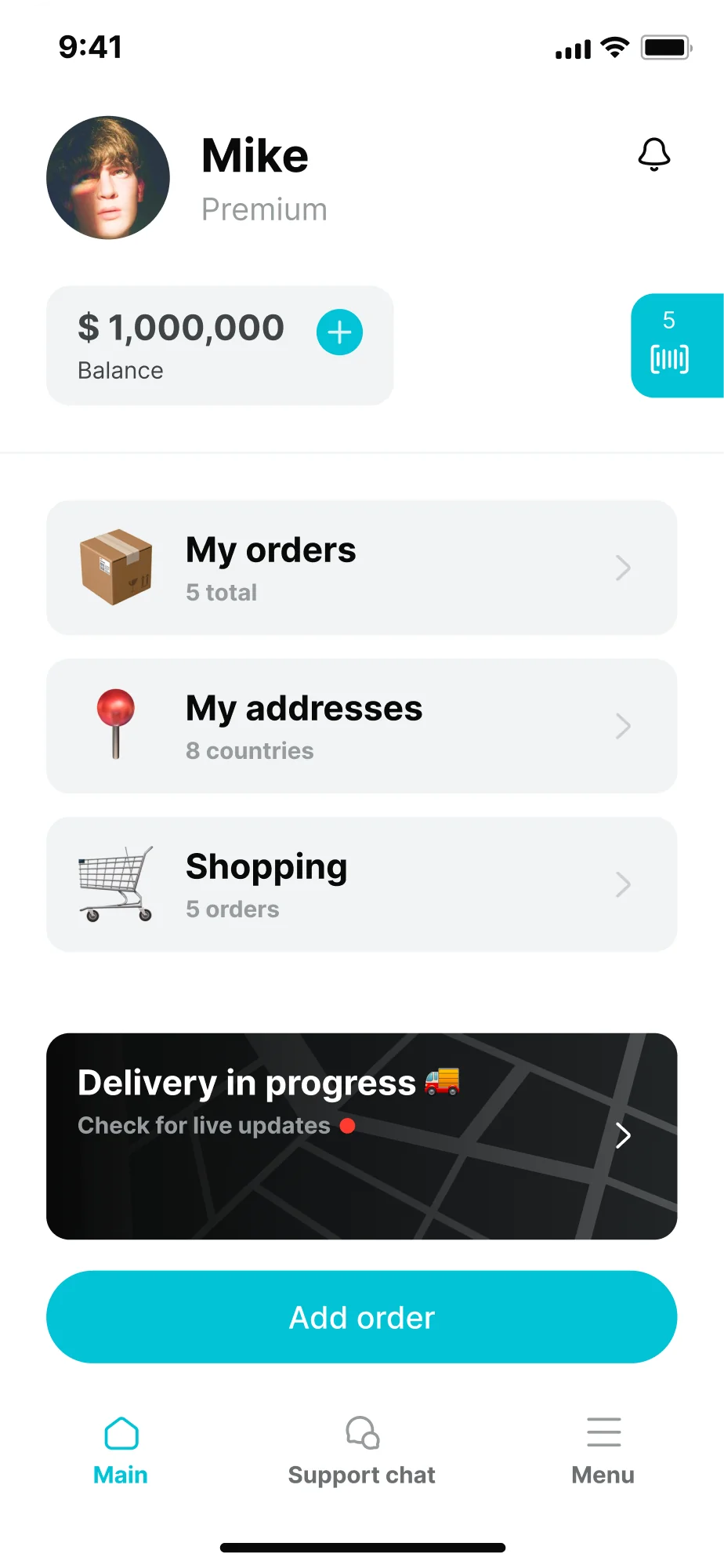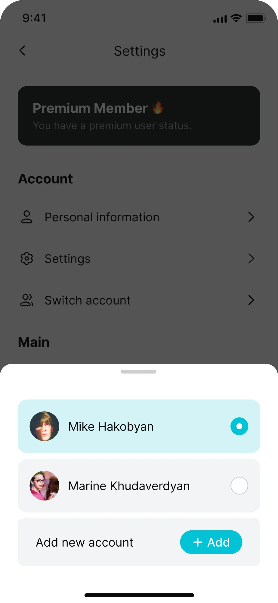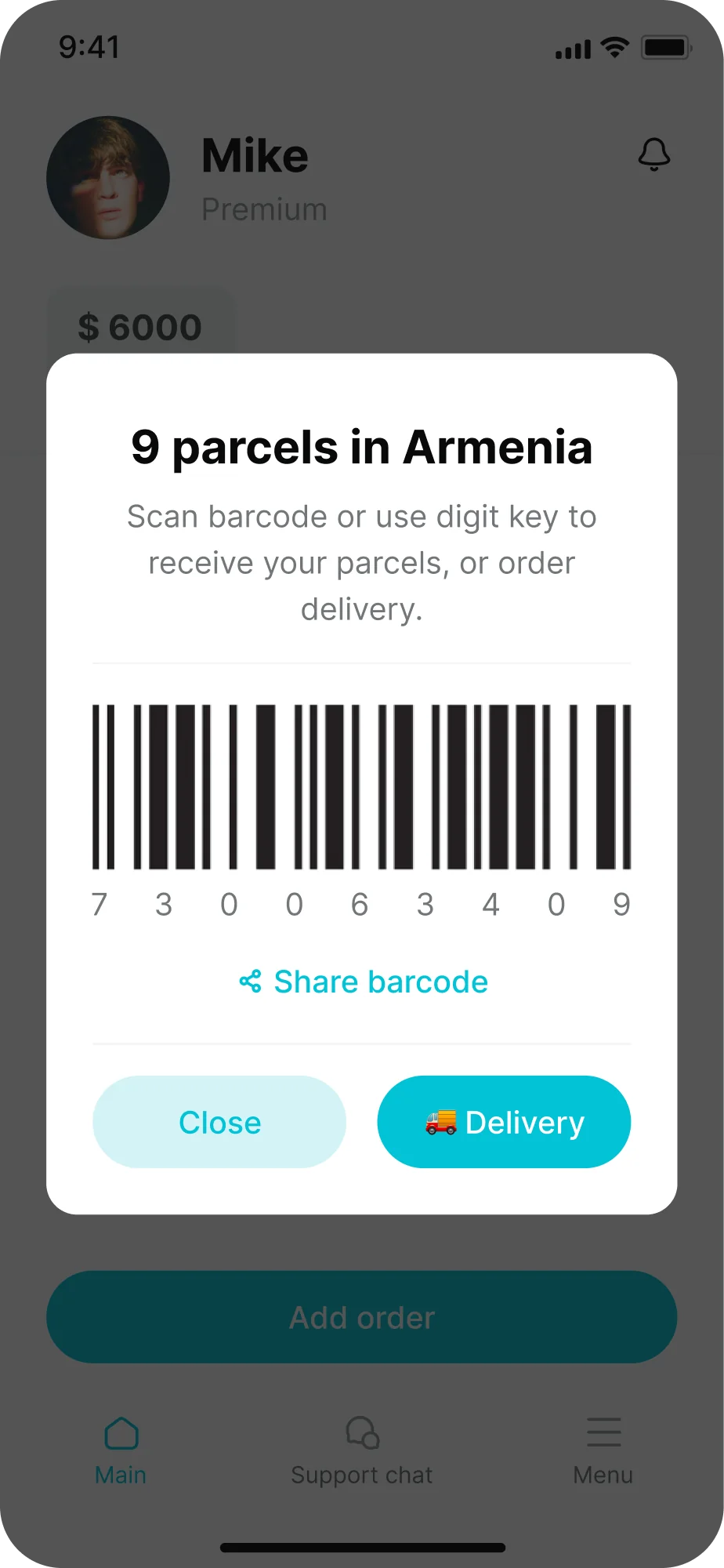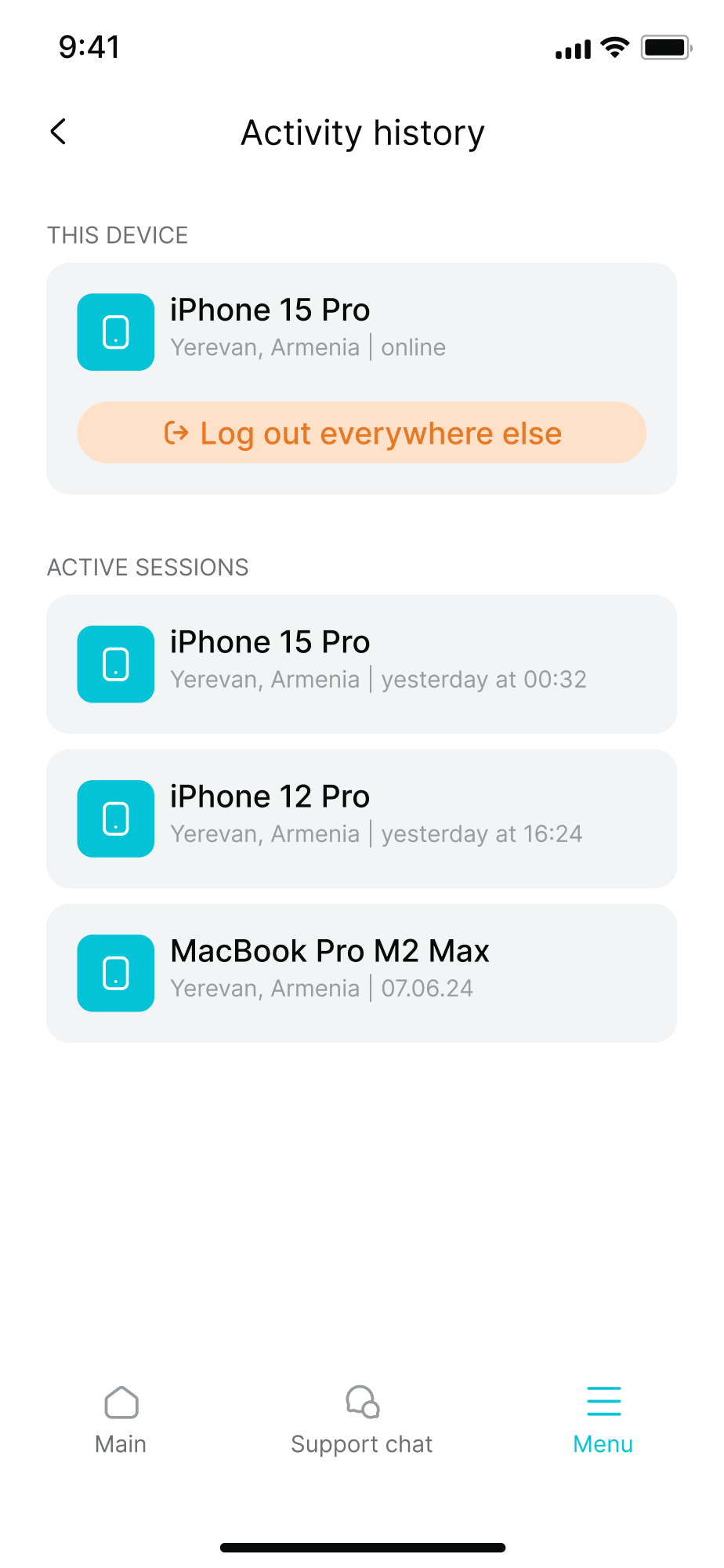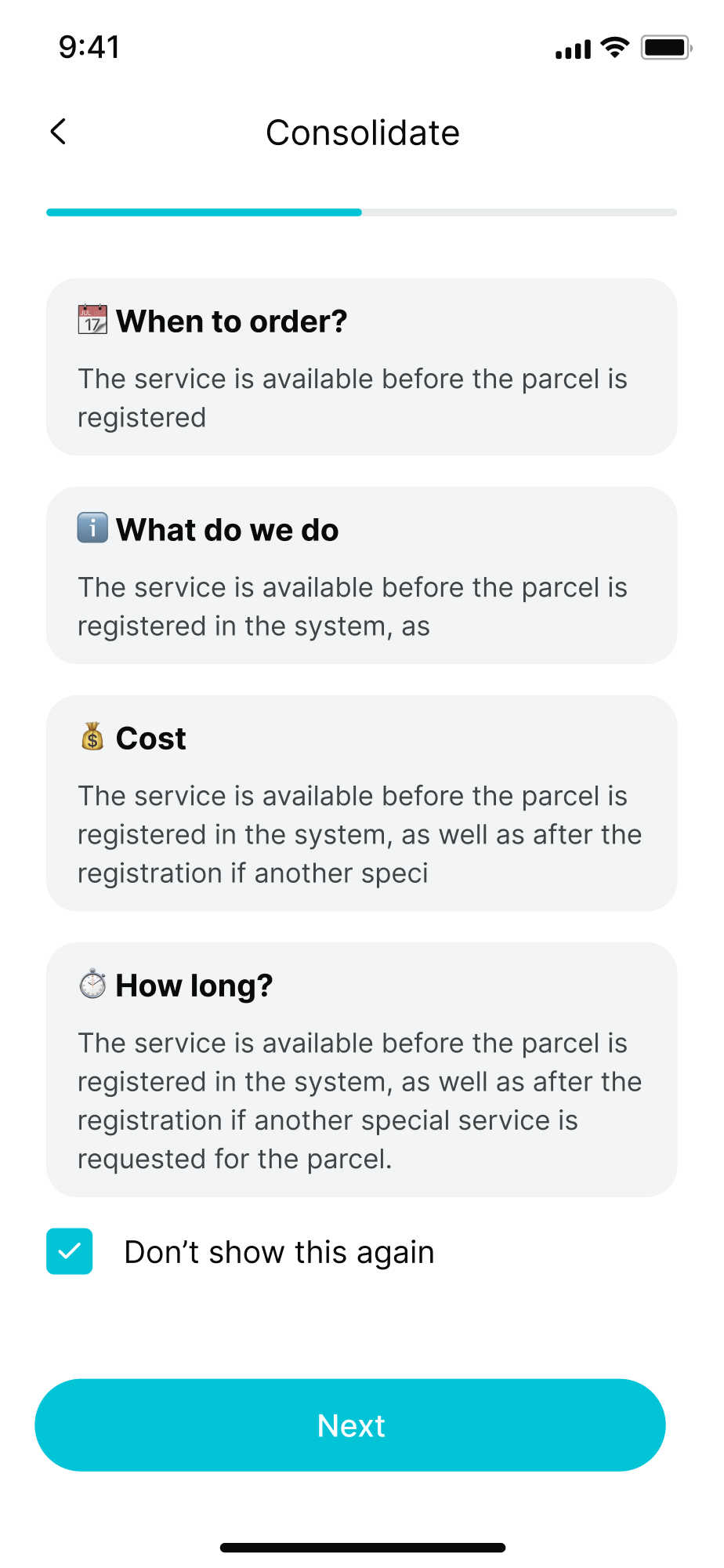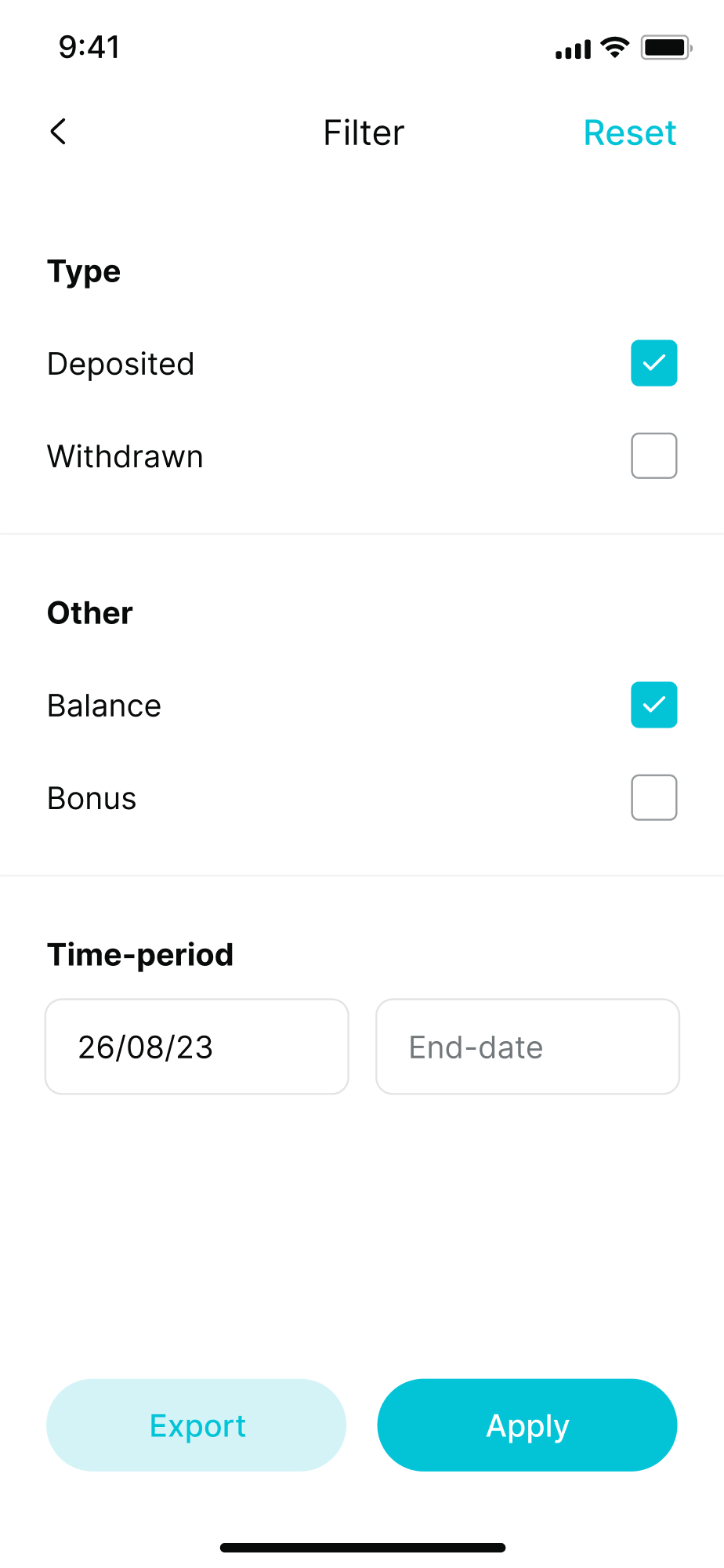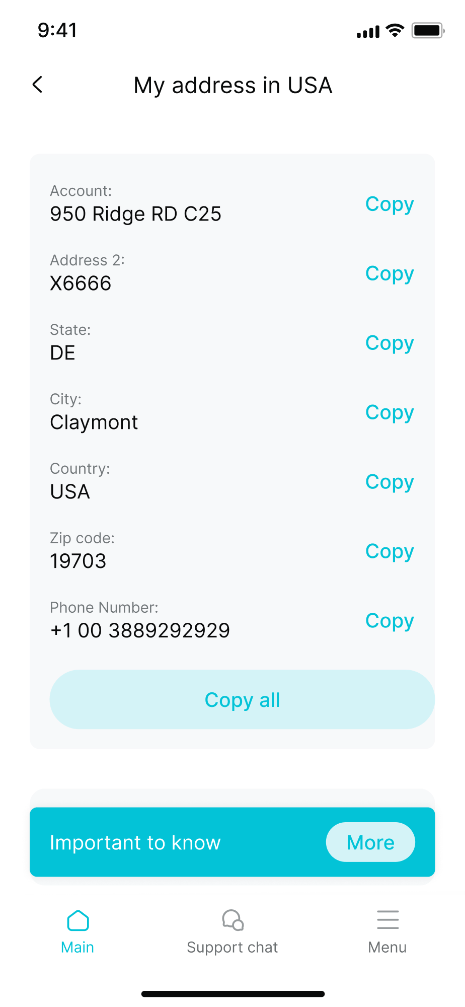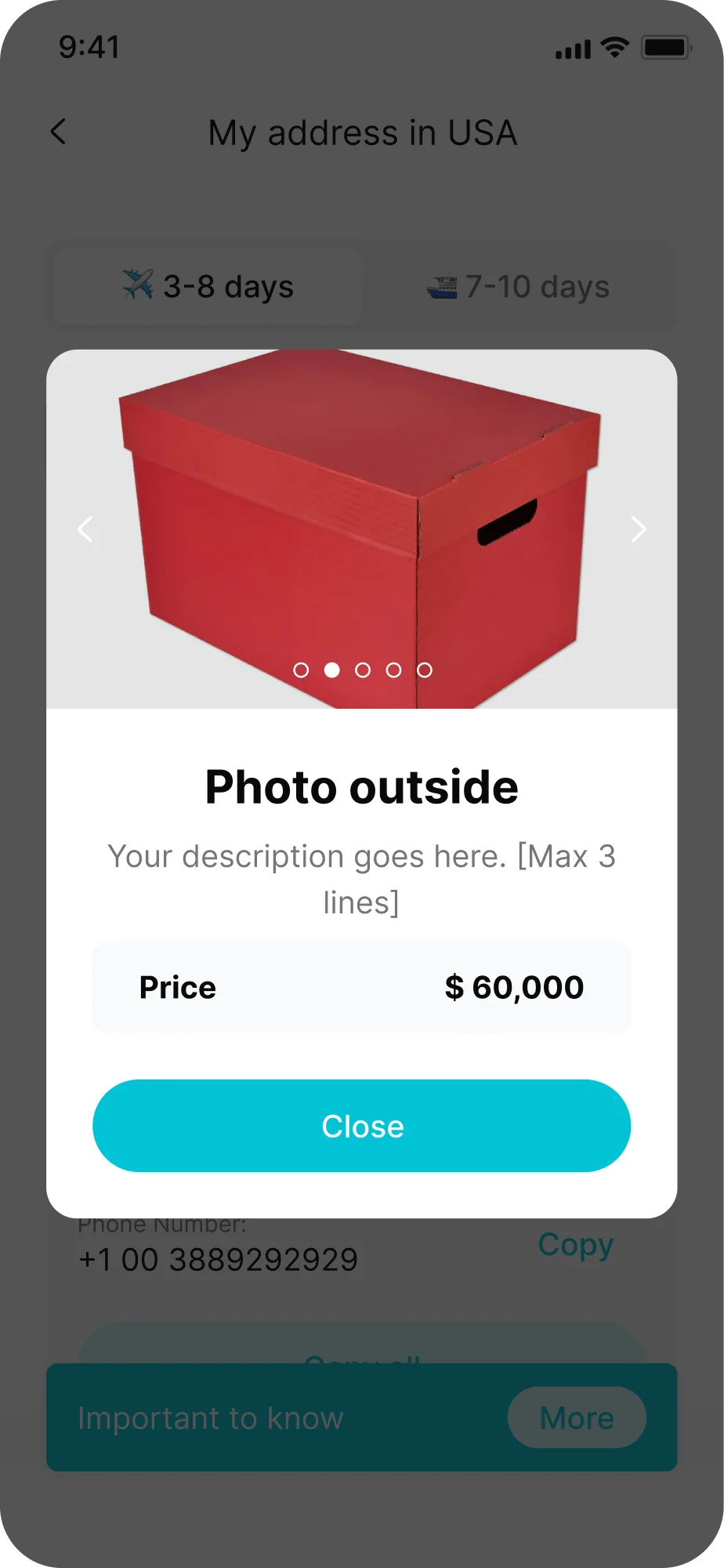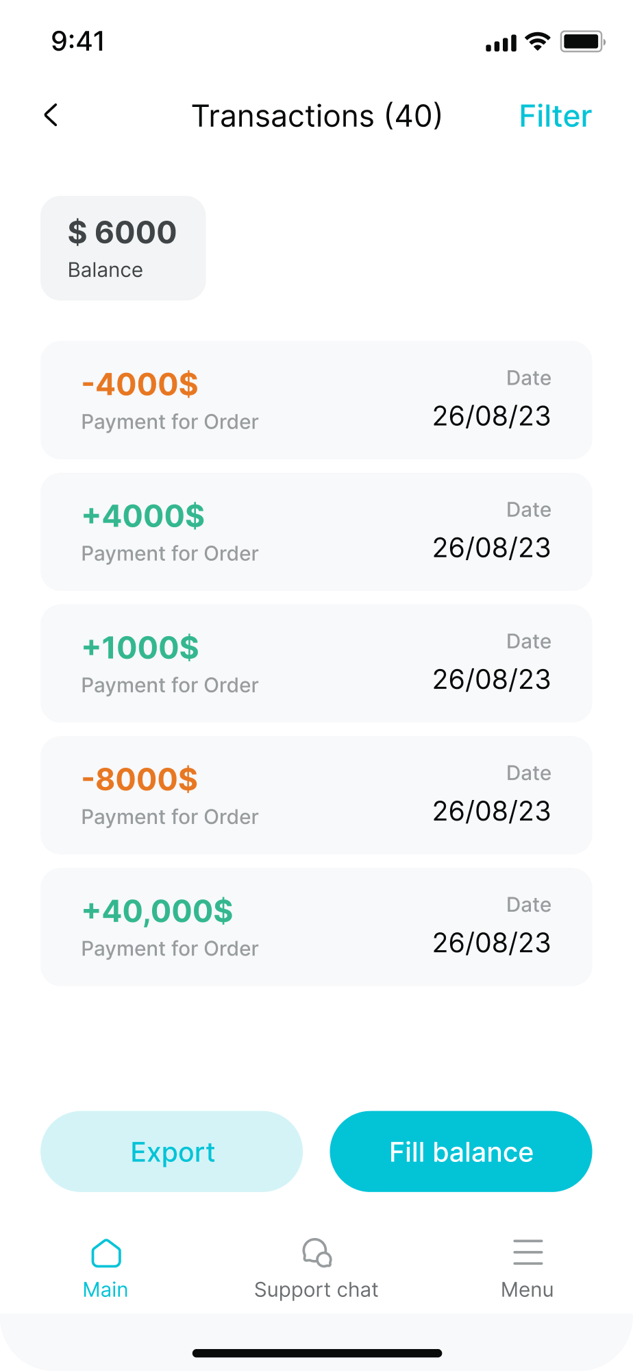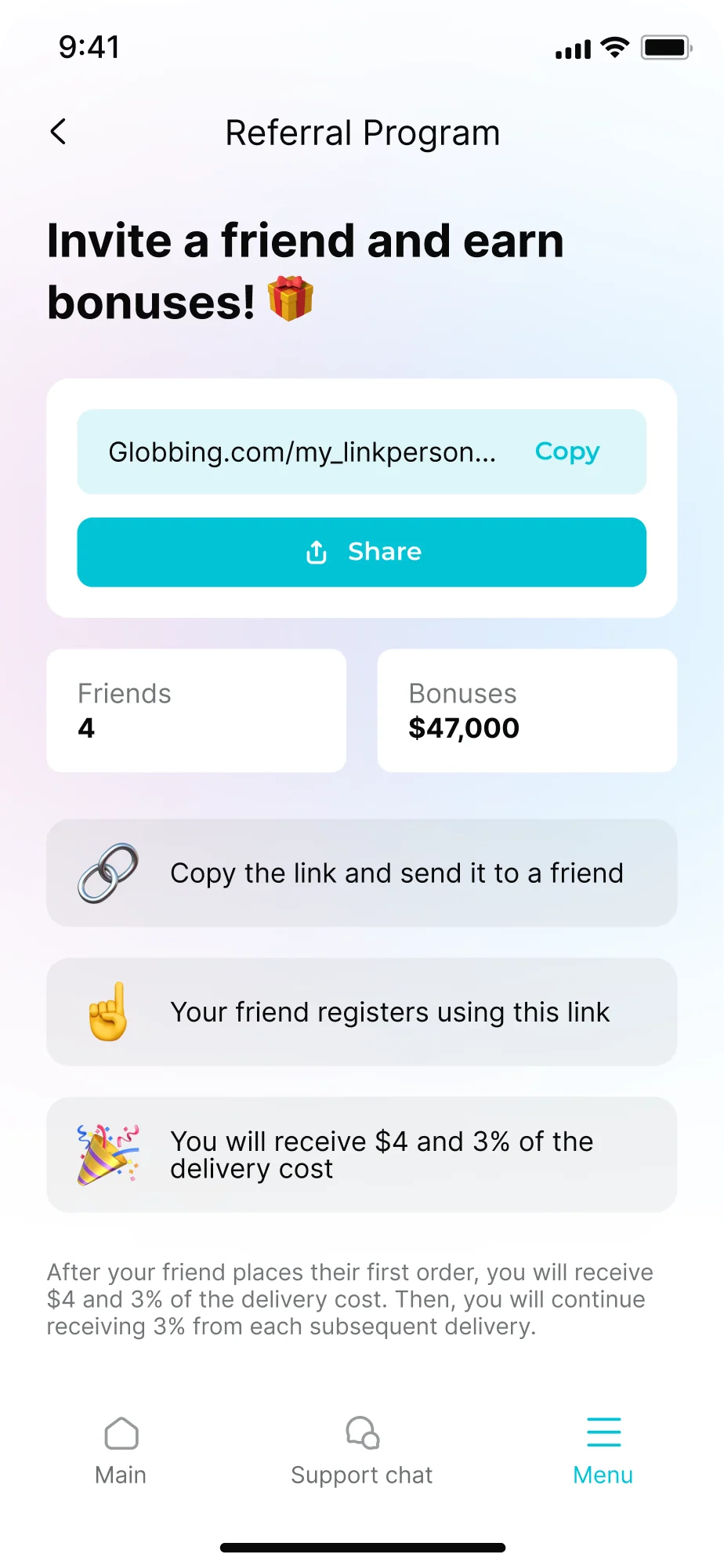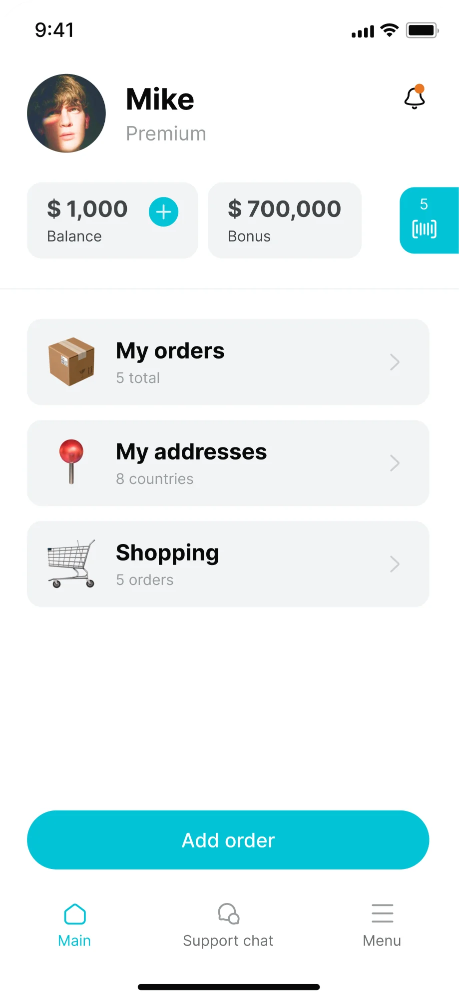
Work in progress — this case study covers an ongoing project. The product has not yet officially released, so some sections reflect the design in progress rather than a shipped result.
Overview
As the sole product designer, I led the end-to-end redesign of Globbing's mobile app — a package-forwarding platform used by millions in Armenia.
The previous app was functionally rich but overwhelmed users with inconsistent UI, ambiguous flows, and buried features. My redesign focused on streamlining interactions, boosting transparency, and building a robust design library for scale.
My role
Senior Product Designer. UX research, user interviews, UI/UX design, prototyping, and system design — collaborating with PMs, customer support, the data team, analysts, engineering, and the CMO.
Goals
Simplify key flows (Add Order, Home Delivery, Tracking); reduce user confusion and support tickets; modernize the UI to match Globbing's brand; improve discoverability of tools like the calculator and tracking; and build a flexible, reusable design library for ongoing growth.
Why we redesigned
Although Globbing had strong brand traction, the app's UX didn't match its reputation. Key issues included:
- High support load from confused users
- Poor visibility of tools like calculators and special services
- Delivery frustrations: no clear tracking or flexibility
- Outdated, inconsistent visual and UI elements
Research & discovery
To understand the pain, I worked closely with support teams and business stakeholders. Key methods:
Observational interviews
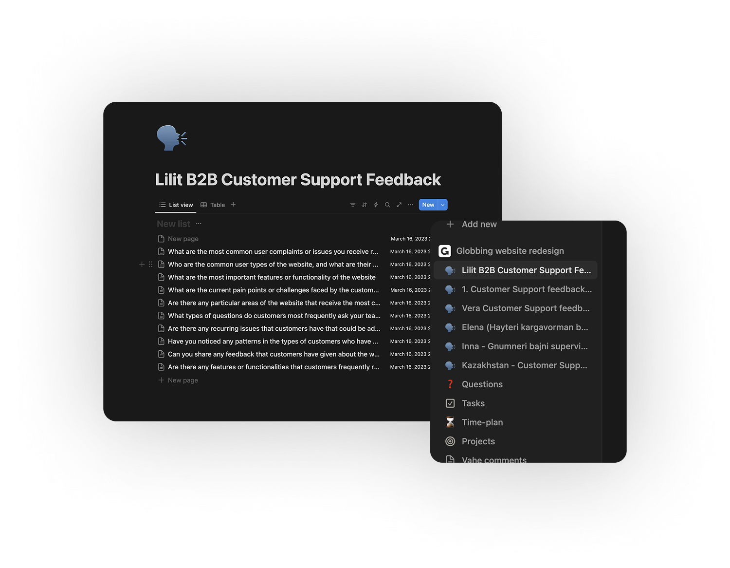
With customer support managers, who are the front line for user complaints.
Internal surveys and strategy sessions
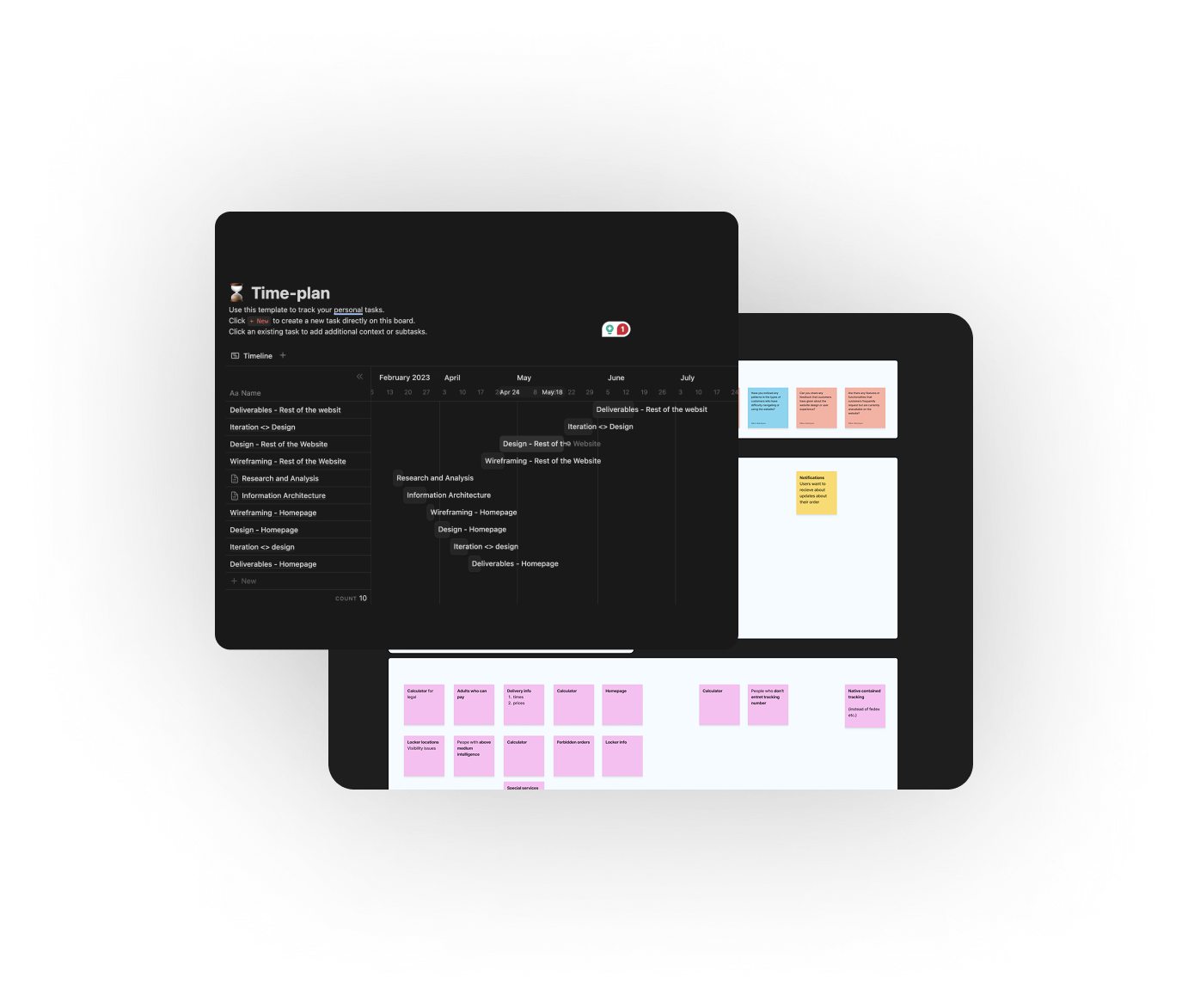
With business, product, and data teams.

Competitor and market reviews
To analyze best practices in cross-border shopping and logistics apps.
Key insights and findings
New users
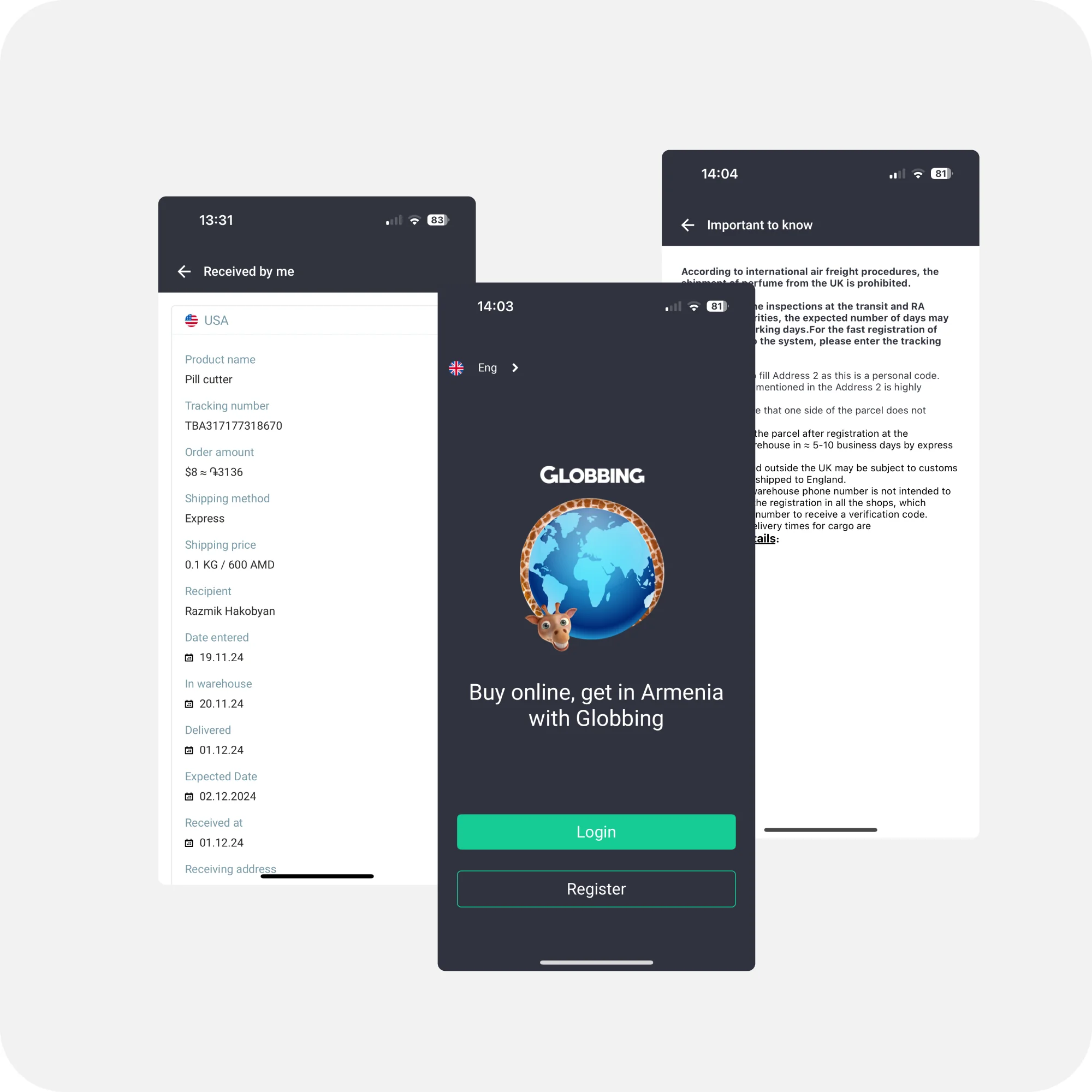
Consistently struggled with registration, tracking, and understanding logistics terms and long descriptions.
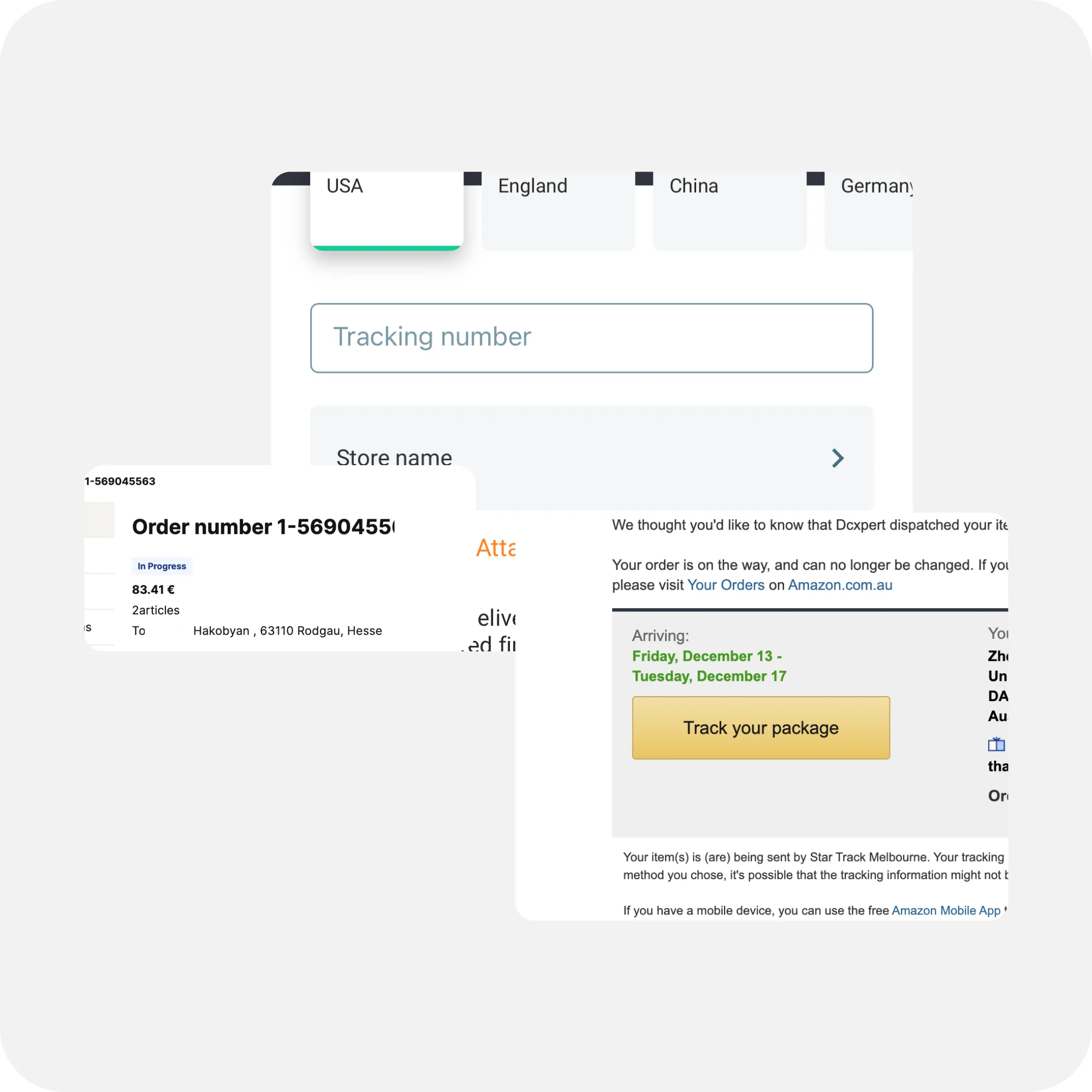
Tracking numbers
Were often confused with order numbers, especially for foreign stores.
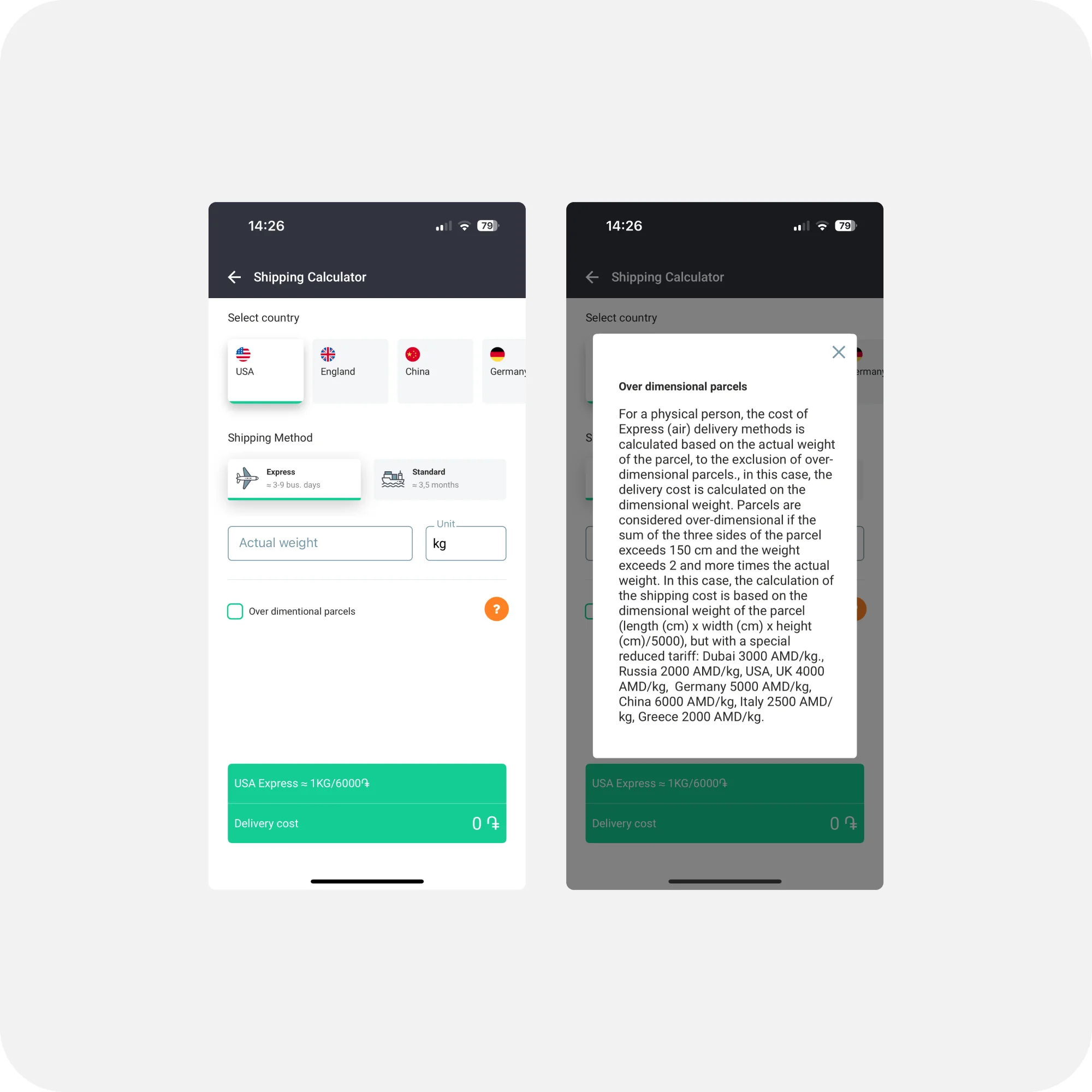
Calculator
For pricing and dimensions had both usability and visibility issues.
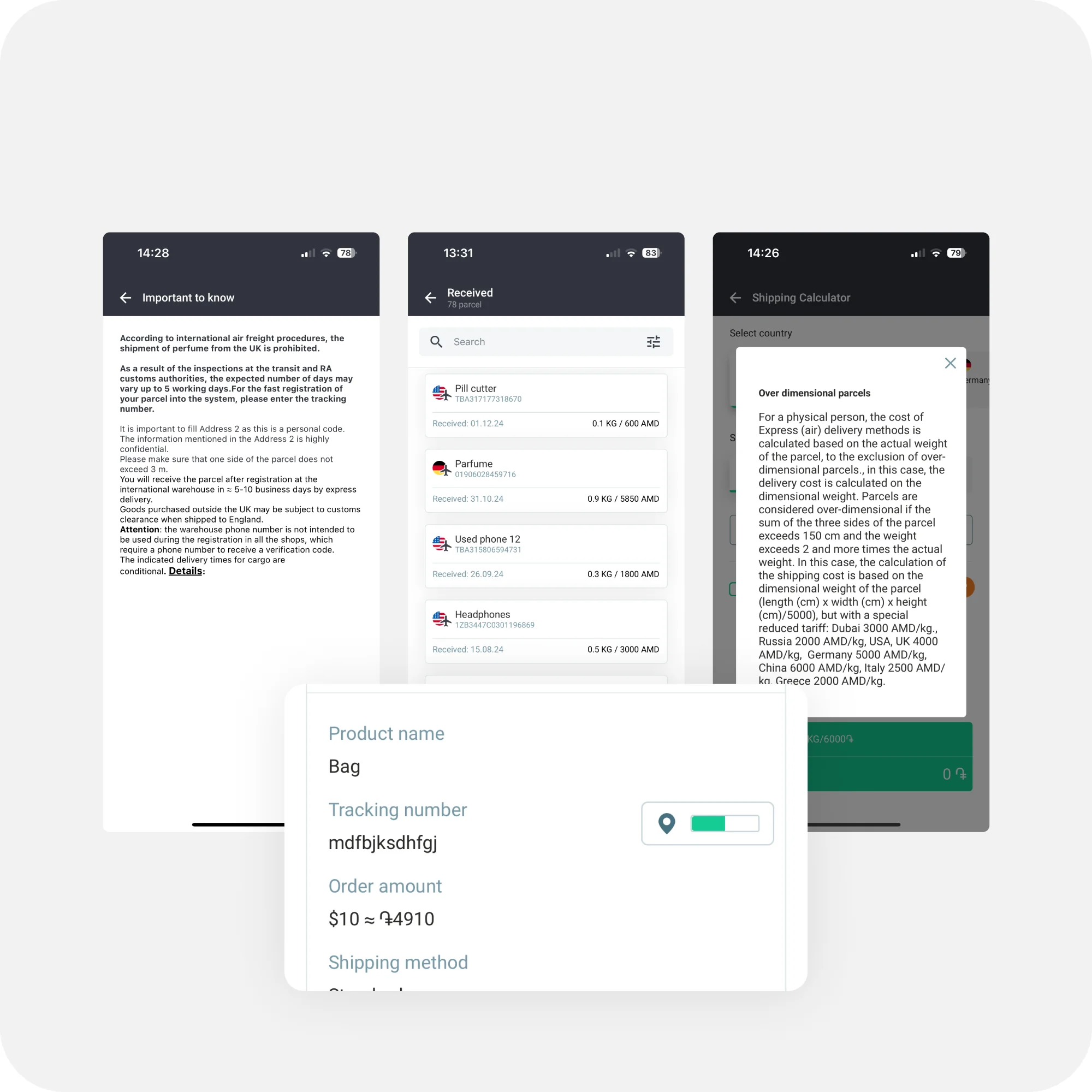
Clarity
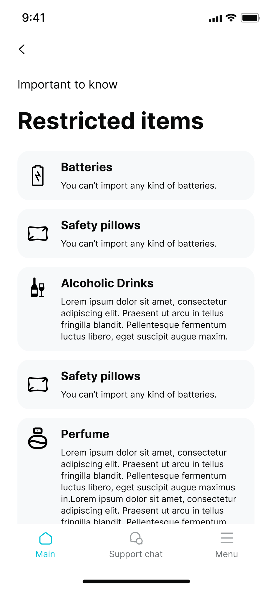
Customers needed more clarity around forbidden items, order statuses, and estimated delivery times.
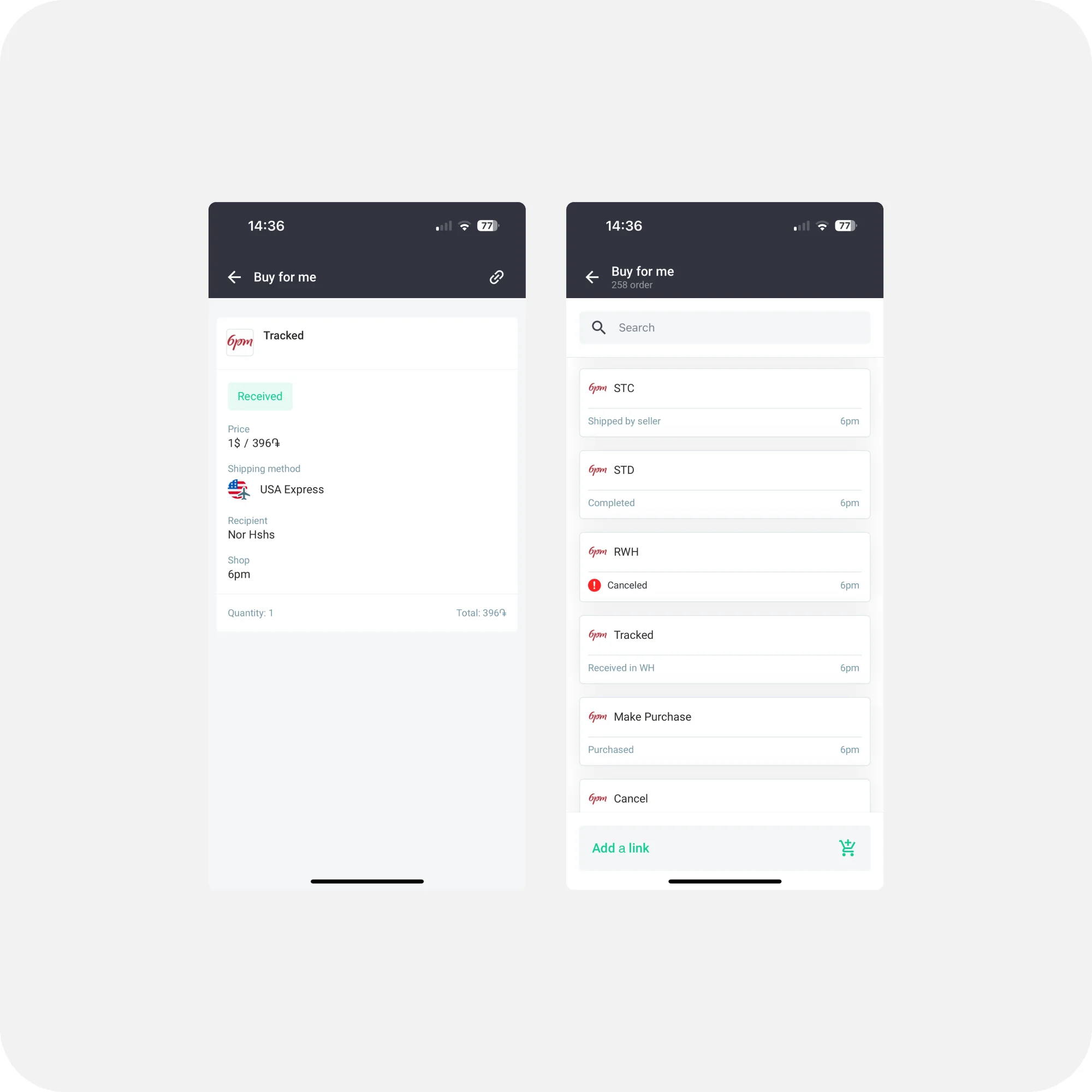
"Buy for Me" orders
Lacked proper tracking or customization options, and users were unsure how to use it.
B2B & power users
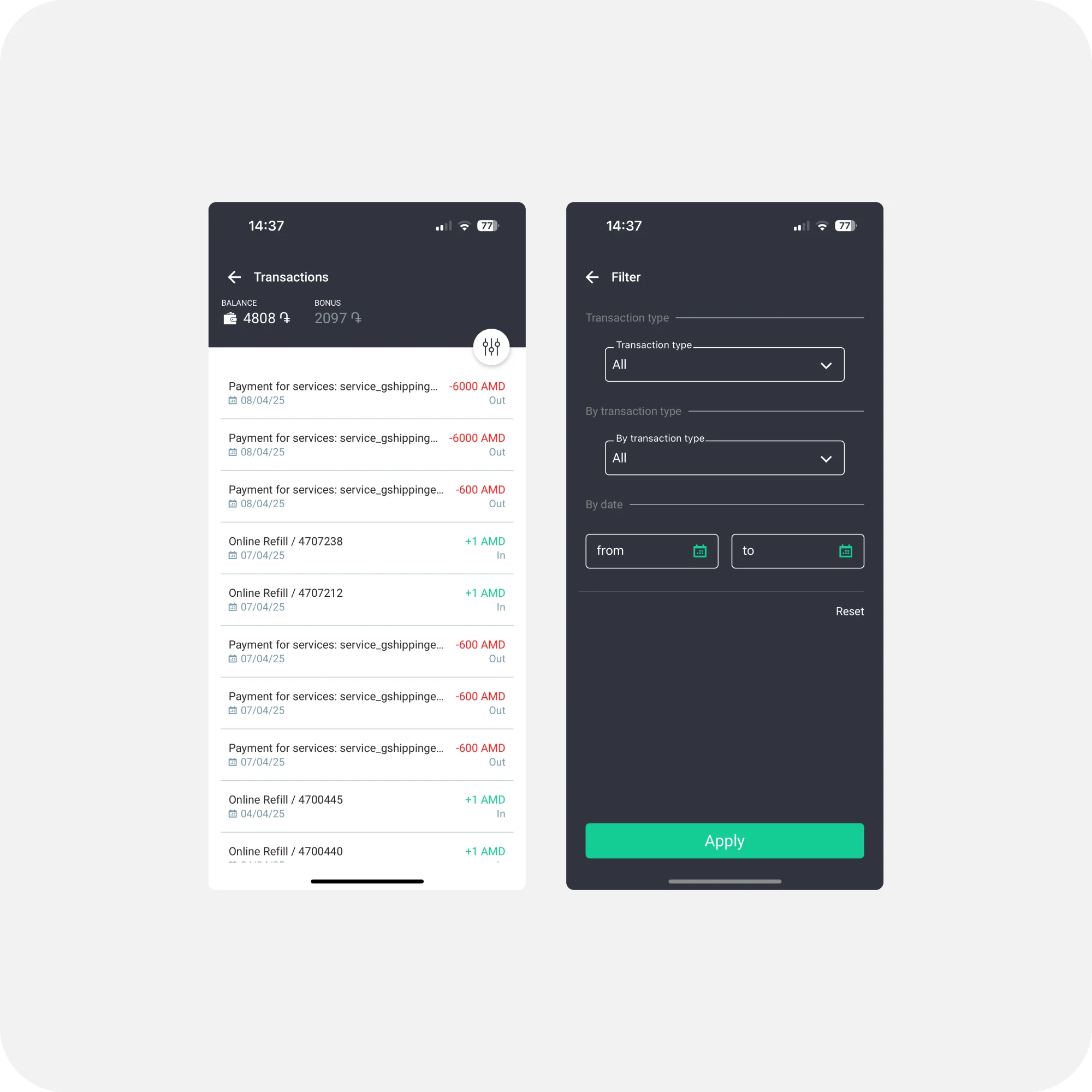
Requested features like data export, order filtering, and basic copy/paste functions.
Modular design library
To ensure consistency and scale, I developed a comprehensive mobile-first design system:
- Atomic components — buttons, forms, dropdowns, modals, status indicators
- Design tokens — for type, spacing and themes, supporting light and dark modes
- Clear documentation — and Figma variants for handoff
Key design decisions
Rearchitected navigation
A clearer information architecture so key tools and flows are easy to find.
Order page + status modals
Tappable status badges with contextual modals explain what a status means, what action is expected, and who is responsible — user, Globbing, or customs. Orders are grouped by progress with clear labels and visuals.
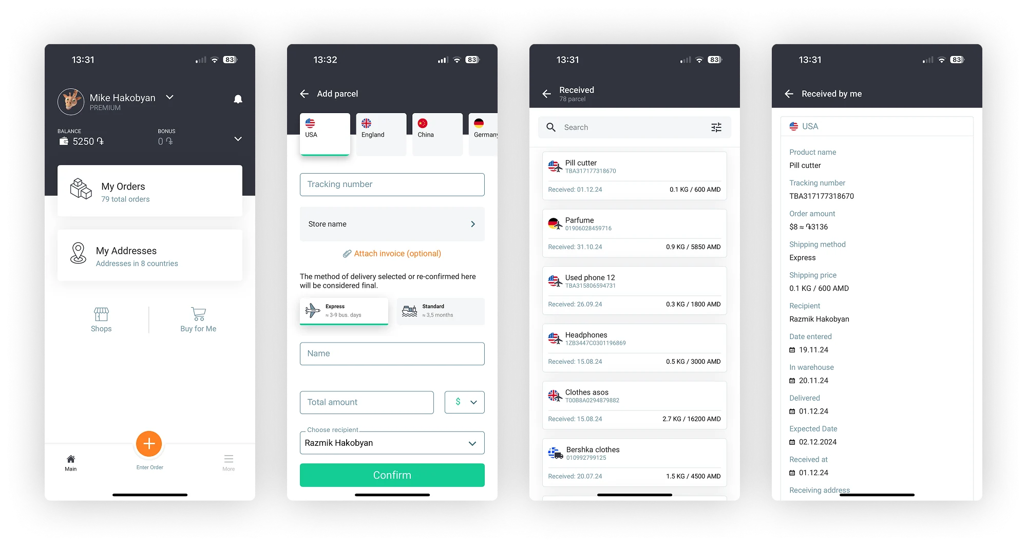
Simplified "Add Parcel" flow
Fewer steps and clearer fields for the most-used action in the app.
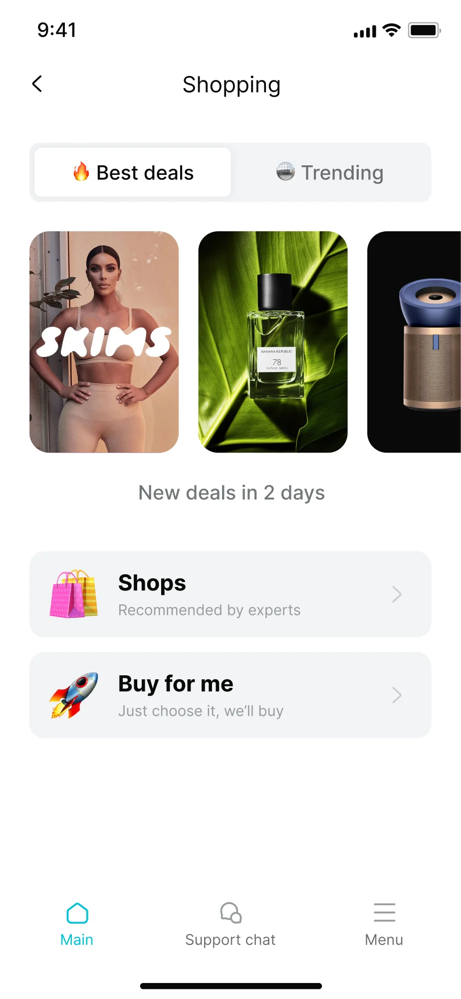
Revamped "Buy for Me" tool
A cleaner, more guided flow for a feature that previously confused users.
Smart, intuitive parcel tracking
A timeline interface with clear visual phases, differentiating local and international tracking, and flagging delays or customs holds with suggested actions.
Home delivery system
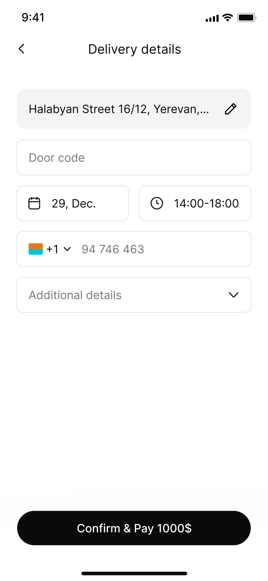
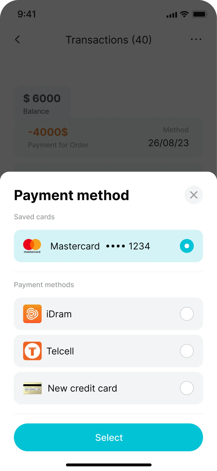
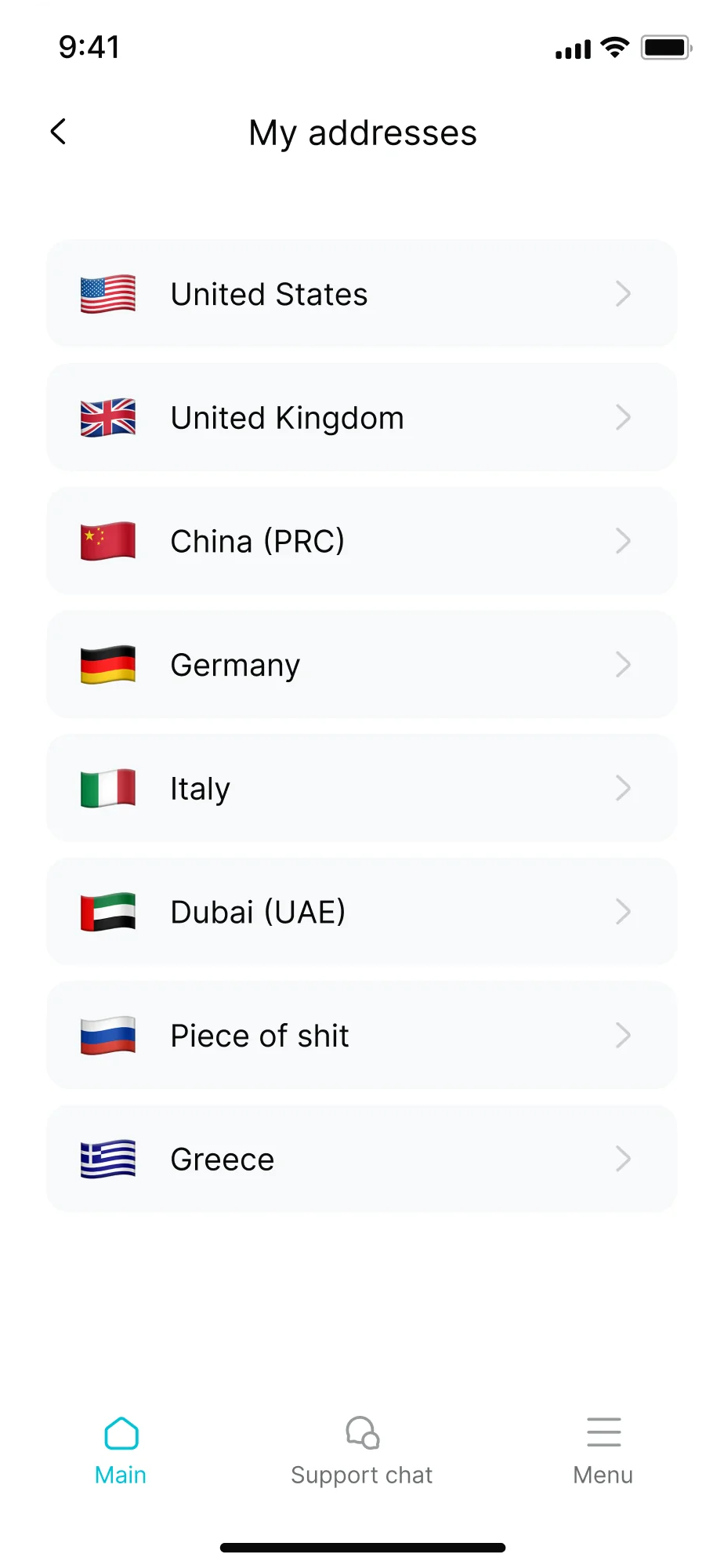
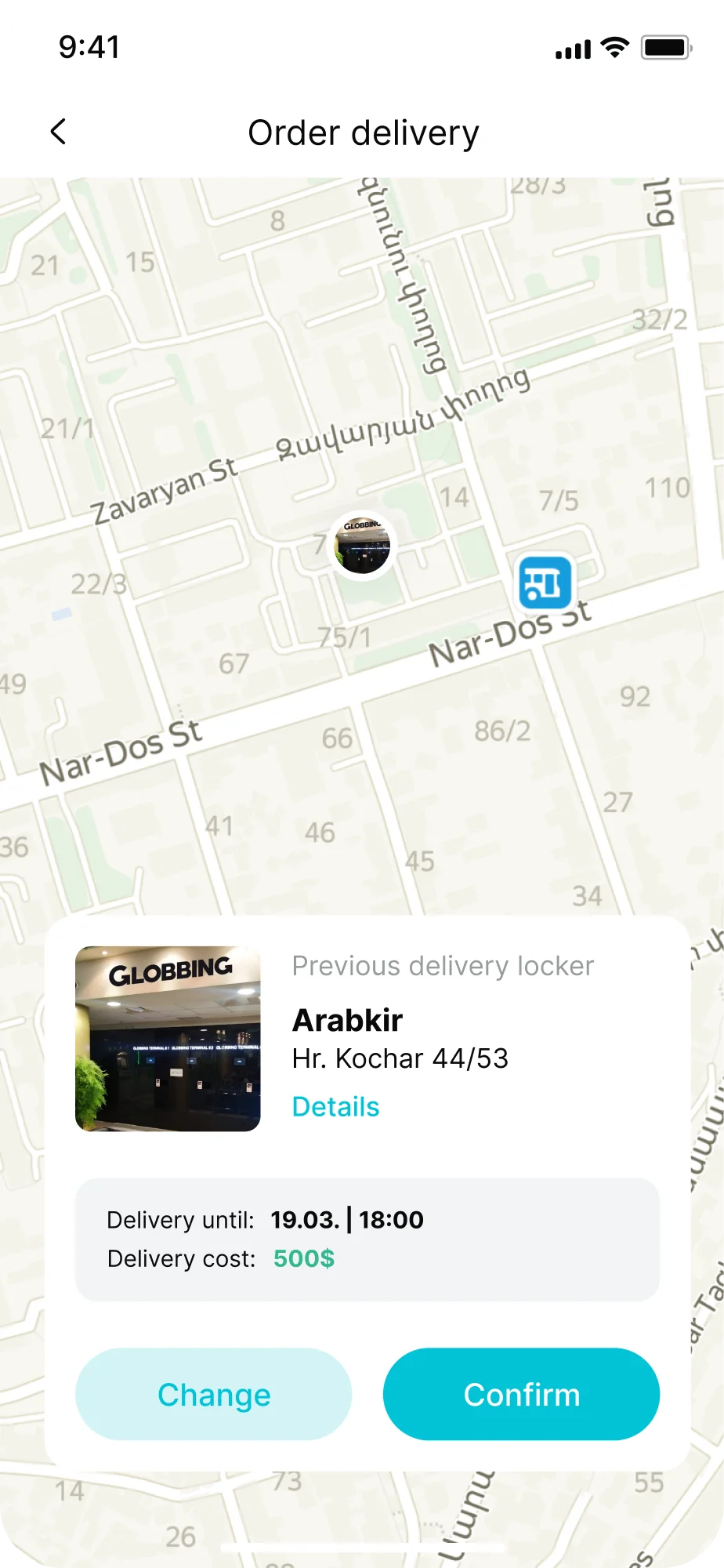
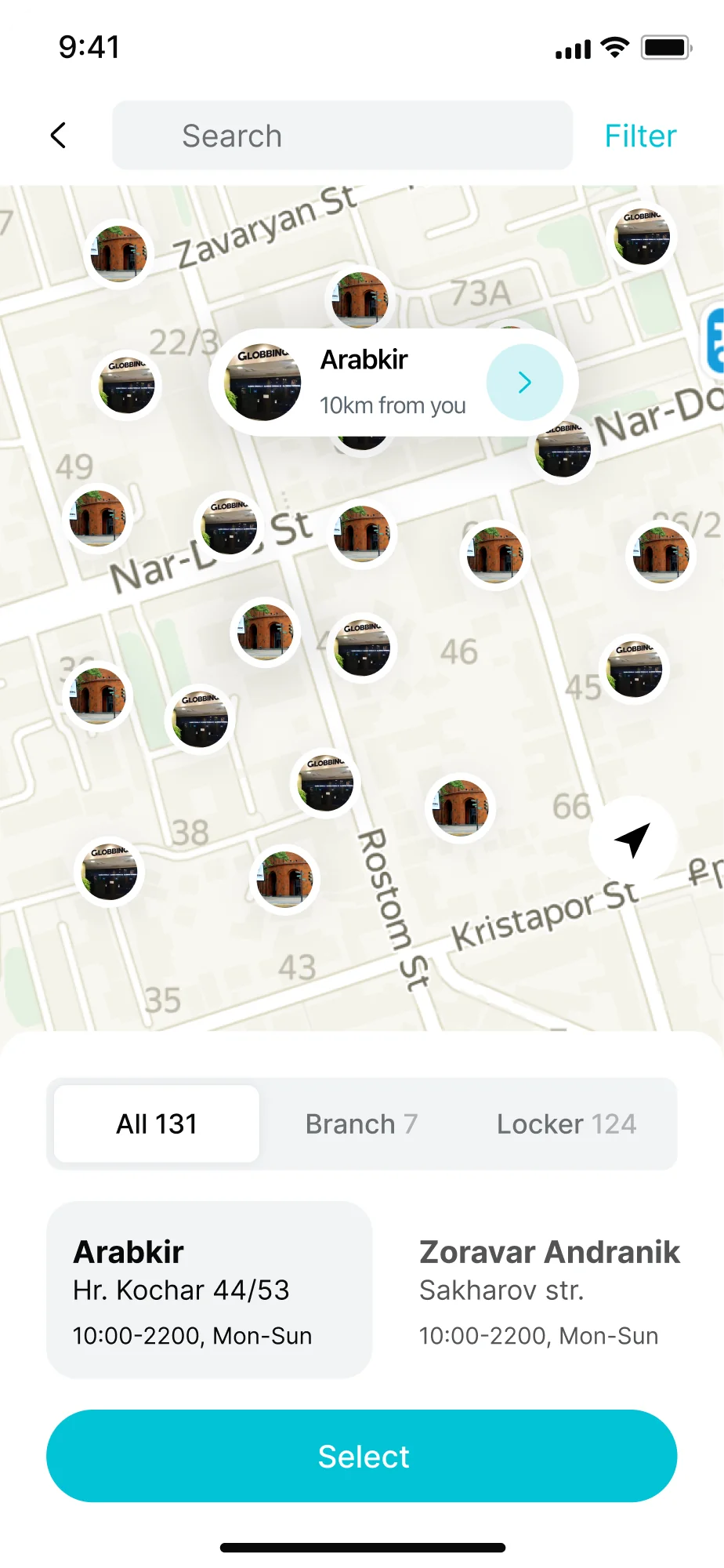
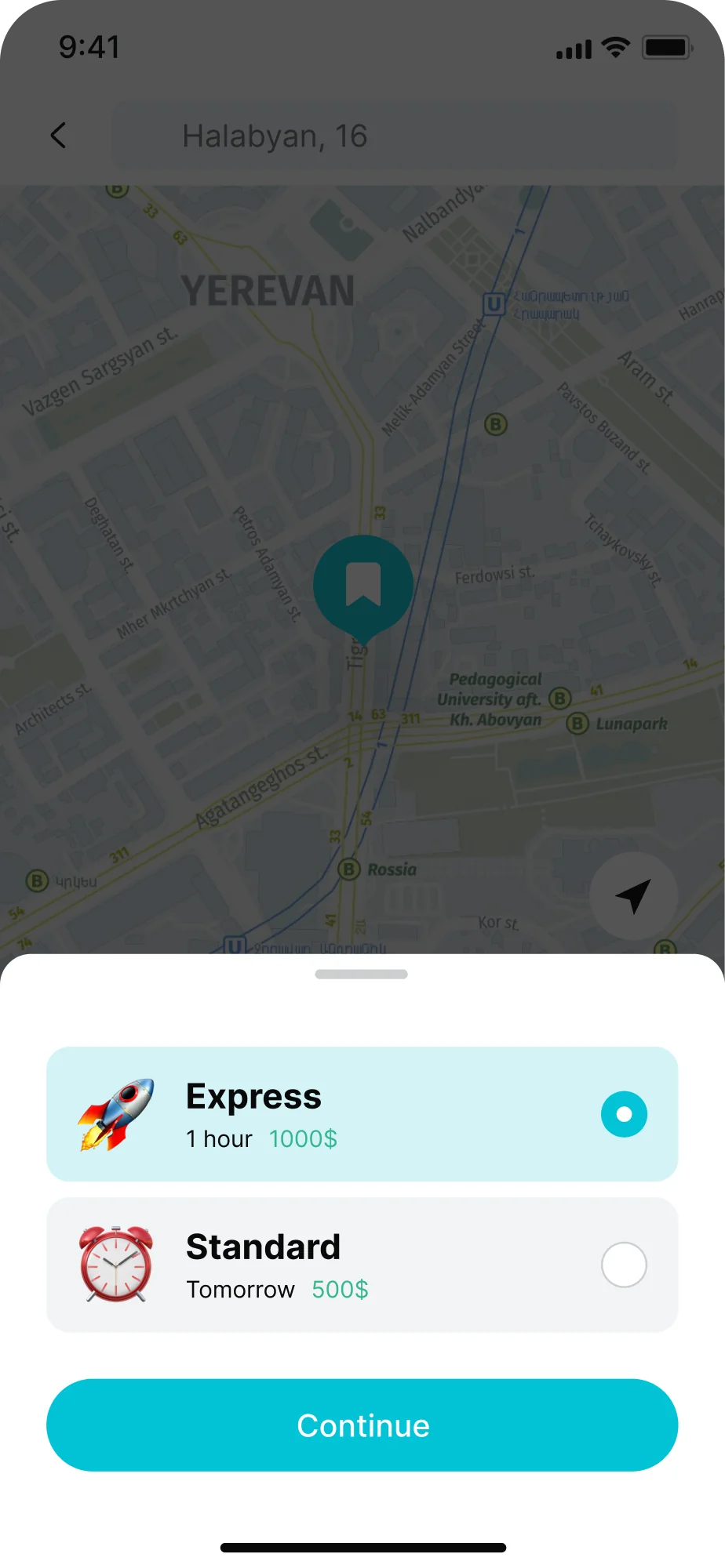
Editable addresses, time slots and save-for-later for home delivery; map-based locker pickup with capacity shown; and custom error handling for known delays.
Redesigned shipping calculator
Available across multiple entry points, with a mobile-first layout, dynamic feedback and built-in explainer functions.