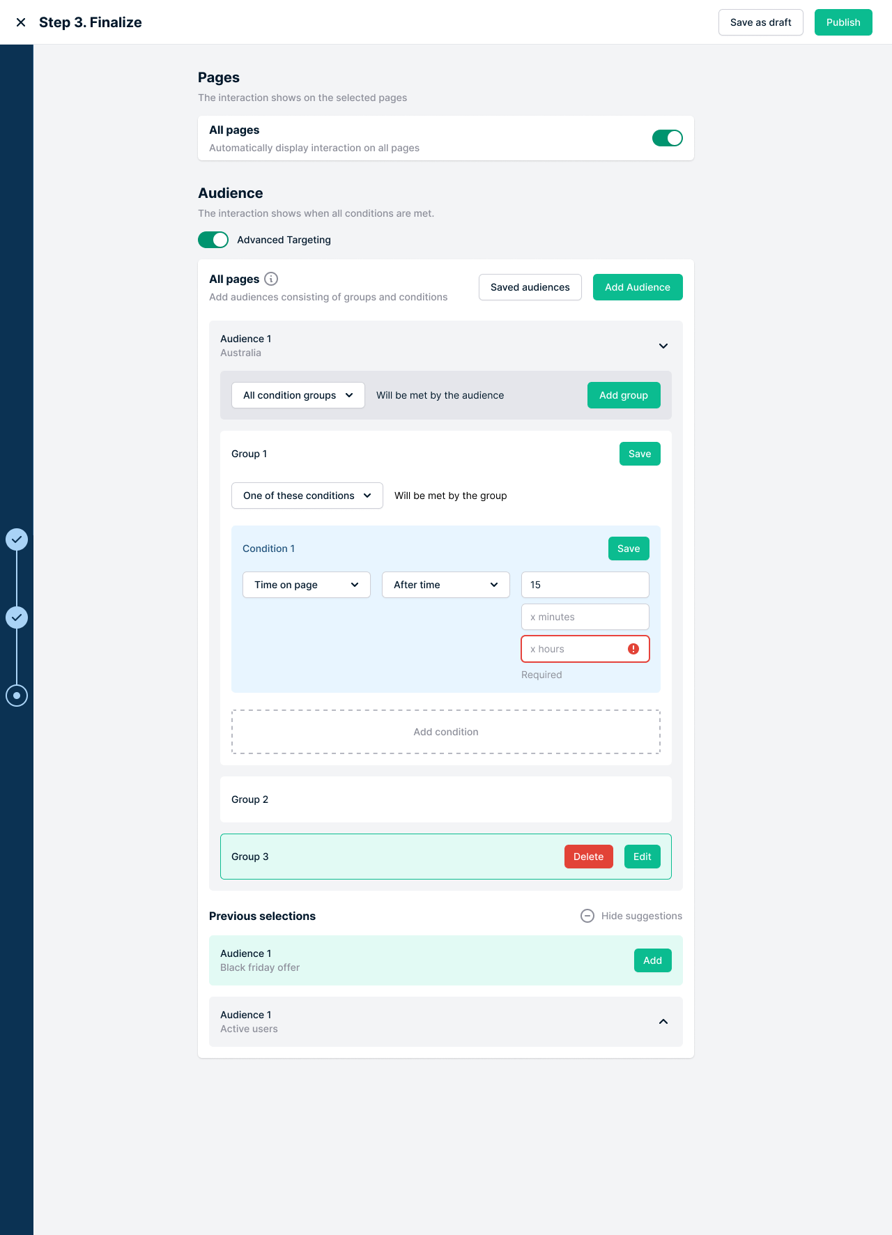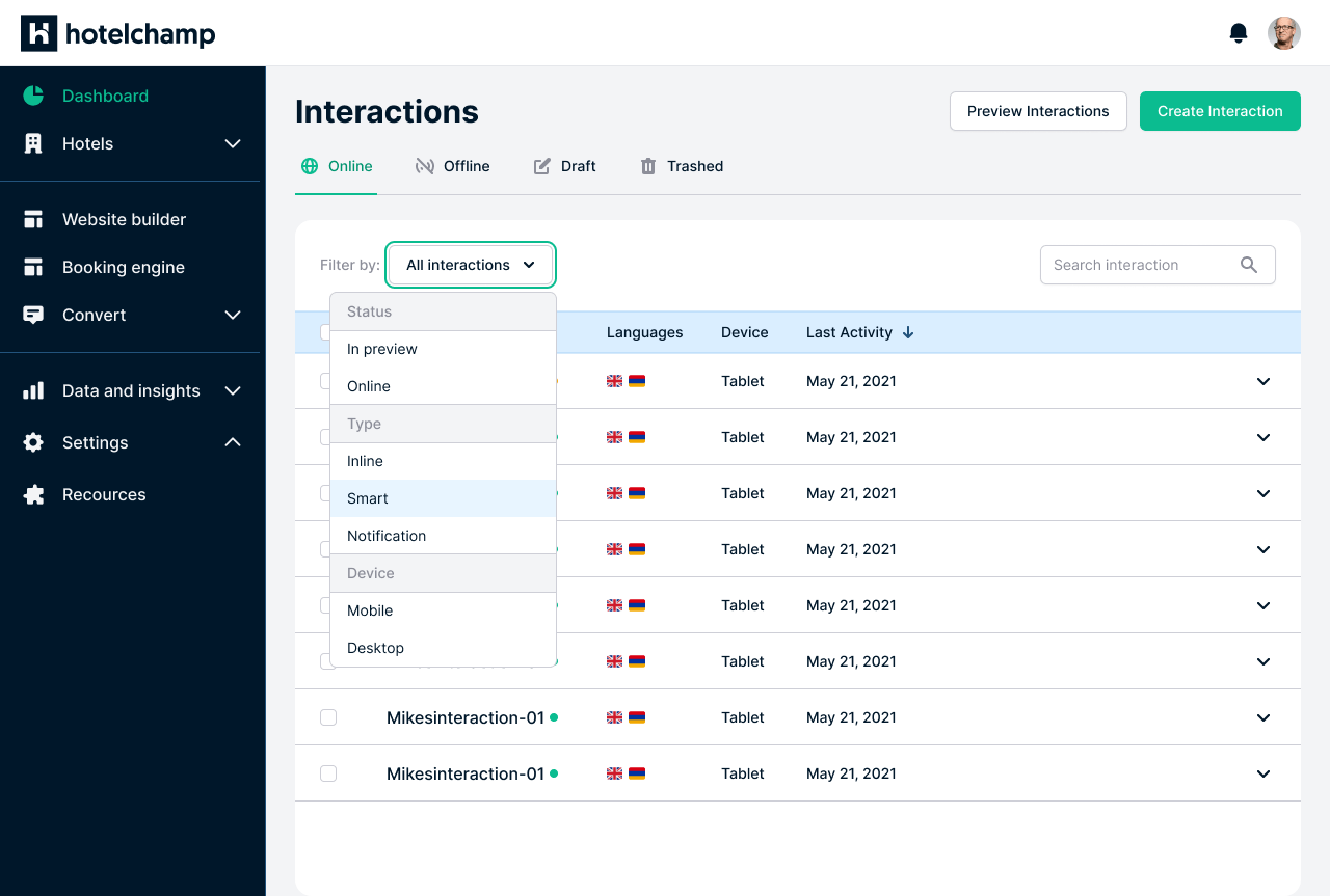
My role
Research, wireframing, prototyping, UI design, unification, and design system creation.
Results
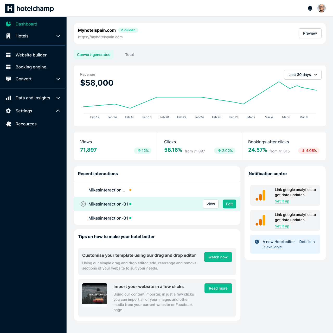
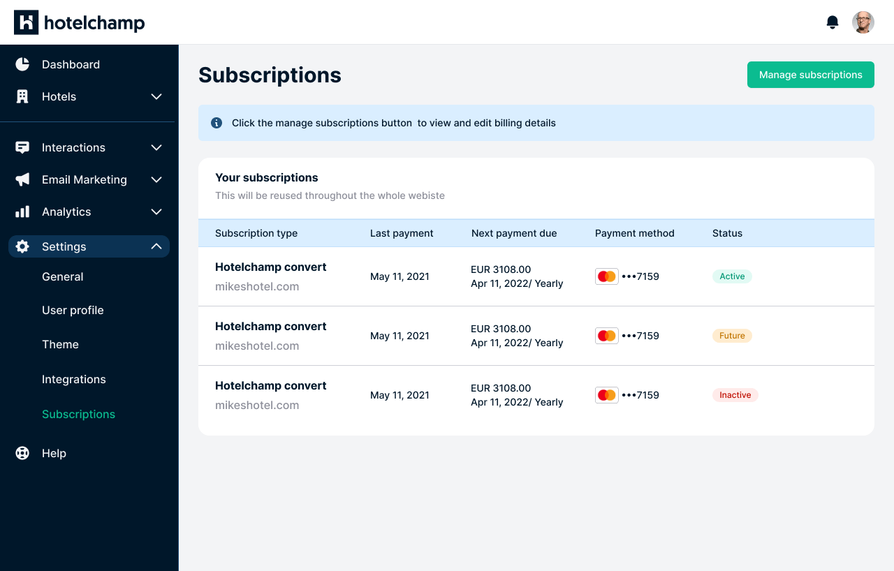
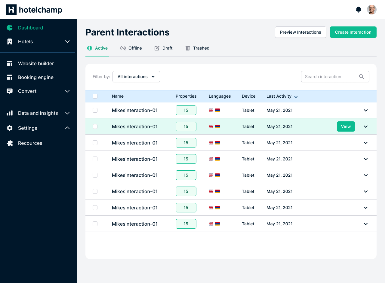
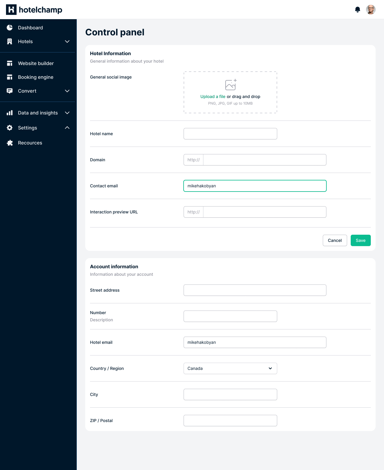
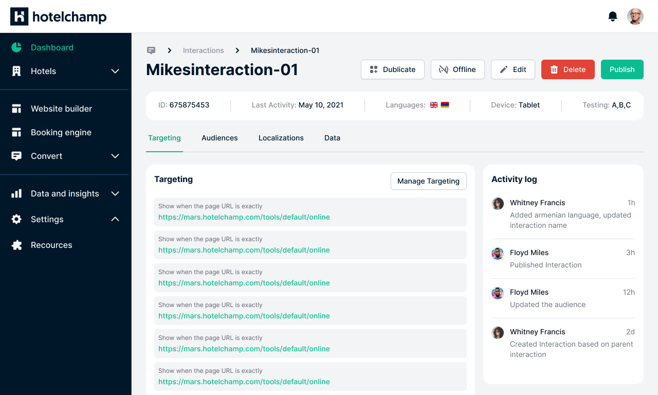
Increased usability of the web-based platform, and reduced reliance on manual customer support through a more intuitive, human-centered design.
Why redesign?
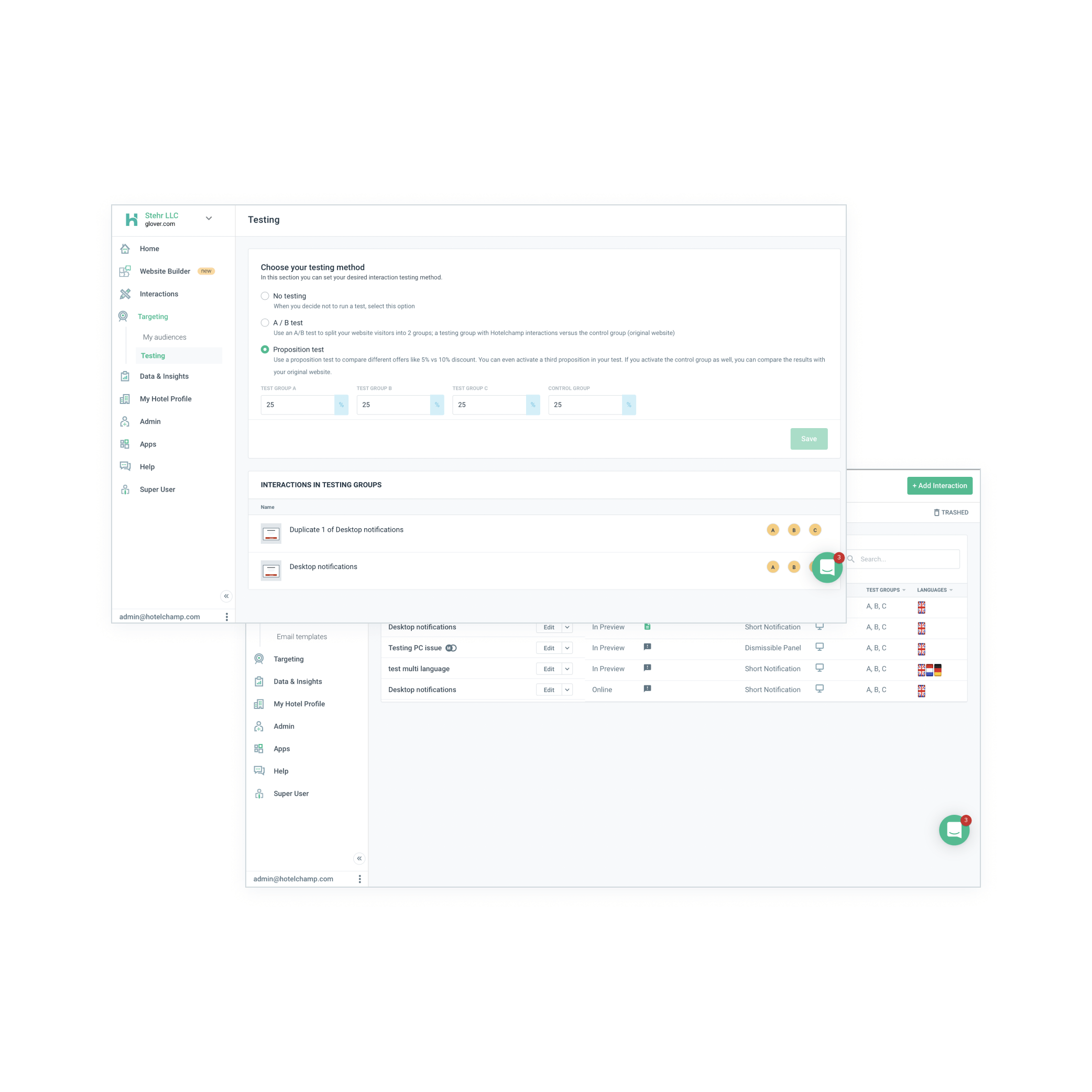
The primary goal of this redesign was to enhance the platform's usability and aesthetics in a cost-effective manner.
Pain points
- Undefined feature scope — lack of clarity on what features hoteliers should have access to and how much customization they need
- Unintuitive navigation & onboarding — users struggled to find key functionality due to poor information architecture
- Low usability — visual design, structure, accessibility and user-control inconsistencies created a frustrating experience
Goals
- Identify and resolve usability issues in the Hotelchamp platform
- Create and validate improved design solutions
- Enhance aesthetics and streamline user flows
- Improve responsiveness across devices
- Establish a cohesive design system based on a defined CSS framework
Defining the problems
Heuristic evaluation
Assessed the platform's UX with a three-level severity scale — critical, serious and mild — using Jakob Nielsen's 10 usability heuristics as a benchmark to pinpoint design challenges.
Element evaluation
An early-stage UX review capturing highlights (elements that worked well and needed minimal changes) and lowlights (areas needing rethinking, research and redesign).
User navigation
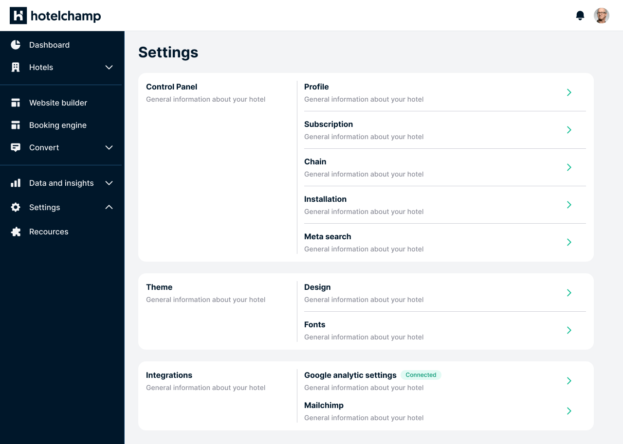
To gain a user's perspective, I explored the product as an end user, mapping out the navigation flow and identifying areas for improvement — including a full revision of the website's main menu, optimized for usability and discoverability.
Wireframing
Sketching
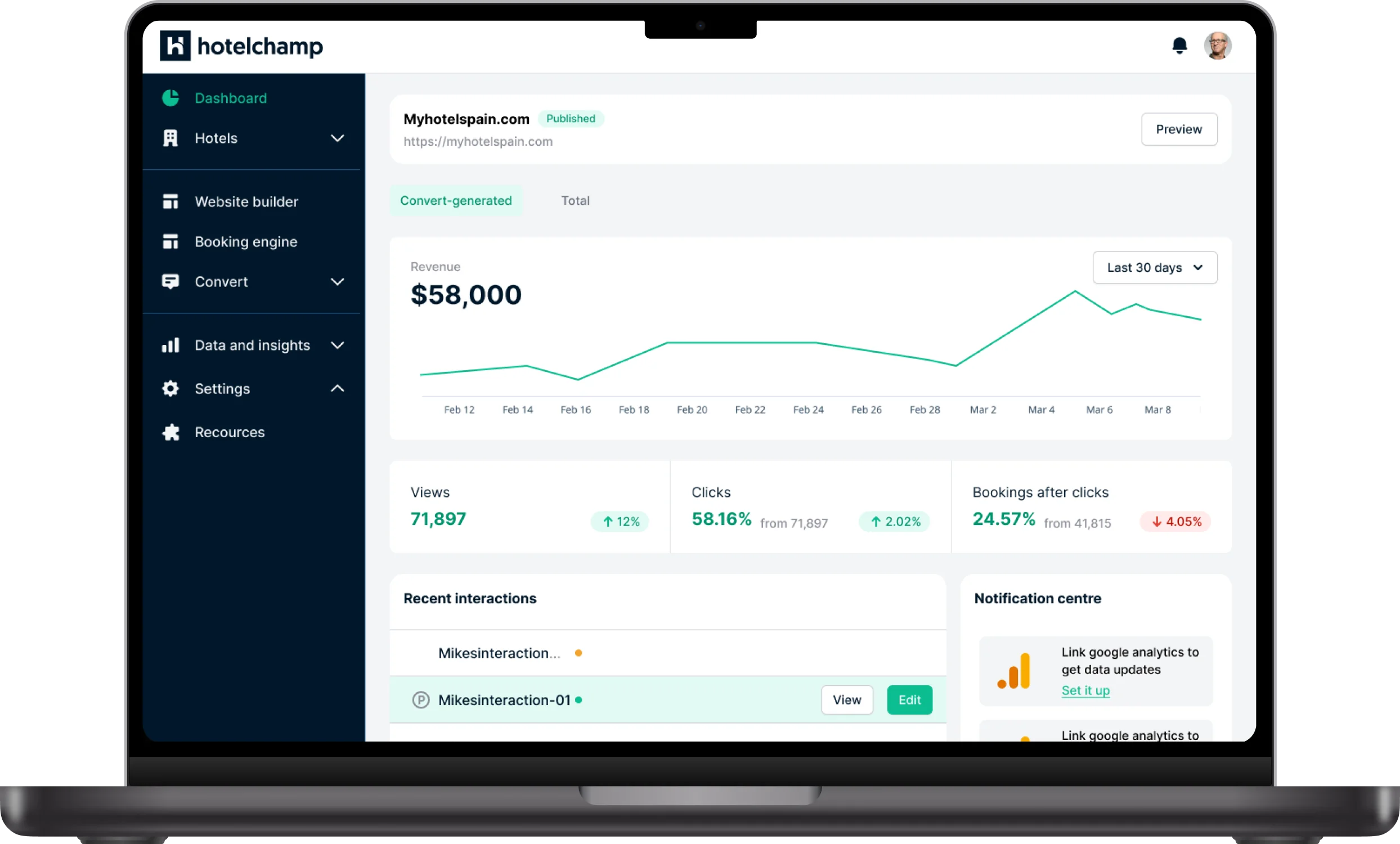
Over 30 pages of rapid sketches exploring different user flows. The final selection for the dashboard prioritized clarity, surfacing key actions like editing the website, recent interactions, and revenue insights for a selected time period.
Low-fidelity wireframes
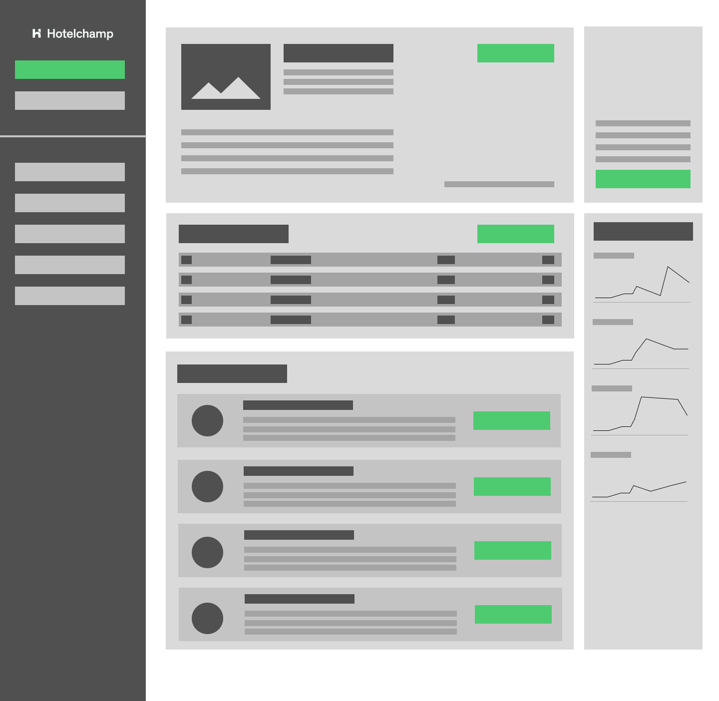
Structural wireframes were reviewed by long-term product users and the product and development teams together, so all stakeholders had early input and could challenge decisions where needed.
High-fidelity wireframes
Once wireframes were validated, I moved on to designing a cohesive system that would streamline the next phase.
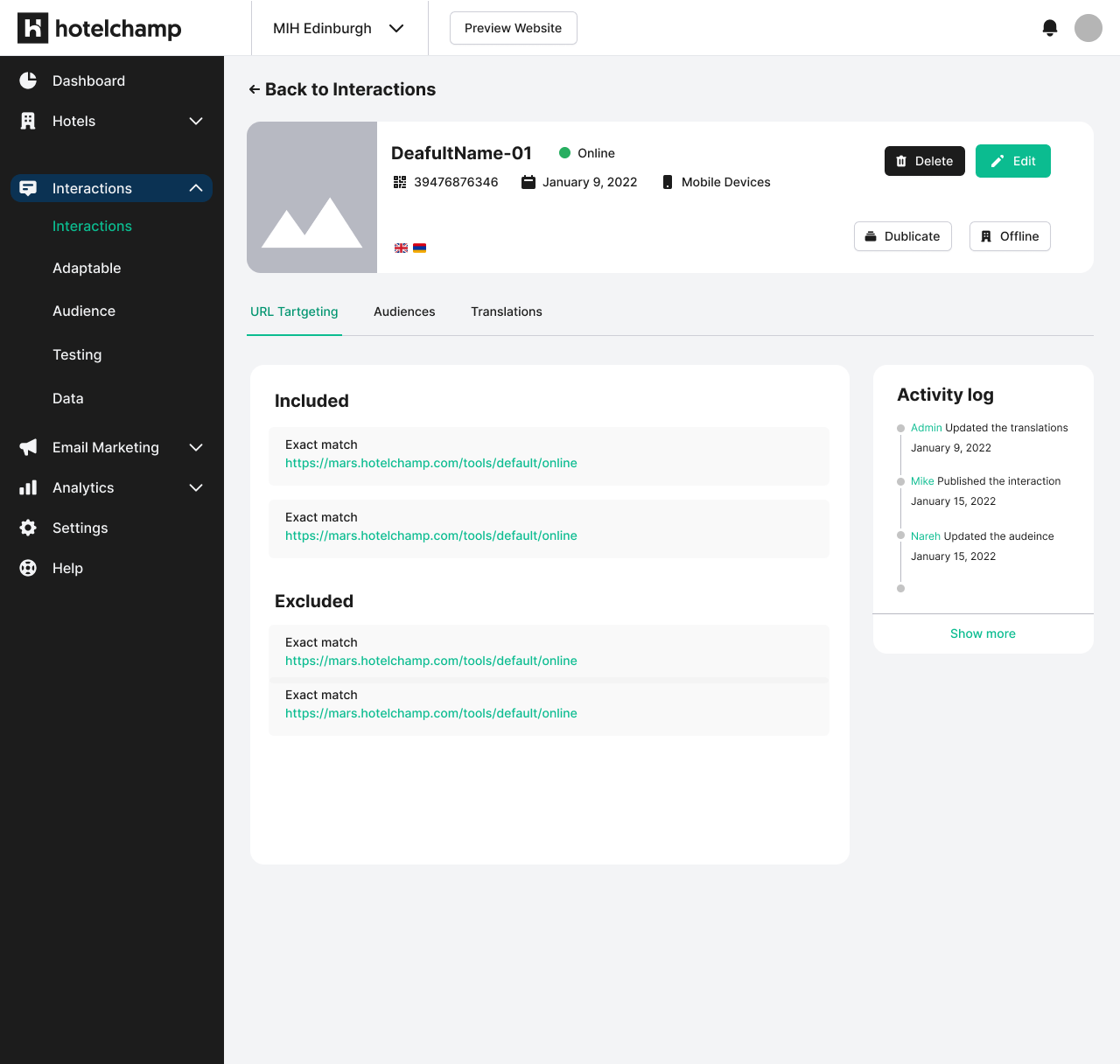
Design systems
The system consisted of two core elements:
1. Foundations
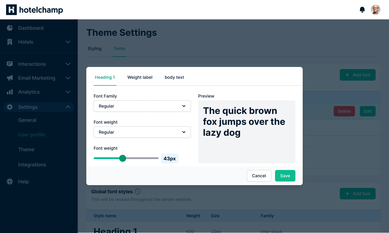
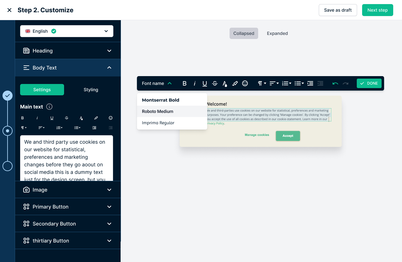
The fundamental design tokens that ensure consistency across the platform — color palette, typography, and effects like shadows and blurs.
2. Components
Ready-to-use functional elements built on the foundations, serving as building blocks for templates — buttons, dropdowns, badges and more.