Overview
Sololearn teaches millions of people to code. I worked on the two moments that matter most on the web: the homepage, where a visitor decides whether to sign up, and the learning experience, where they decide whether to keep going.
For the homepage I started from data: survey responses, personas and heatmaps. For the learning experience I started from the screen: the old version was the phone app stretched to desktop.
The result is one journey that feels made for its audience: a homepage built around who actually visits, and learning that makes the most of a big screen.
How it was before
One message for everyone
Students, career changers, hobbyists and business people all saw the same generic homepage pitch.
Lost below the fold
Important content sat where few visitors ever scrolled.
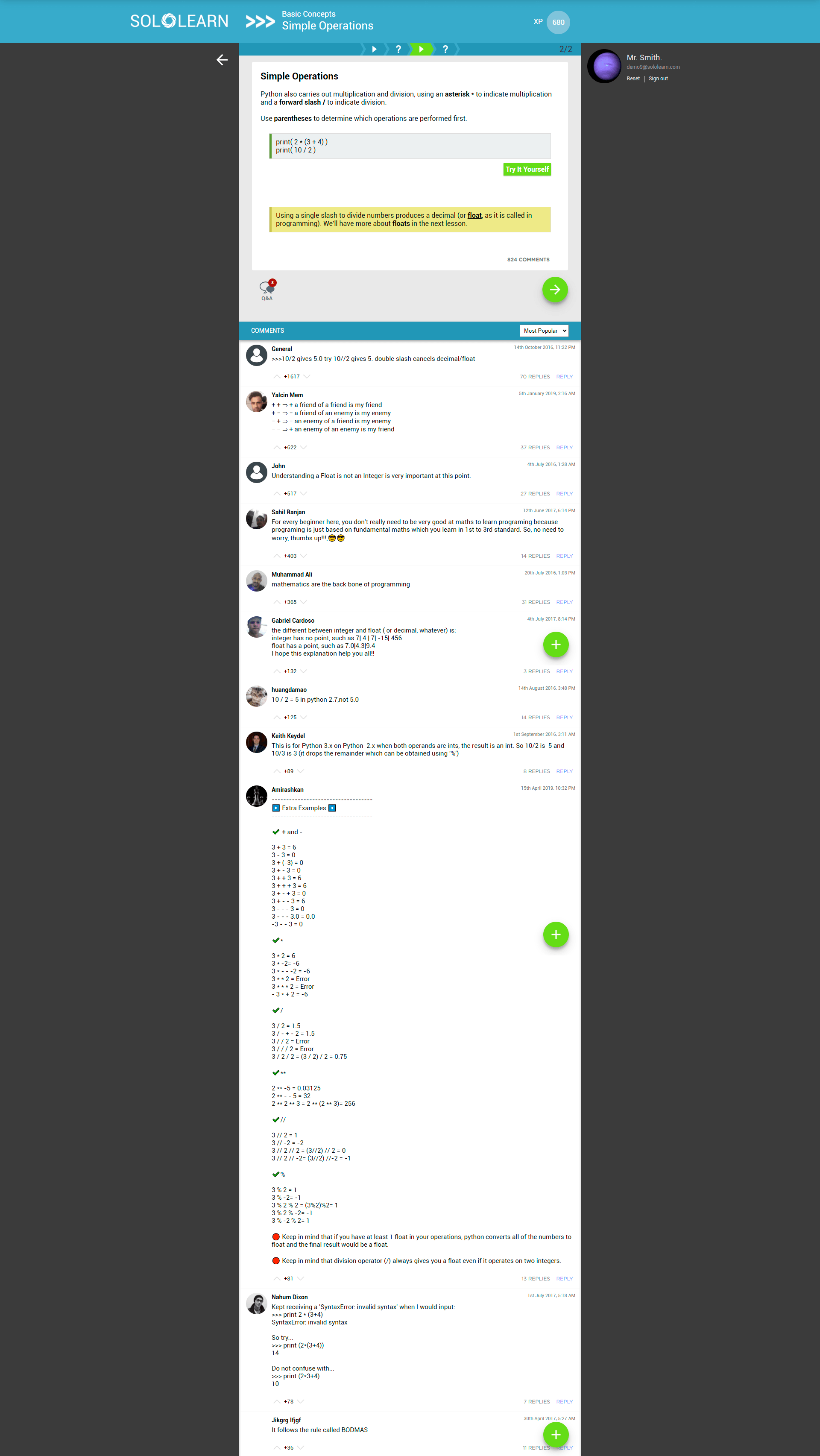
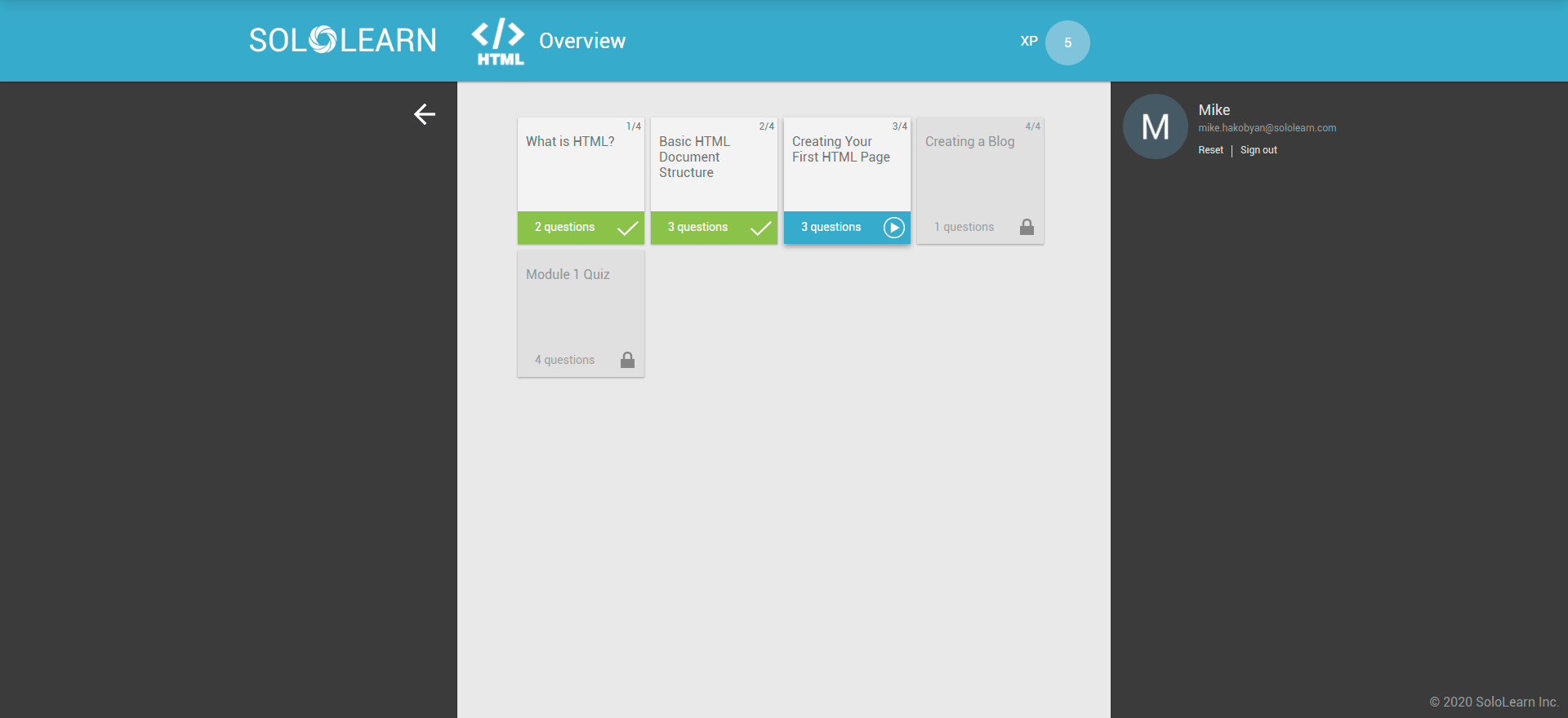
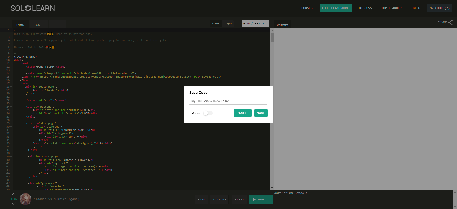
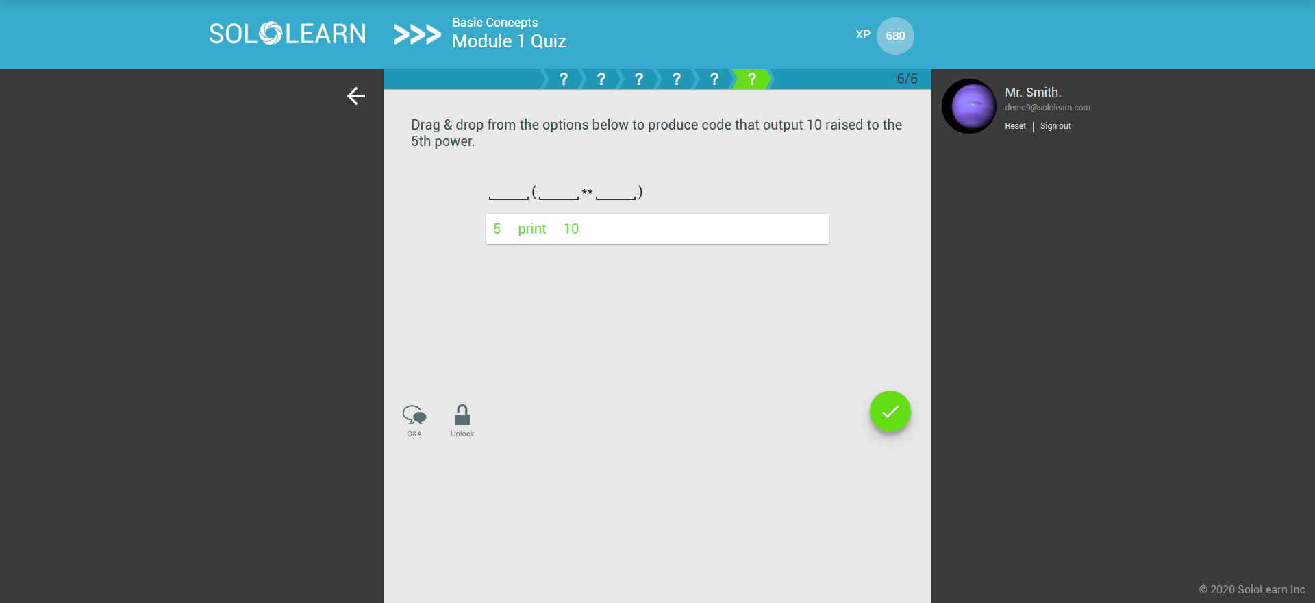
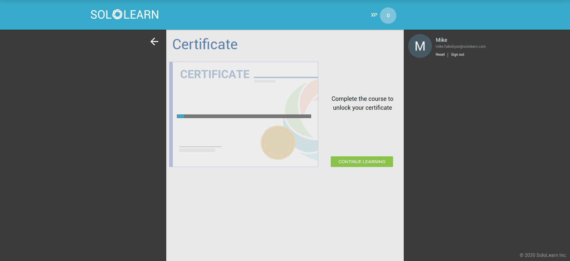
A phone app on a big screen
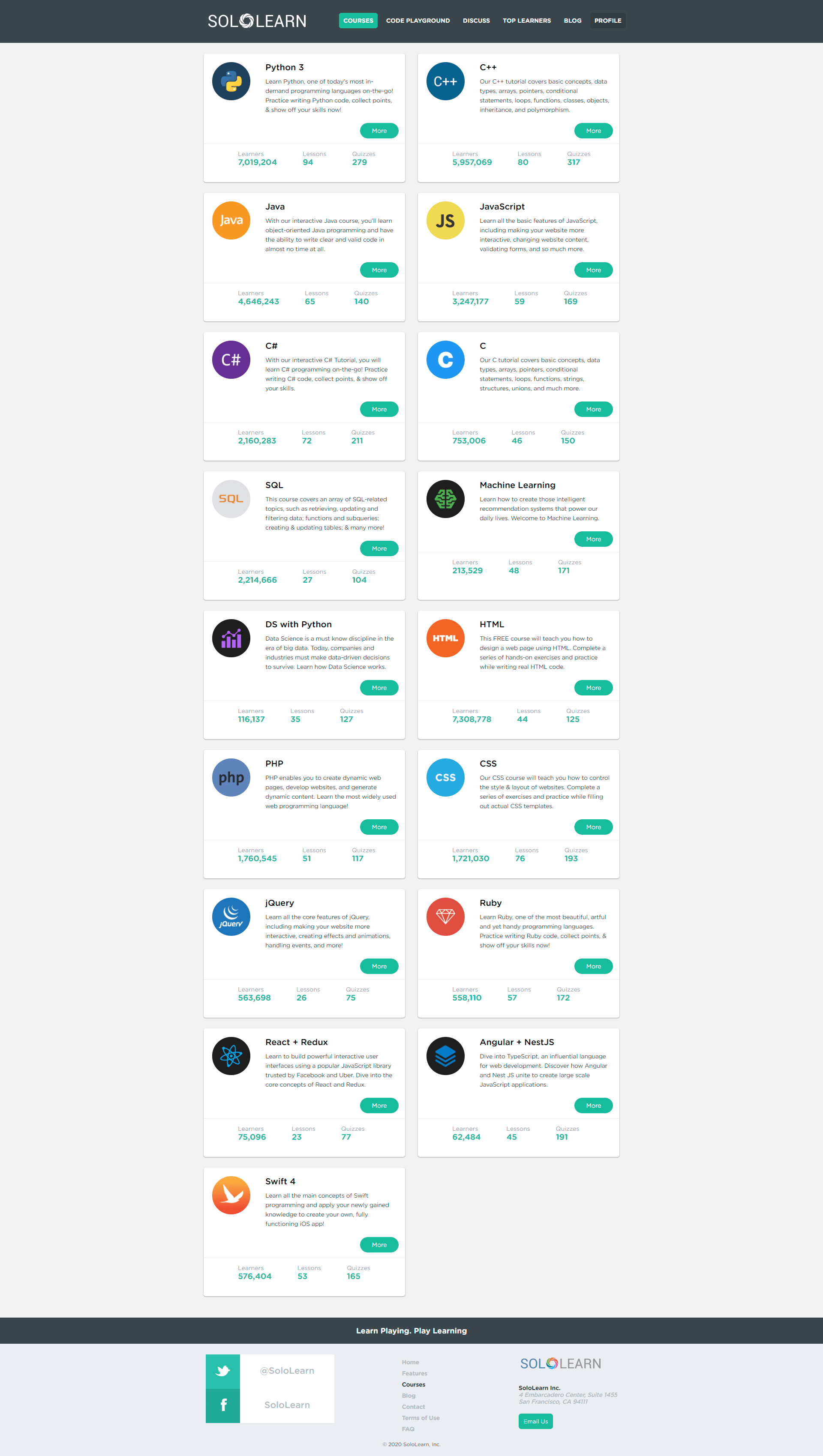
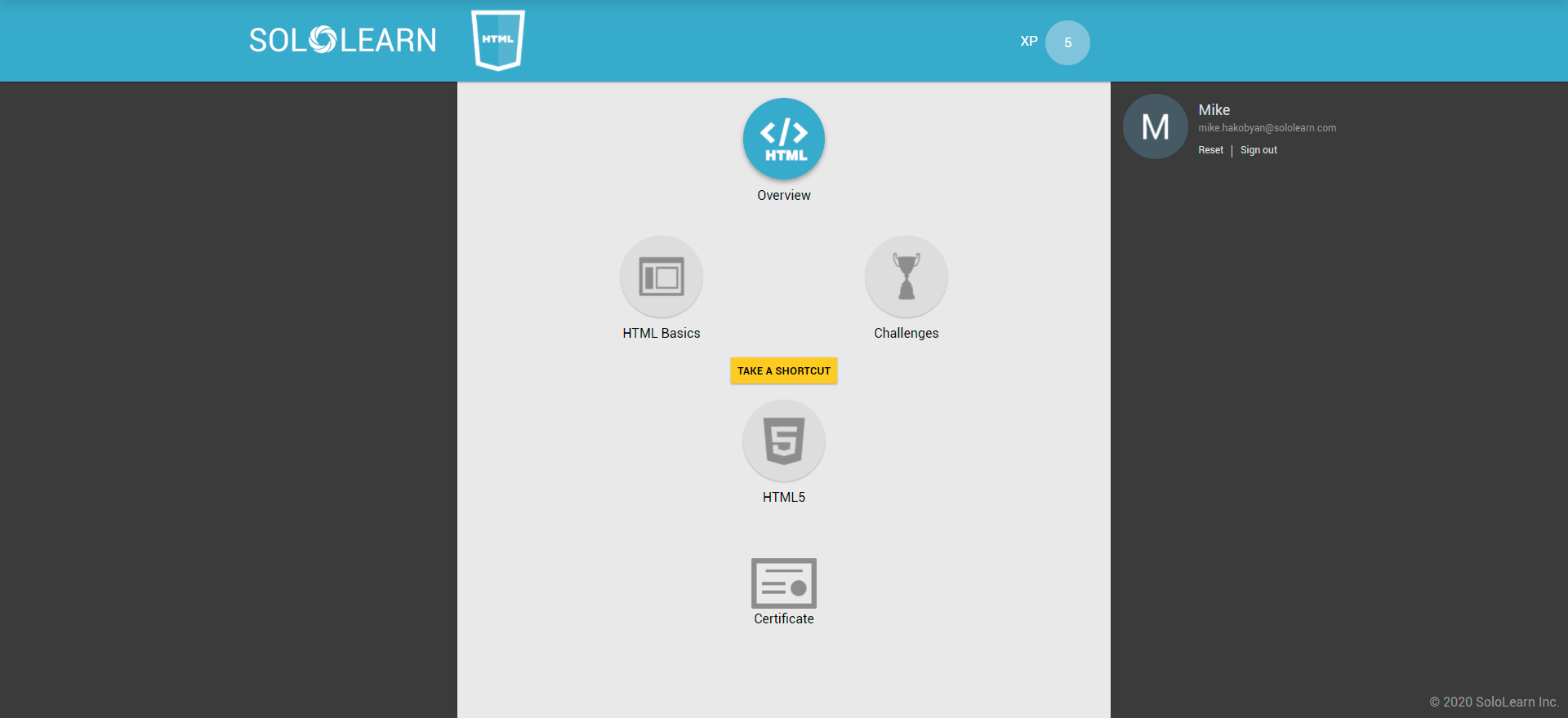
The web learning experience was the mobile app stretched to desktop, with only minor tweaks.
Hard to find your way
Once inside, people struggled to navigate and find the content they needed.
How I approached it
- 1
Understand
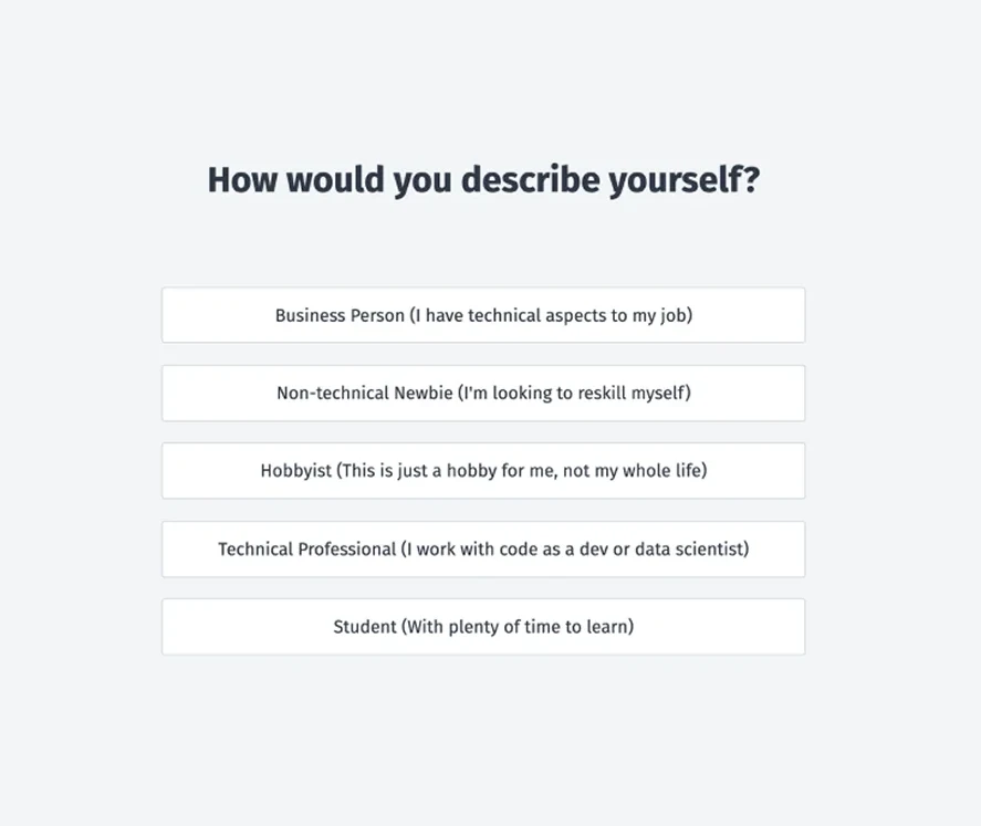
33,162 onboarding survey responses turned into clear user types and five personas.
- 2
Prioritise
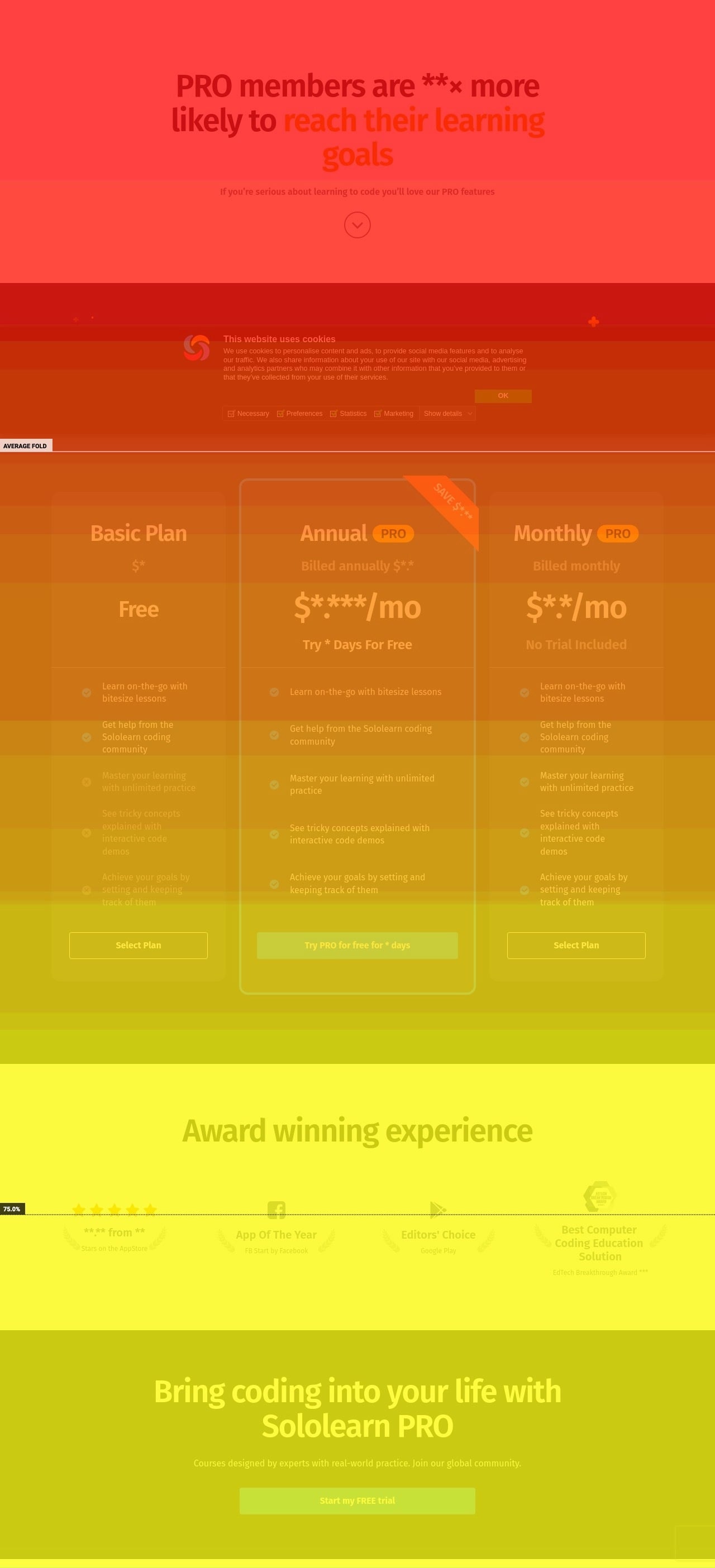
A scroll heatmap and a persona × value-proposition map decided what goes where.
- 3
Redesign
A new homepage, then a learning experience designed for desktop first, not ported from mobile.
A homepage for every kind of learner
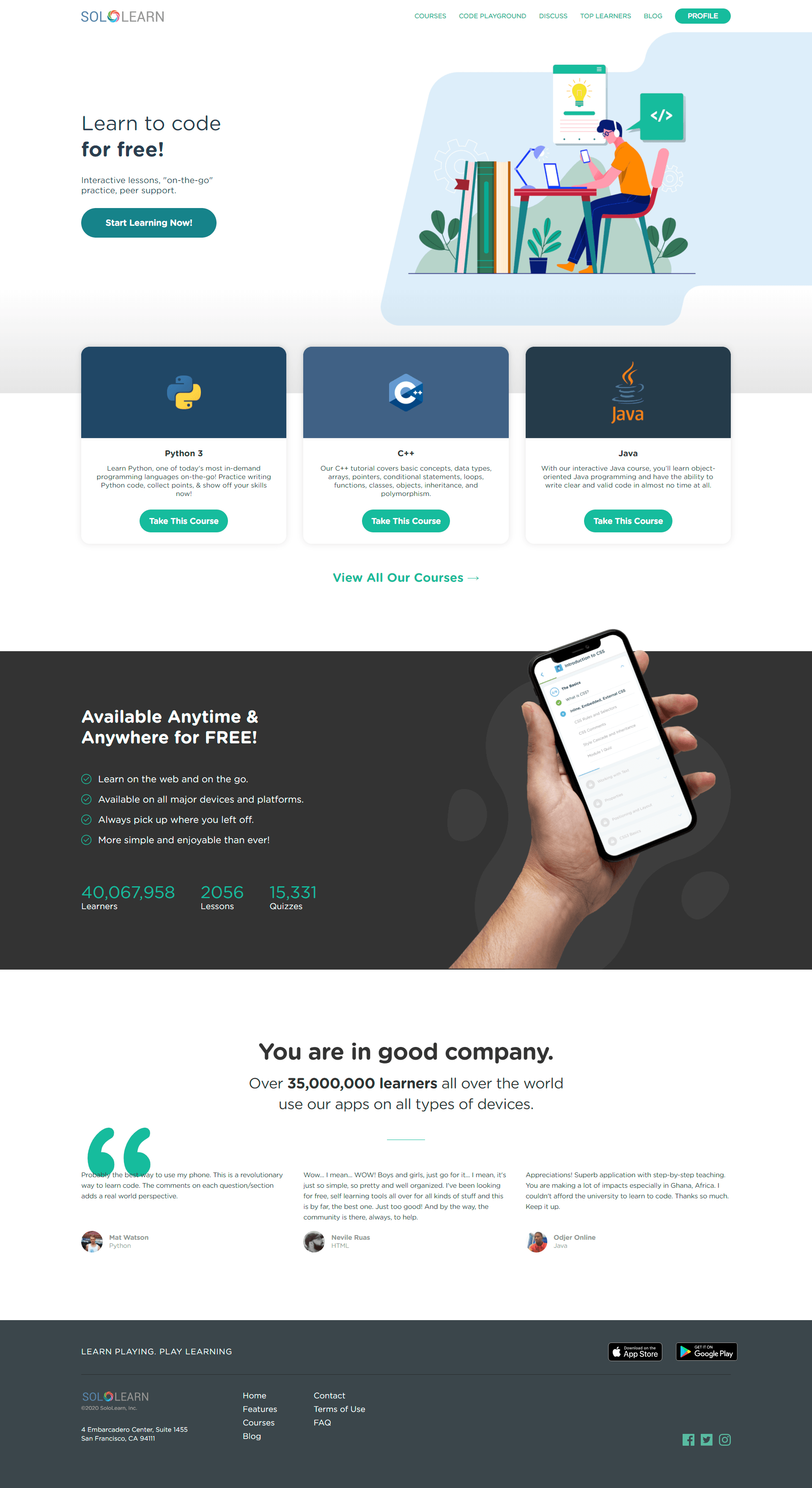
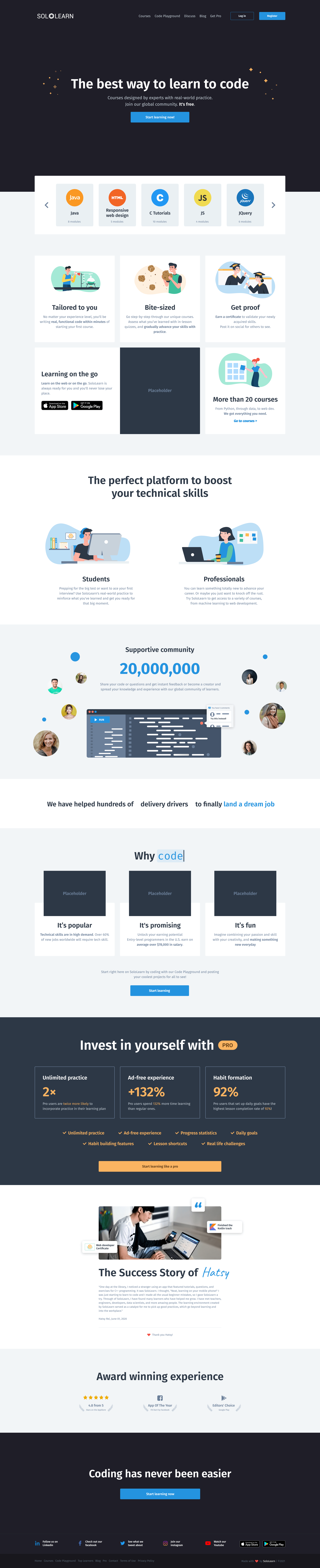
The homepage had seconds to show visitors they were in the right place. Instead of one pitch for everyone, I built it around the people who actually visit.
Who actually visits
33,162 onboarding survey responses, collected across all three platforms over 3 months, split visitors into clear user types.
Five people to design for
Julia
Student and technical, 58.91% combined. Wants confidence in her field and a career in programming.
Adam
Non-technical, 21.04%. Wants a job, new skills and a way into new markets.
Bunny
Hobbyist, 13.11%. Wants a new hobby.
Debian
Business person, 6.96%. Building an existing product.
Marco
A mix of all of the above, plus a willingness to invest in himself.
Where attention goes
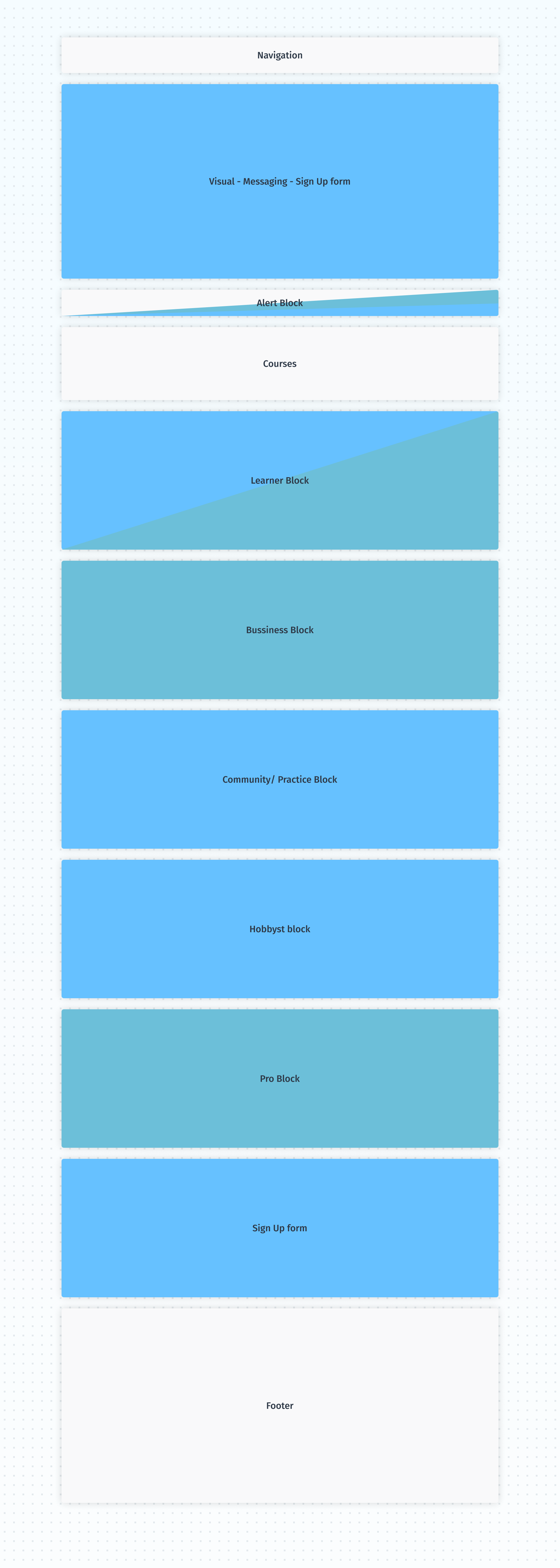
A vertical scroll heatmap showed how attention fades down the page. Matching each persona to a value proposition, I put the biggest group in the most discoverable spot.
The new homepage
Bringing it to life
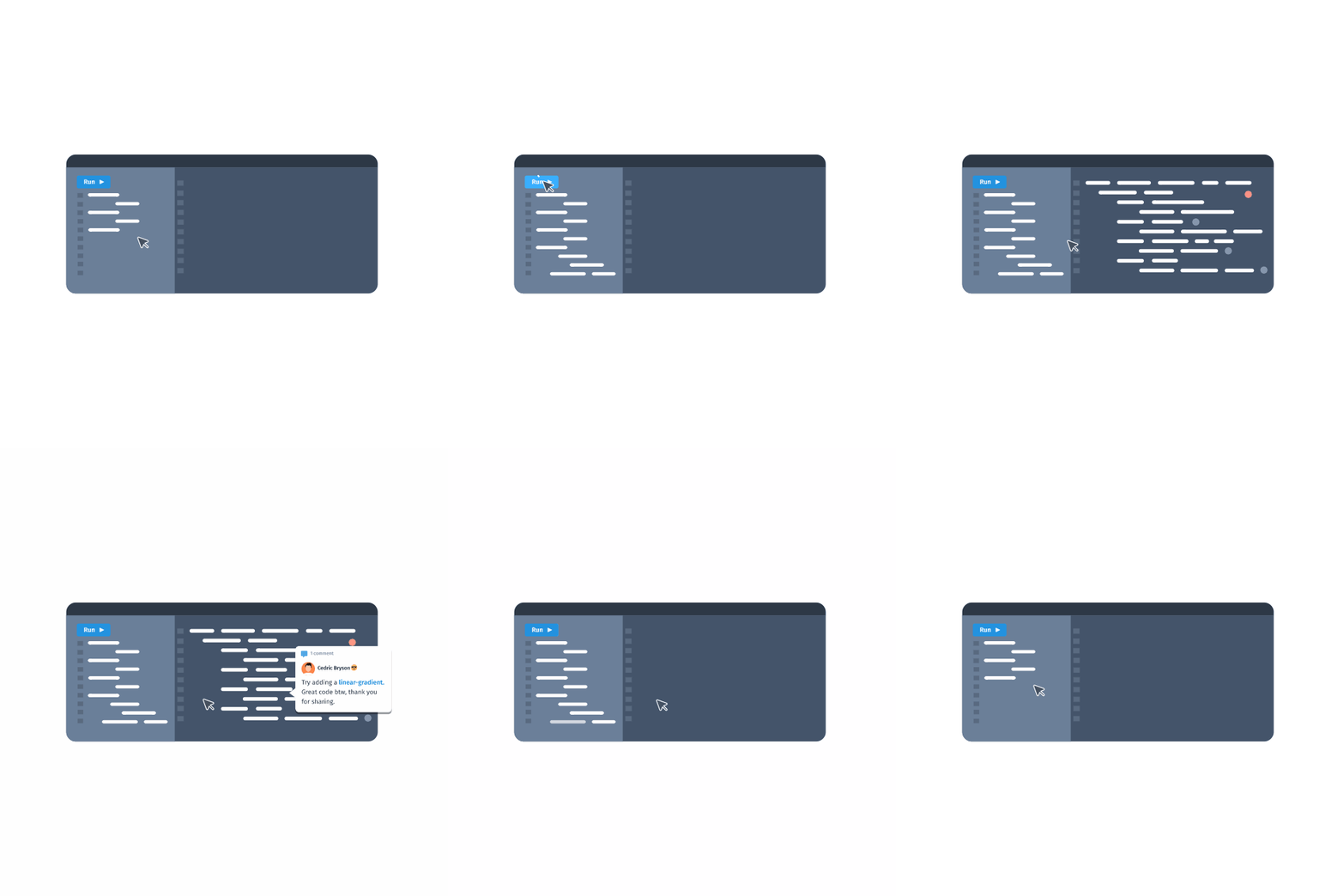
Motion did a lot of the explaining. A small animation shows what learning on Sololearn feels like (write code, hit run, see it work), and the logo animation gave the page a little personality.

Learning, built for the big screen
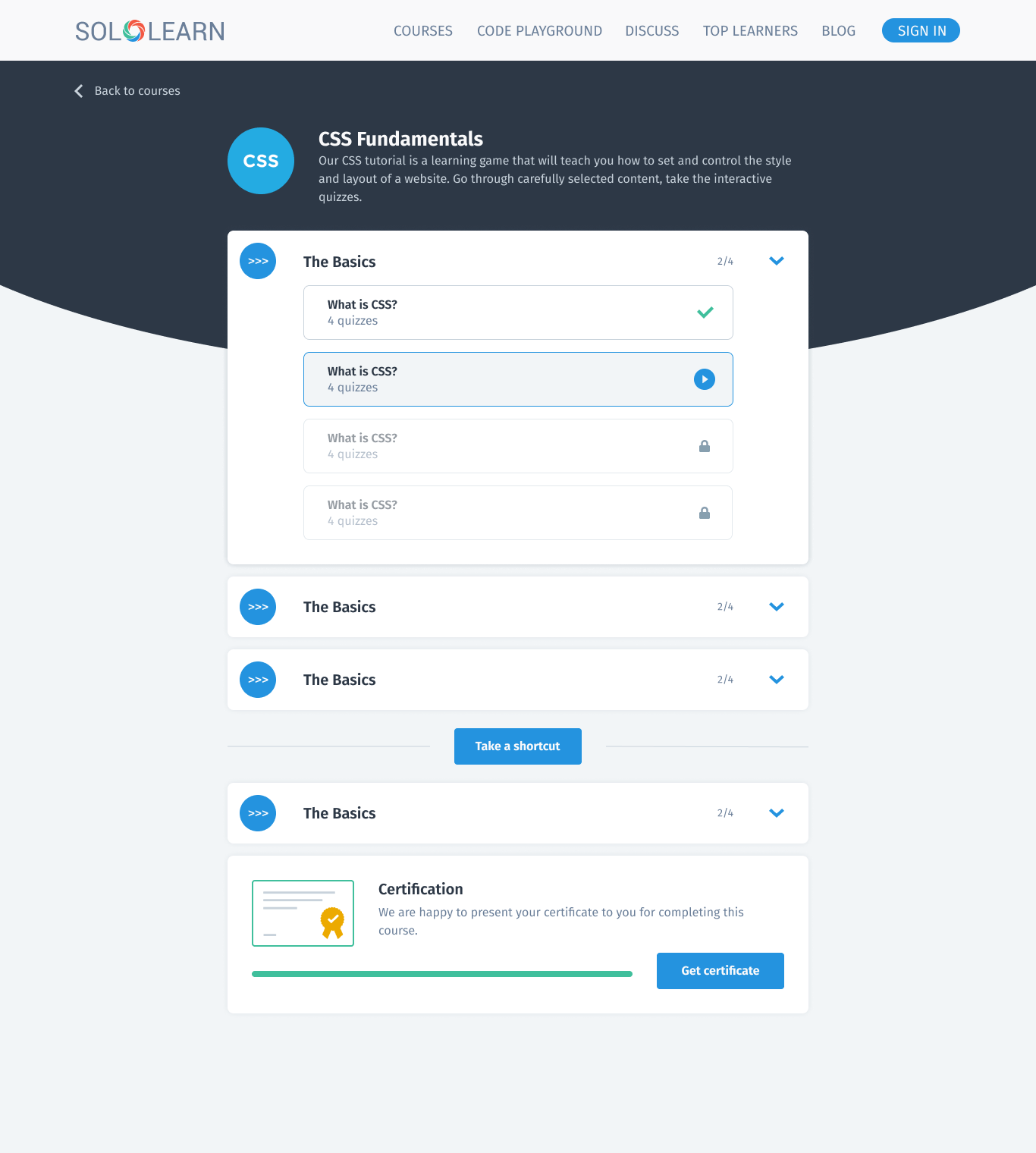
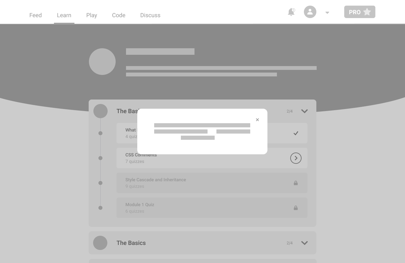
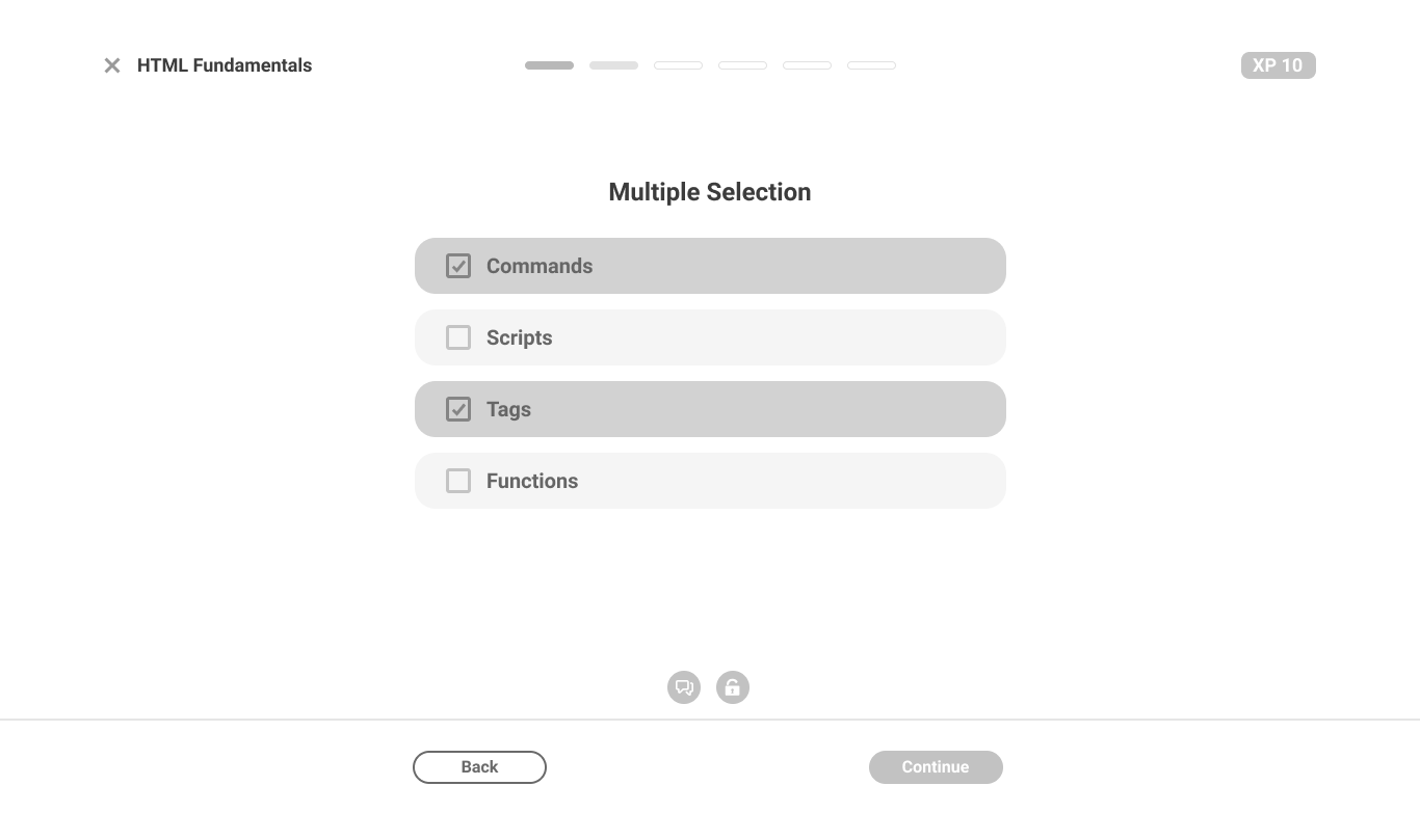
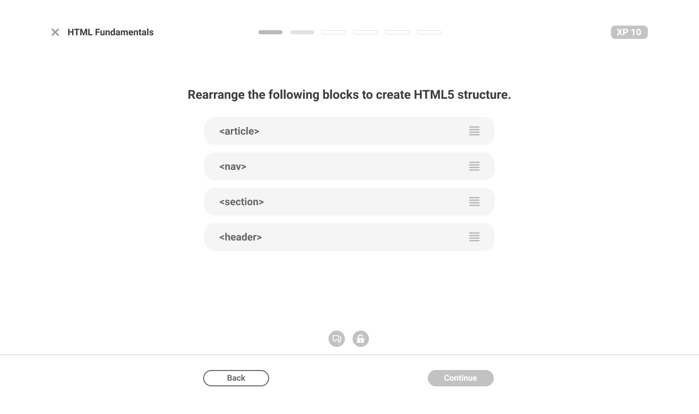
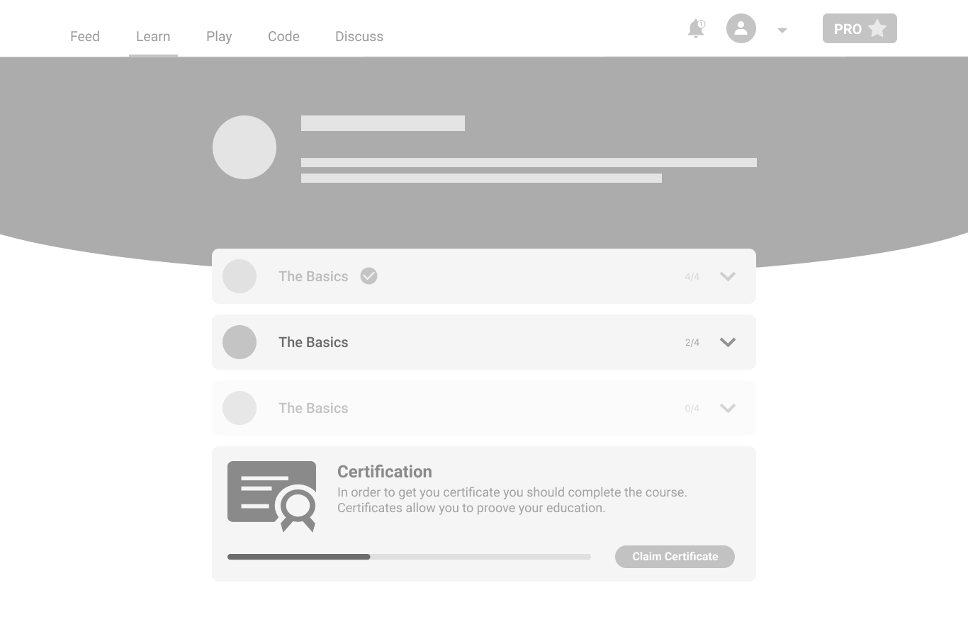
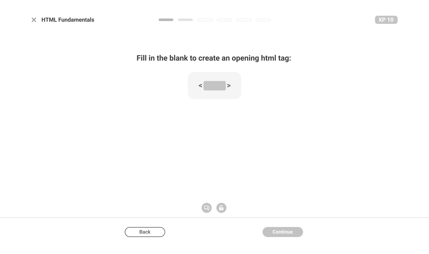
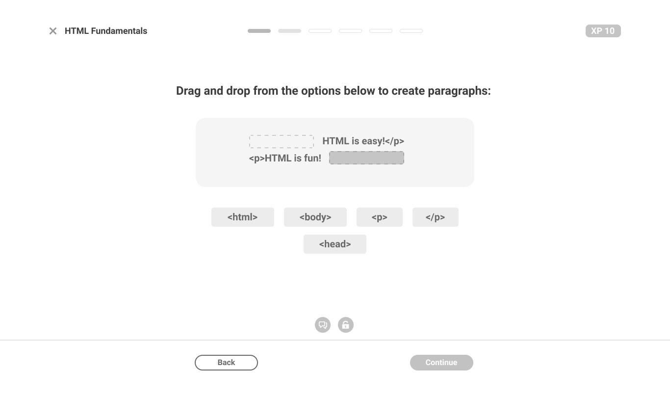
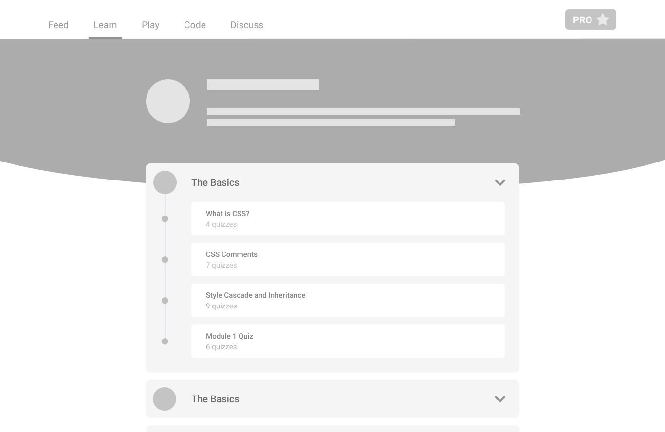
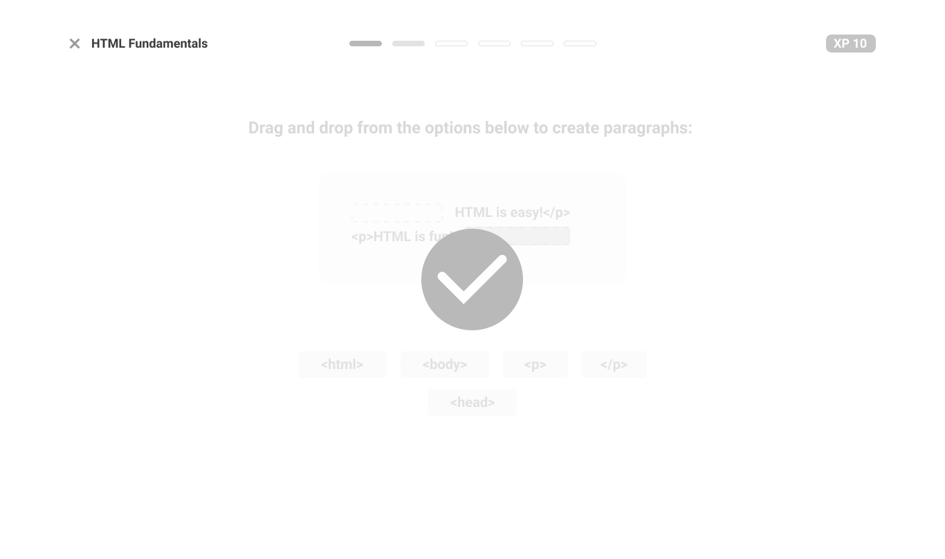
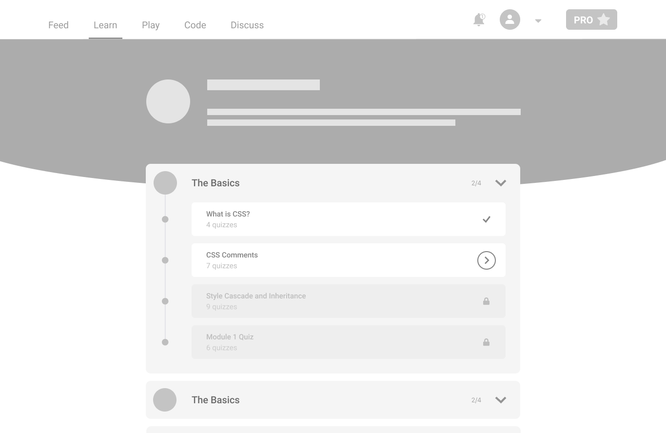
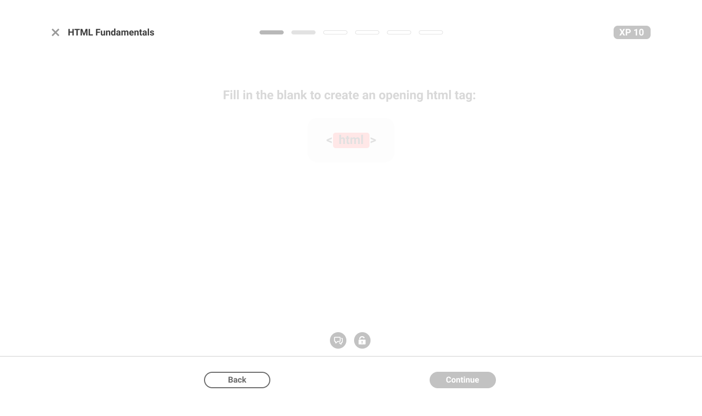
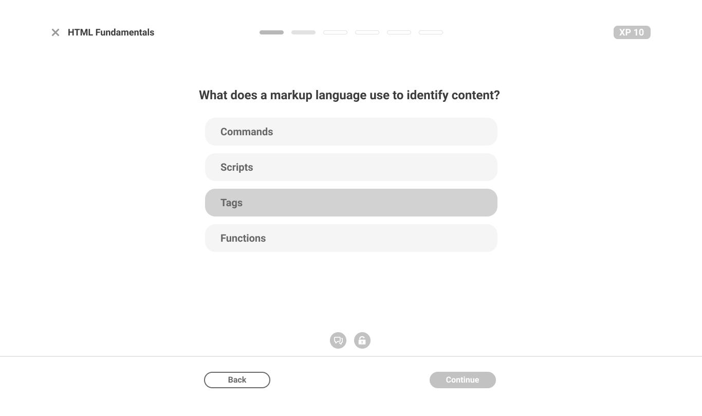
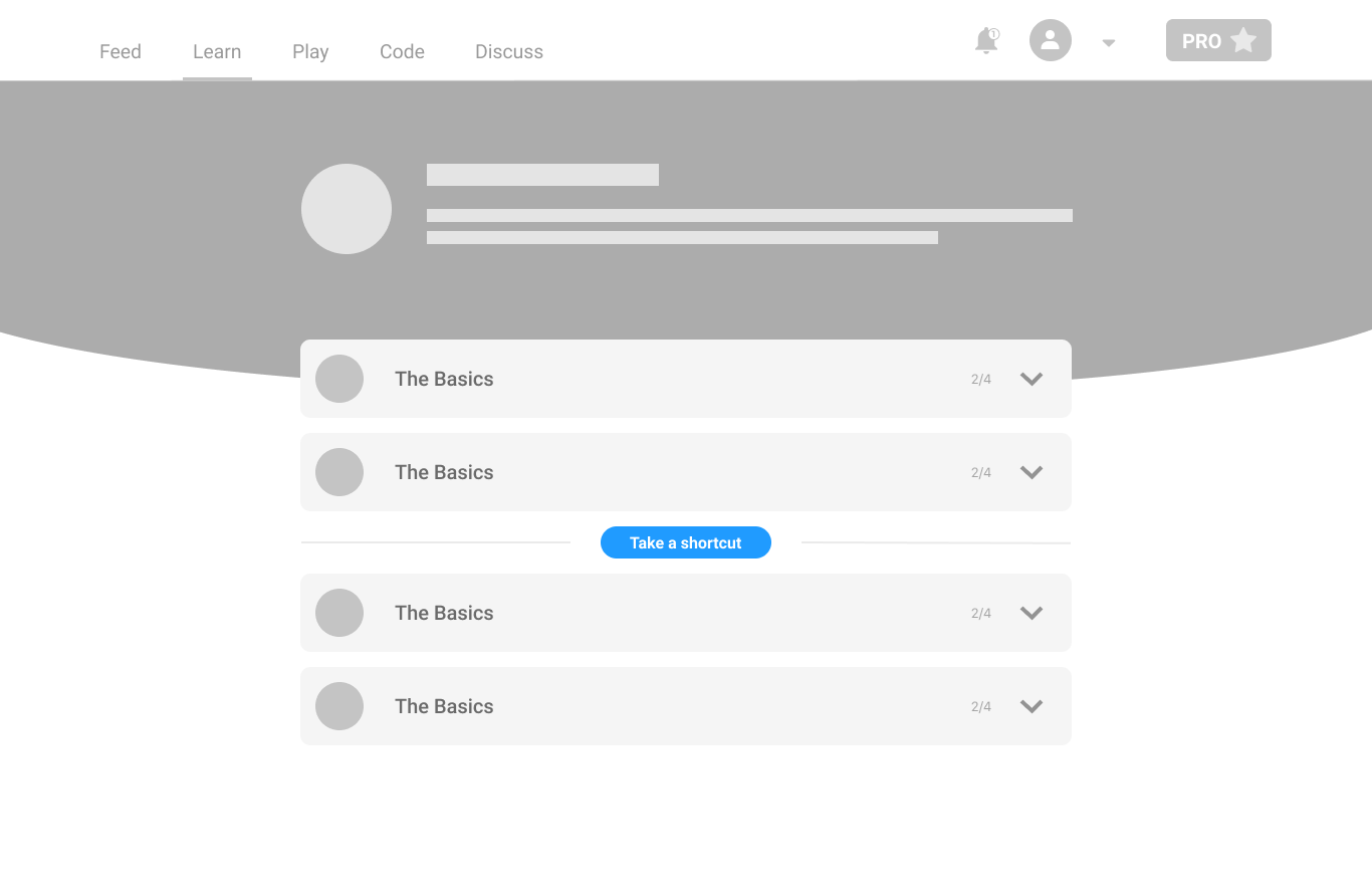
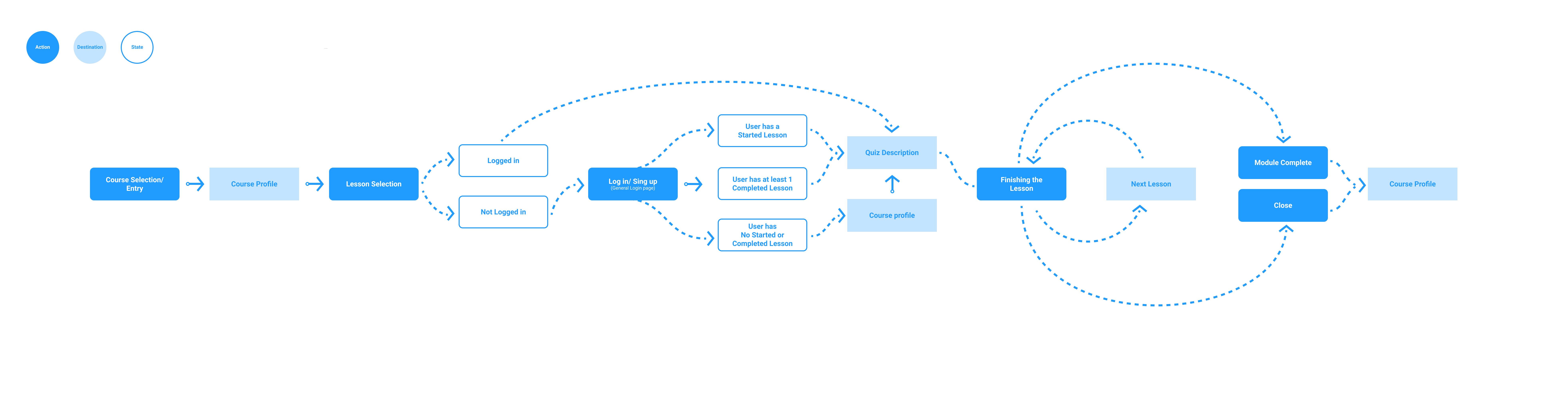
Once people signed up, the web learning experience let them down: it was the phone app on a bigger canvas. I redesigned it for desktop first.
A glimpse of the process
What changed
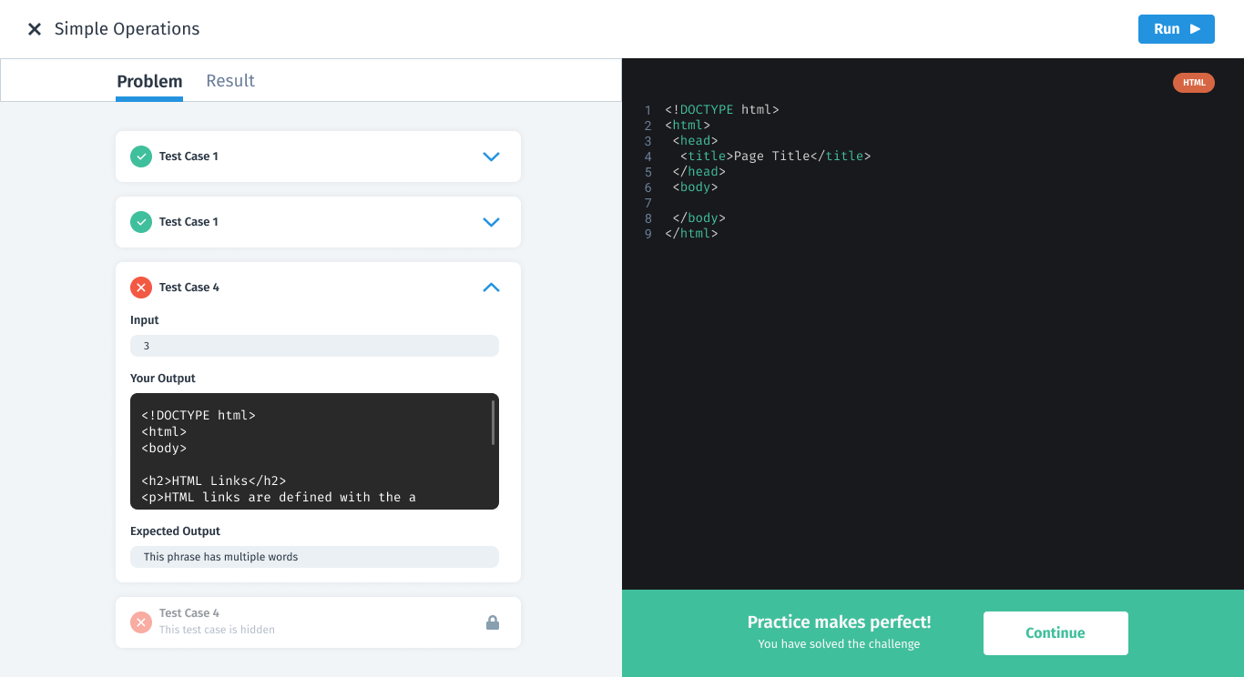
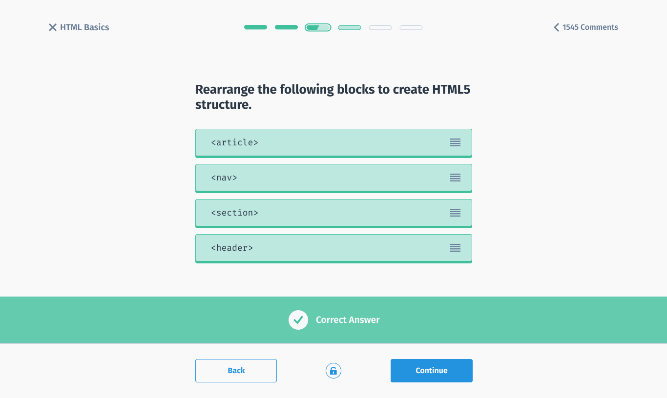
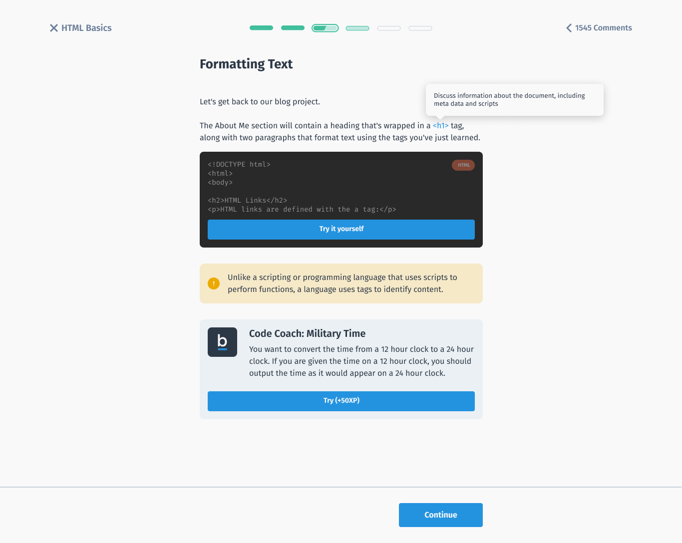
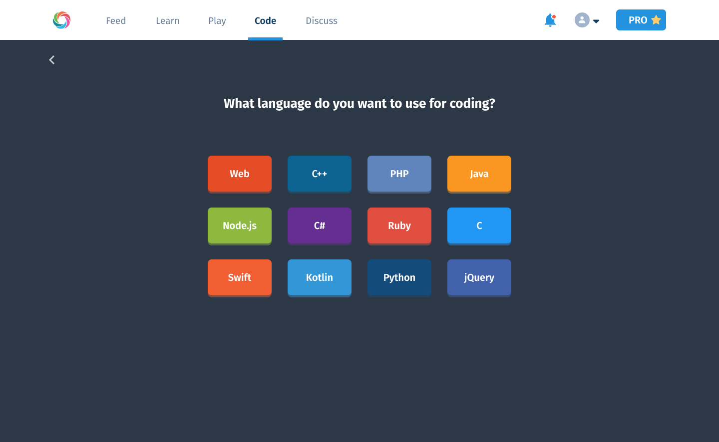
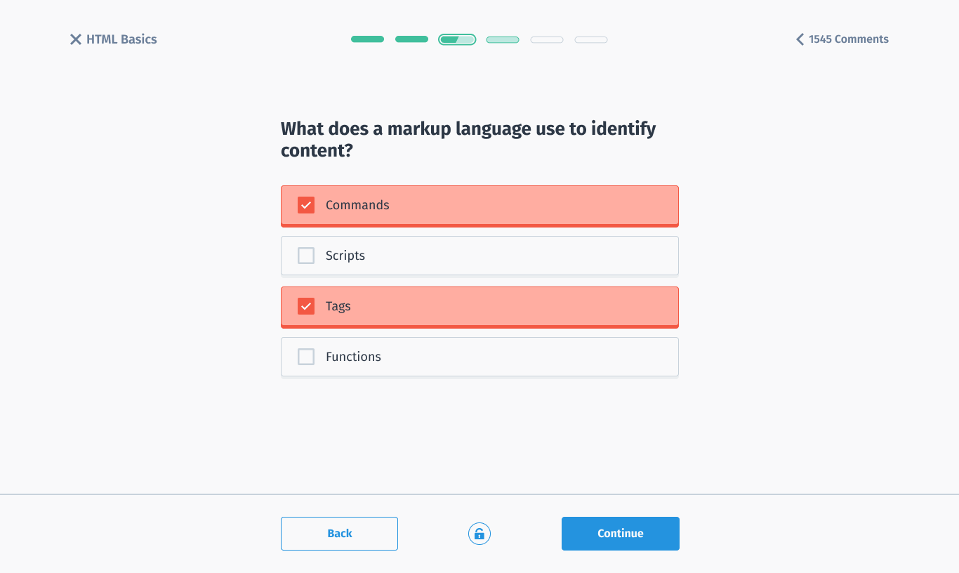
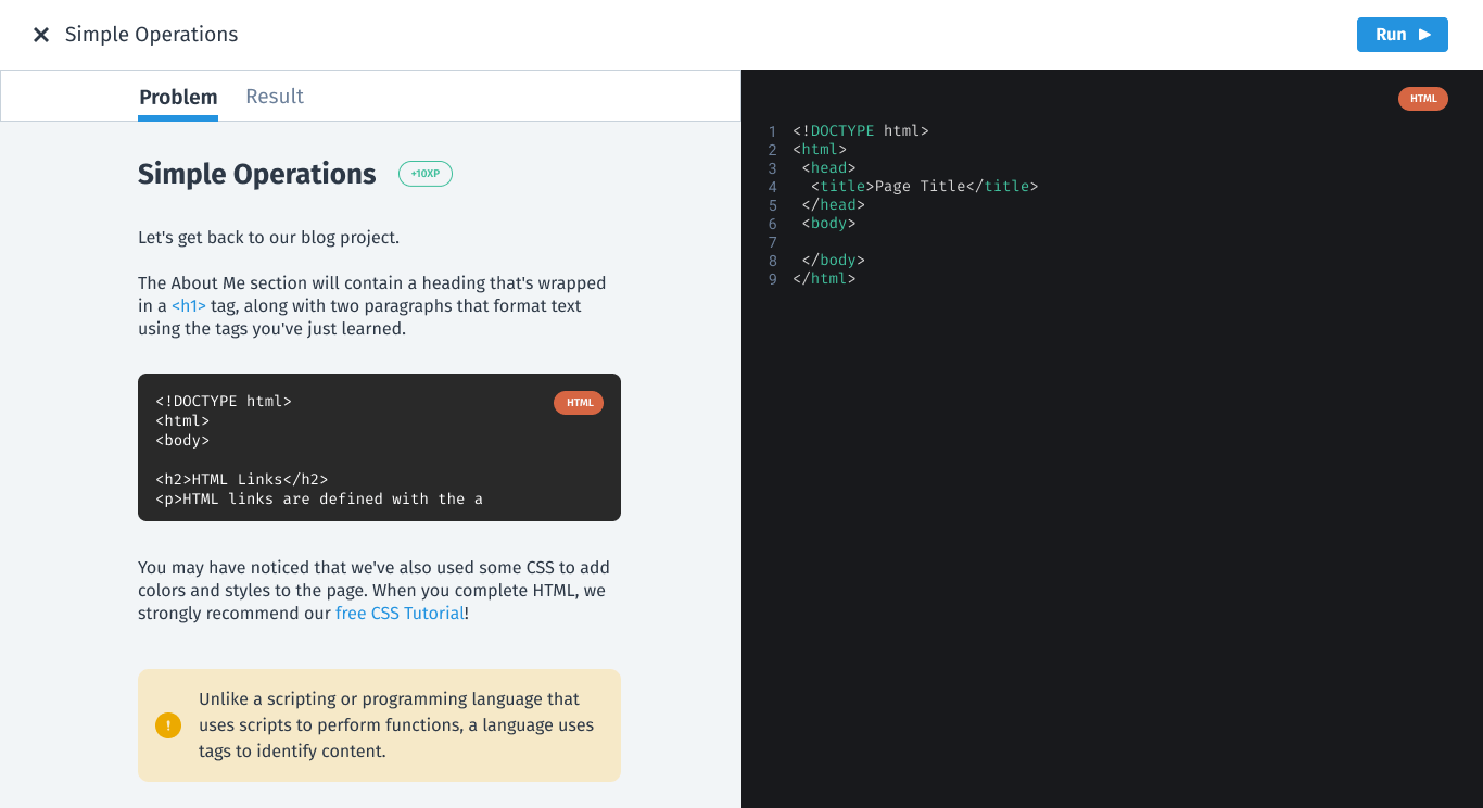
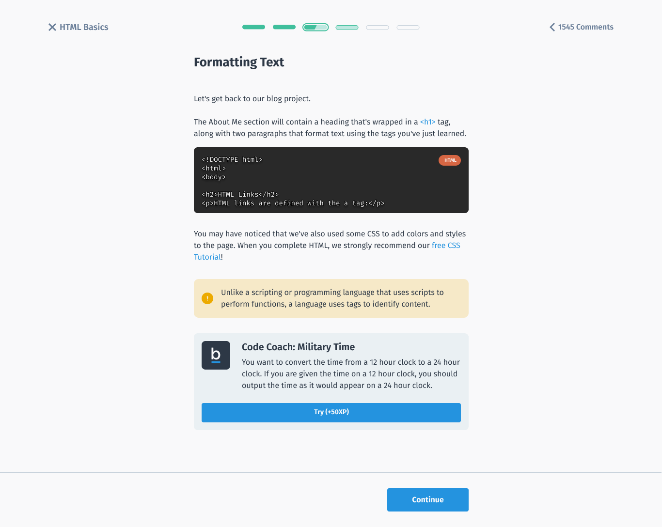
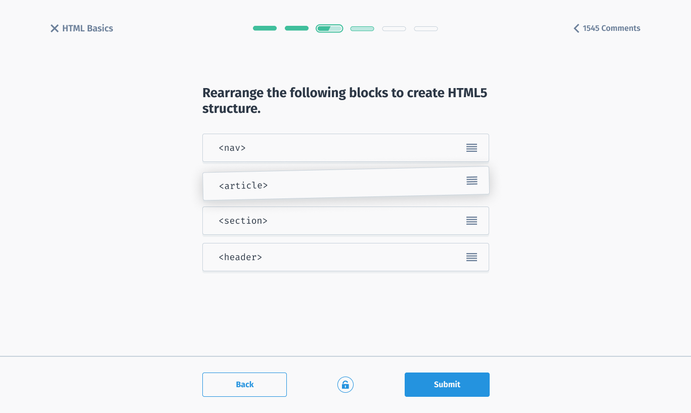
A layout made for desktop browsing, content that's easy to find, a visual language that matches the rest of Sololearn, and interactive touches like hover effects and animation.
The new web platform
Details that matter
Biggest group first
The most common learner gets the most visible spot, since attention drops further down the page.
A place for every motivation
Career, skills, hobby and business each map to a clear section and value proposition.
Made for desktop
Layouts that use the space a big screen gives you, instead of a stretched phone UI.
Feels alive
Hover states and motion that make learning on the web more engaging.
The impact
See it for yourself
Both the homepage and the learning experience are live. Have a look at the real thing.
What I took away
Real data beats assumptions about "the user". One audience turned out to be over half of all visitors, and the homepage changed shape around that.
Porting isn't designing. A layout that works on a phone rarely makes the most of a big screen, so starting from desktop paid off.