How it started
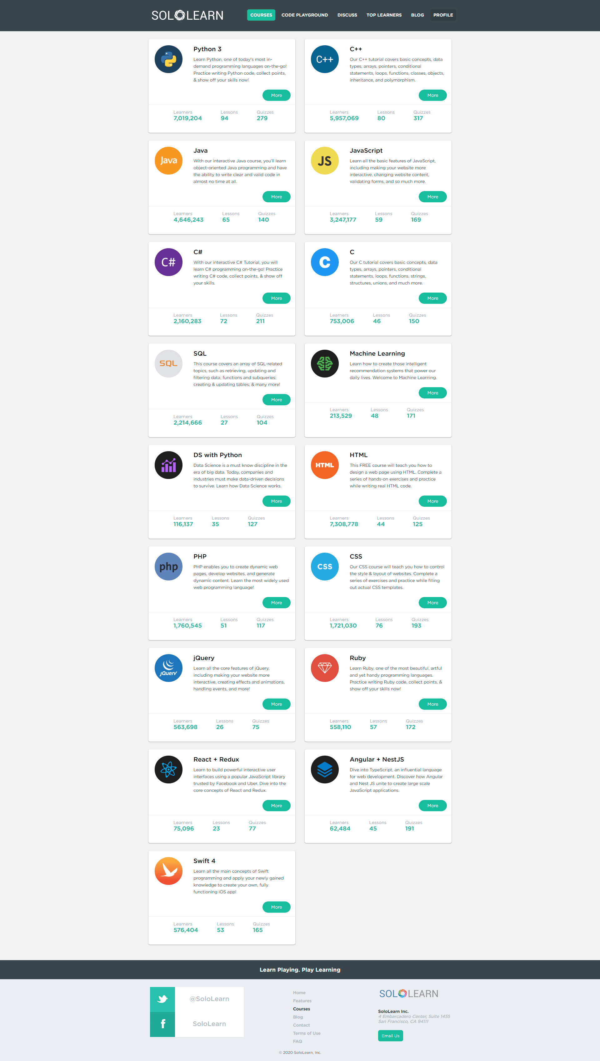
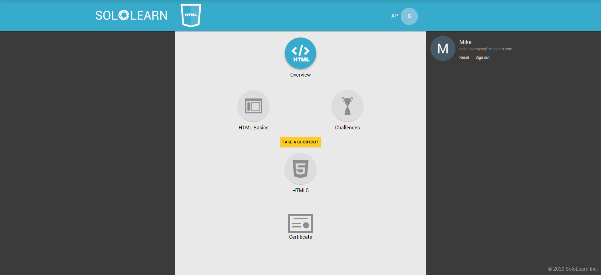
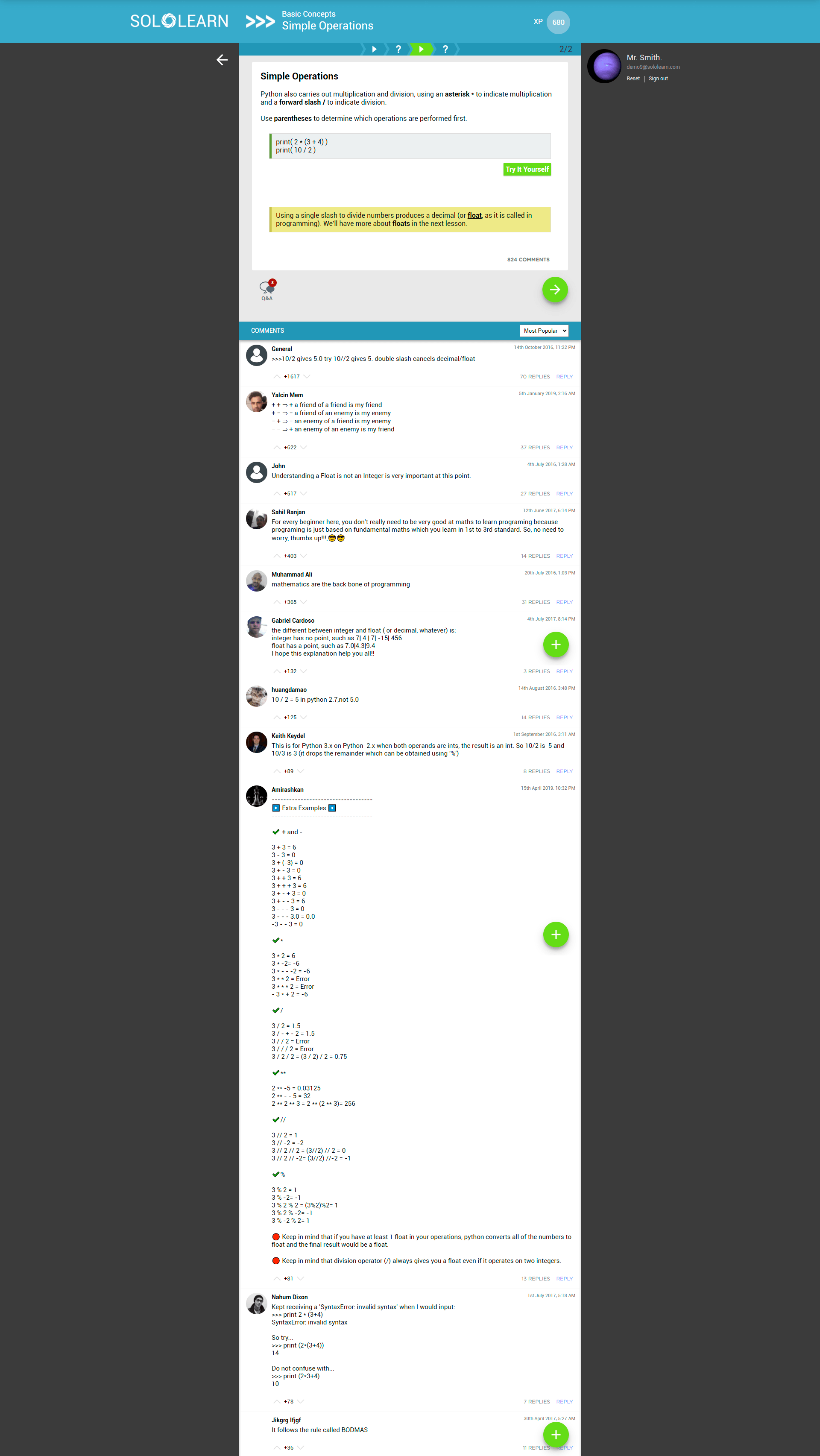
The redesign of the web experience represents a major milestone in the product's evolution. The previous version was essentially a mobile experience translated to desktop with minor tweaks, and didn't fully account for the unique needs of desktop browsing — users often found it difficult to navigate the site and find the information they needed.
The old platform
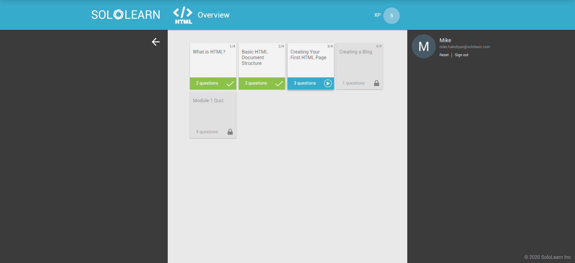
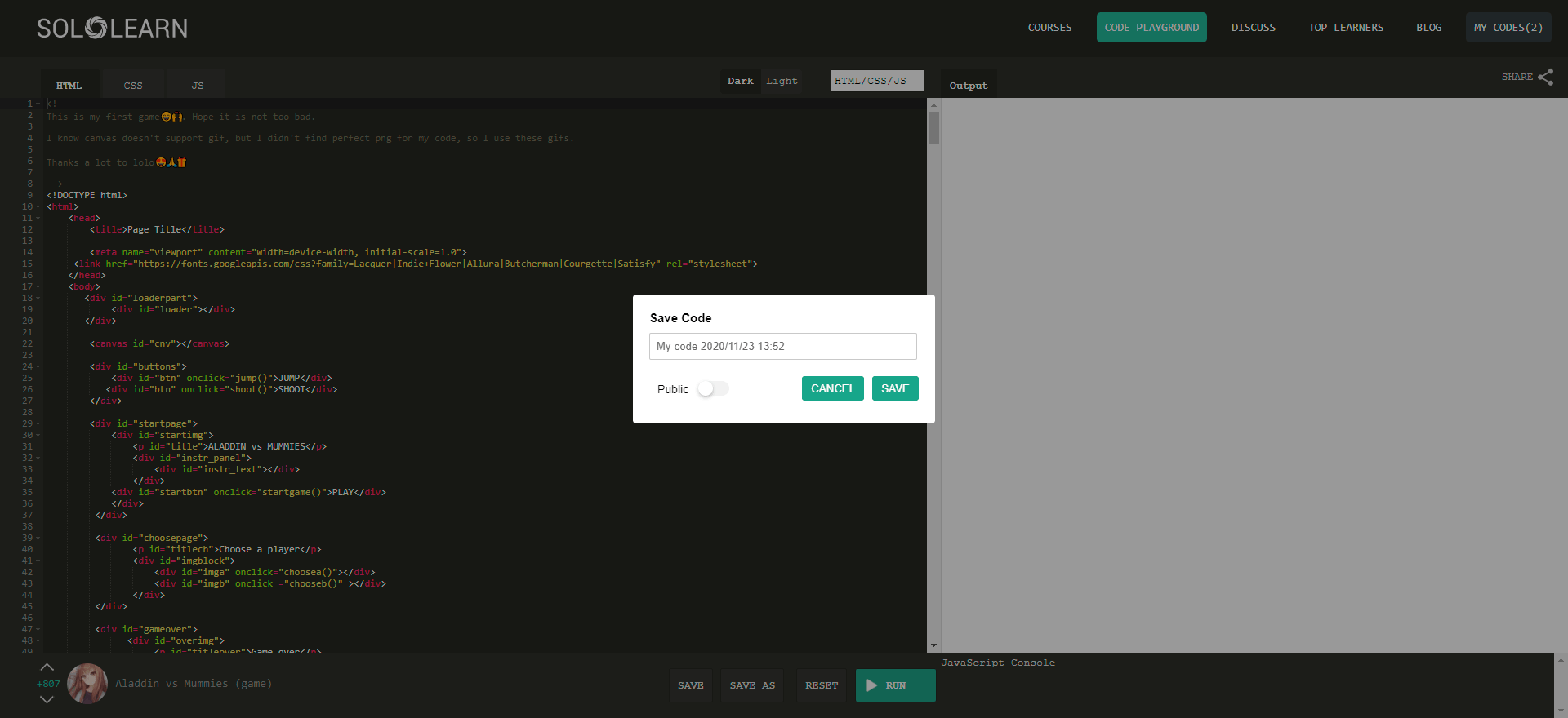
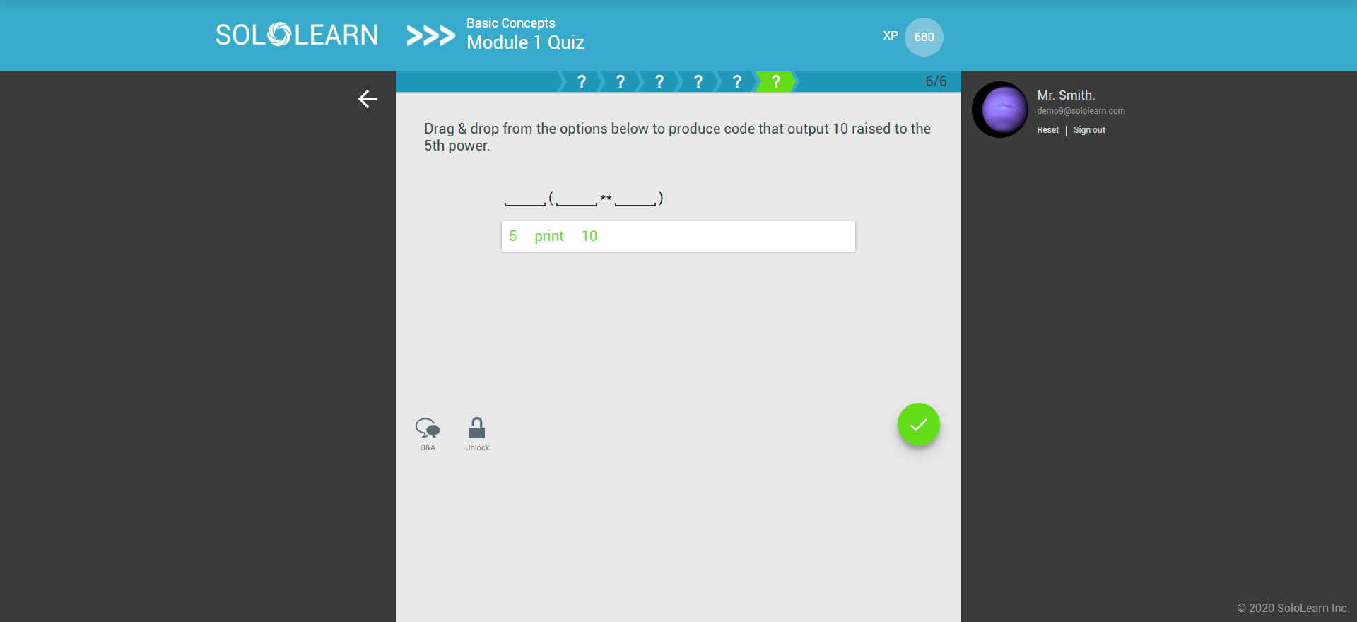
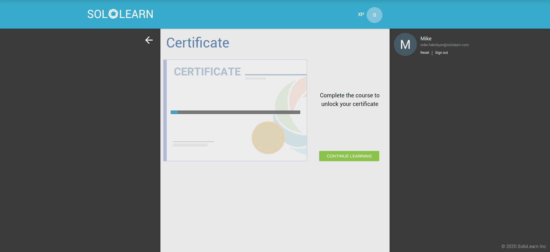
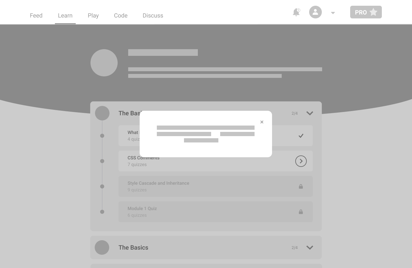
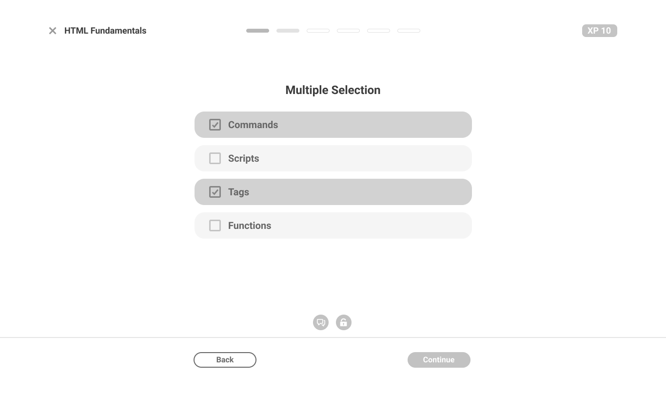
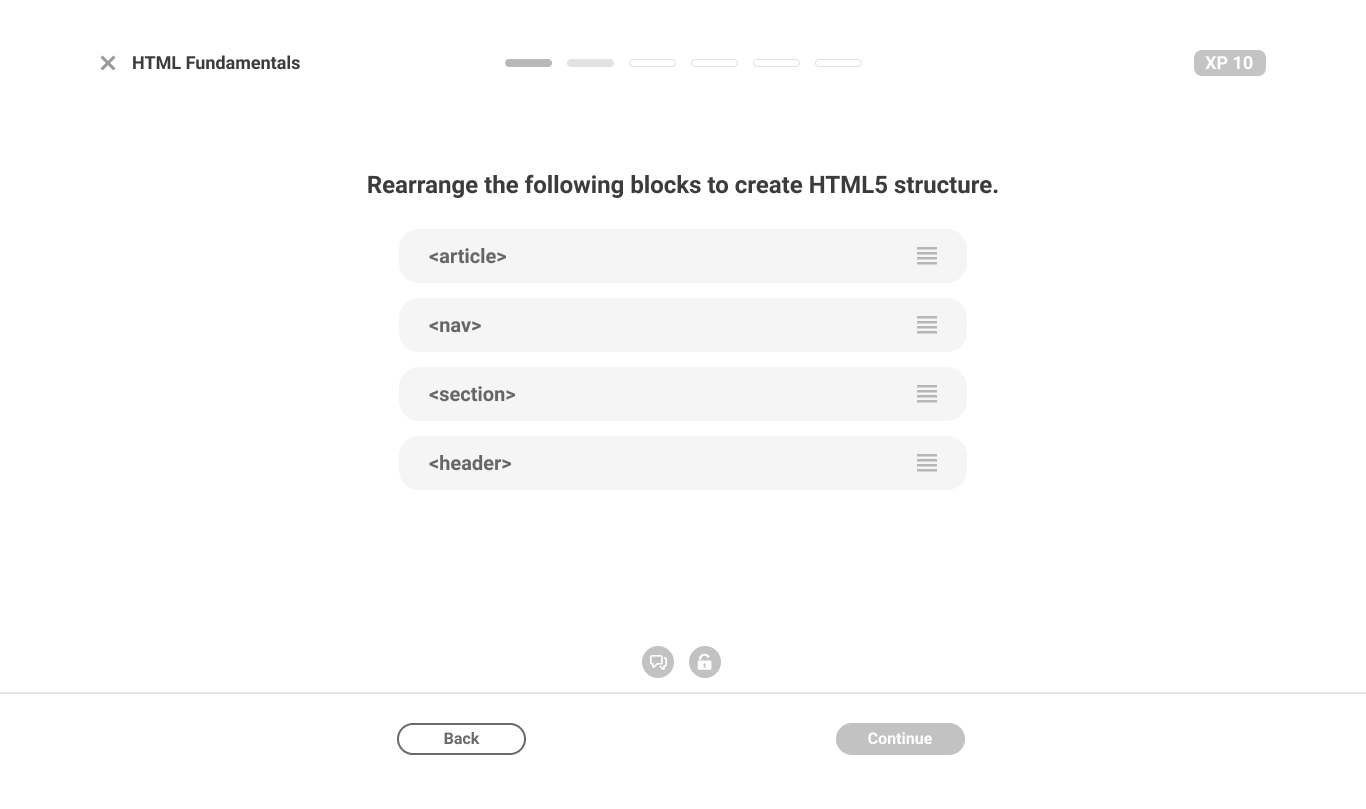
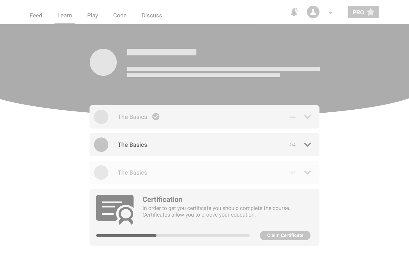
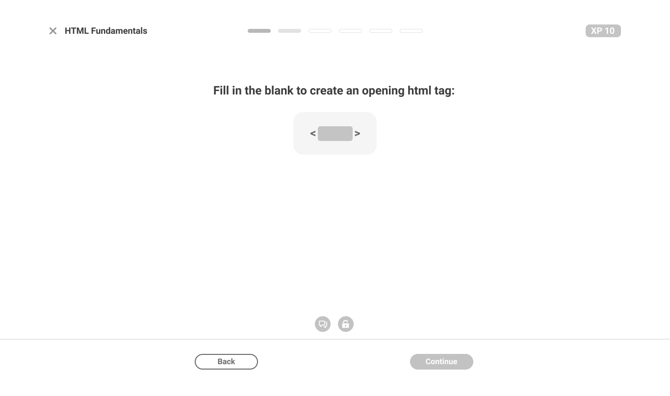
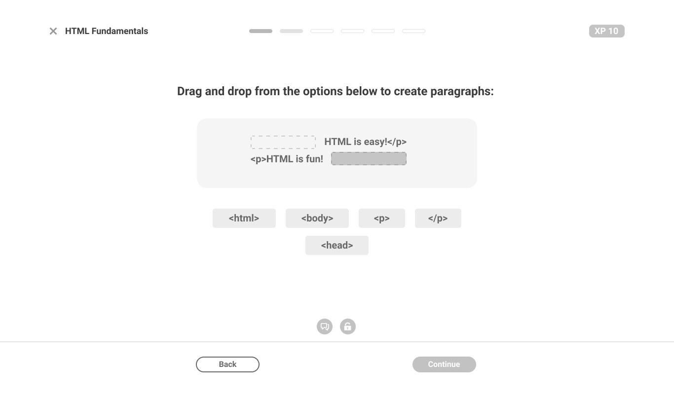
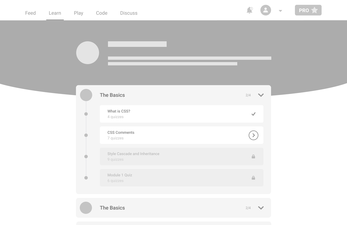
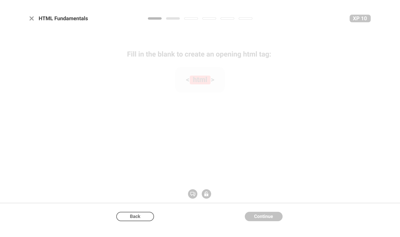
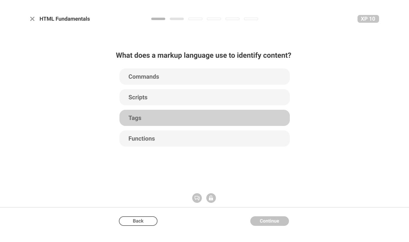
A glimpse of the process
What changed
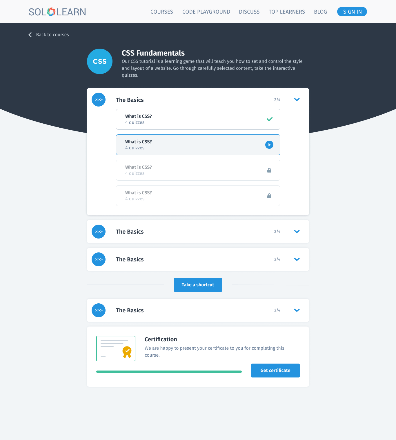
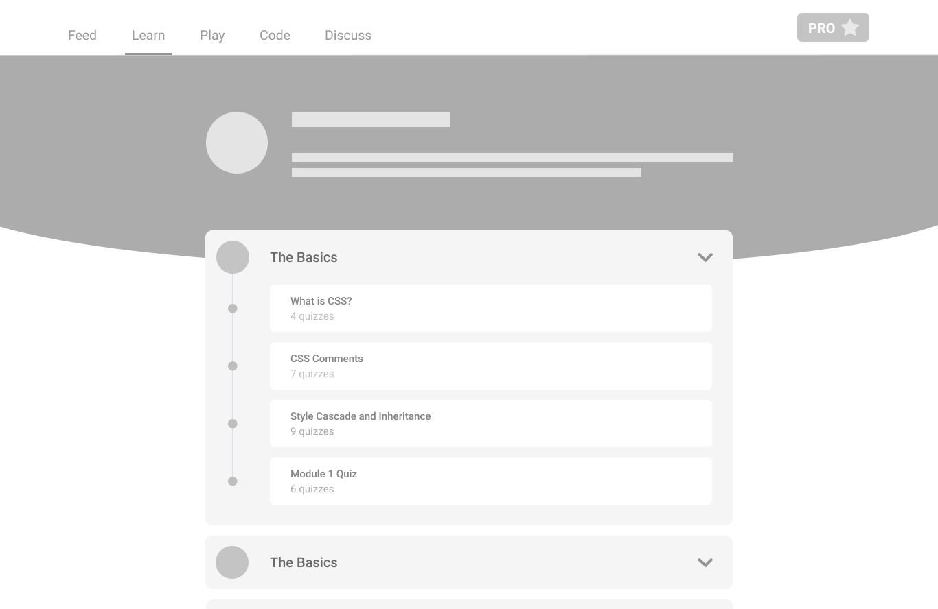
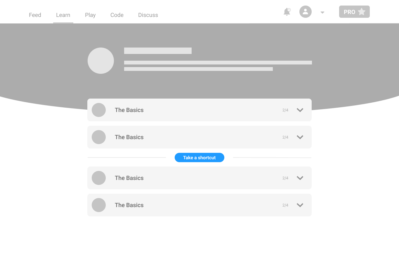
The team focused on a web experience optimized for desktop browsing. The visual language was updated to be more consistent with the site's overall style, creating a more cohesive, integrated experience — with special attention paid to the layout and organization of content, so it's easy to navigate and find what you're looking for.
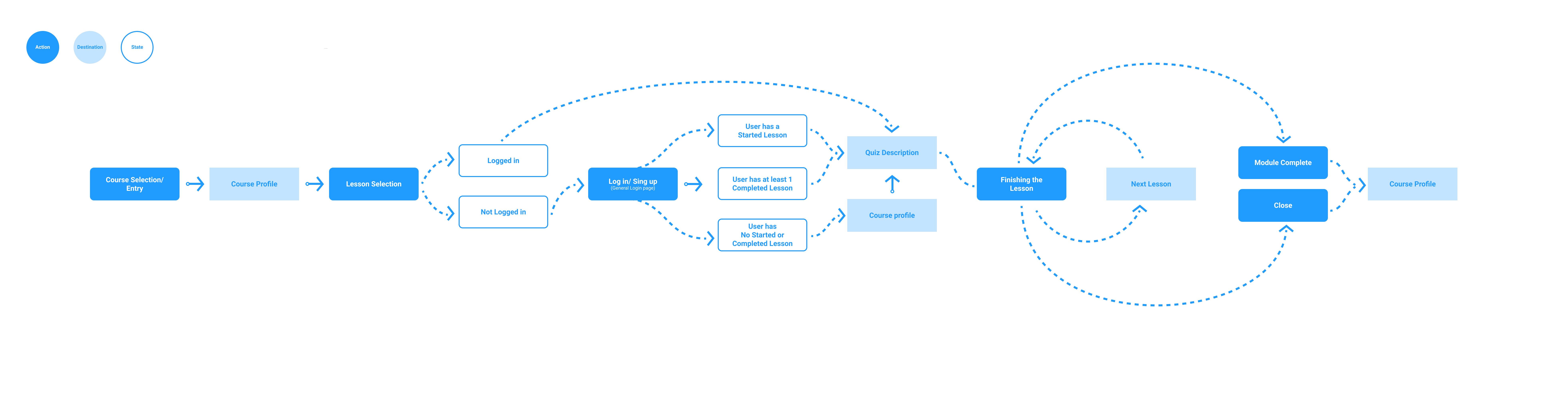
A key goal was a more web-friendly experience that takes advantage of desktop browsing's unique capabilities — the site now includes more interactive elements, like hover effects and animations, that make it feel more engaging and dynamic.
New web platform
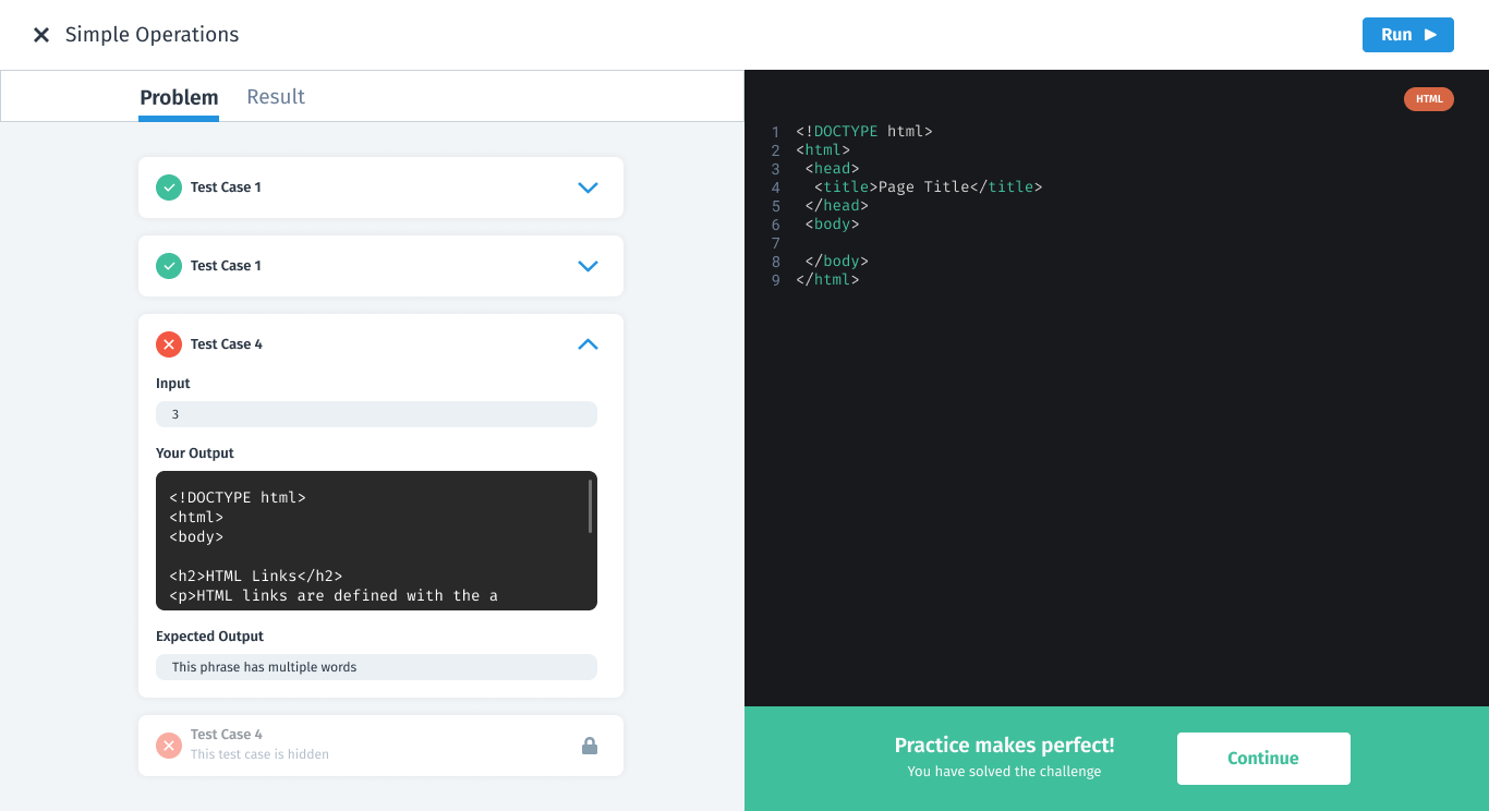
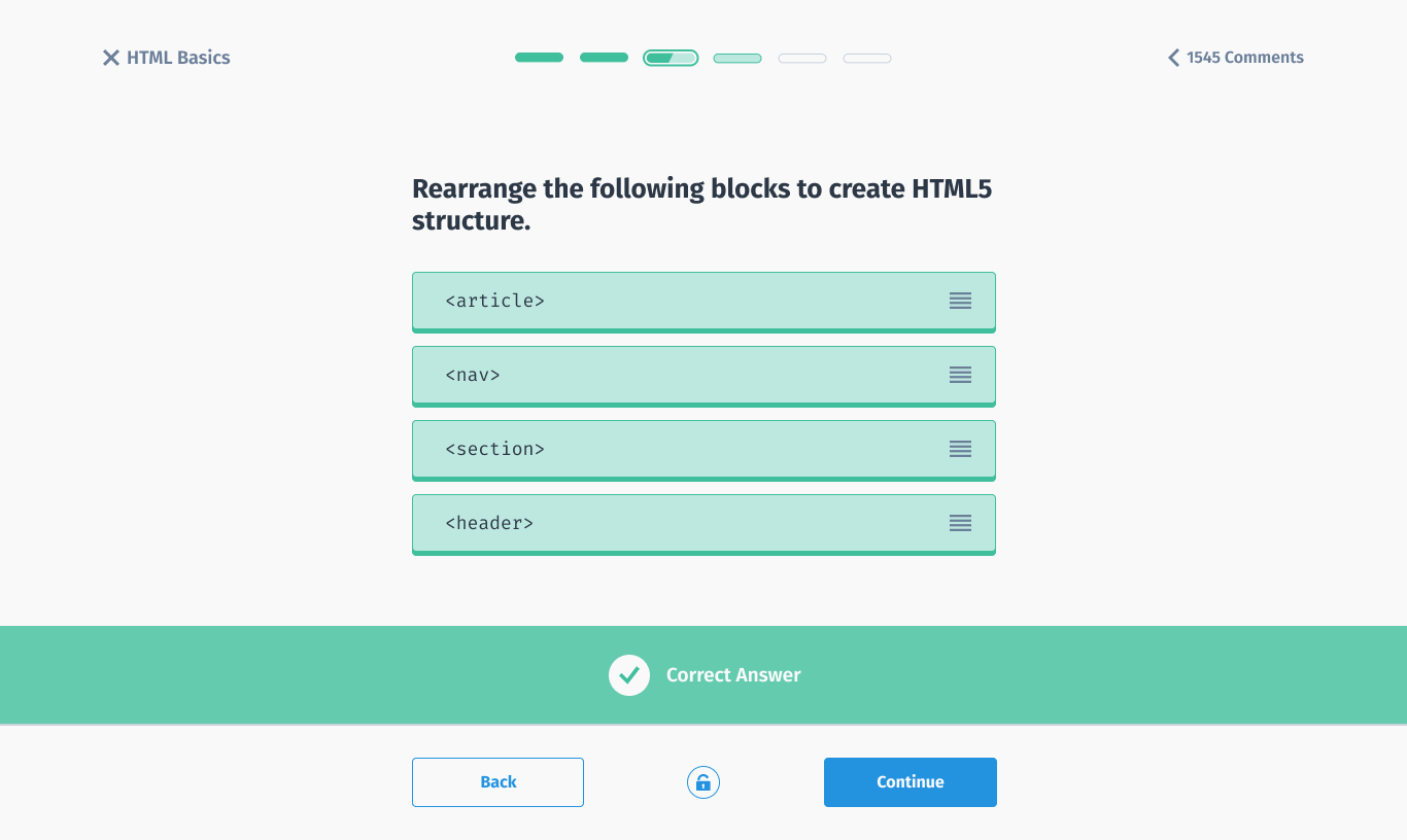
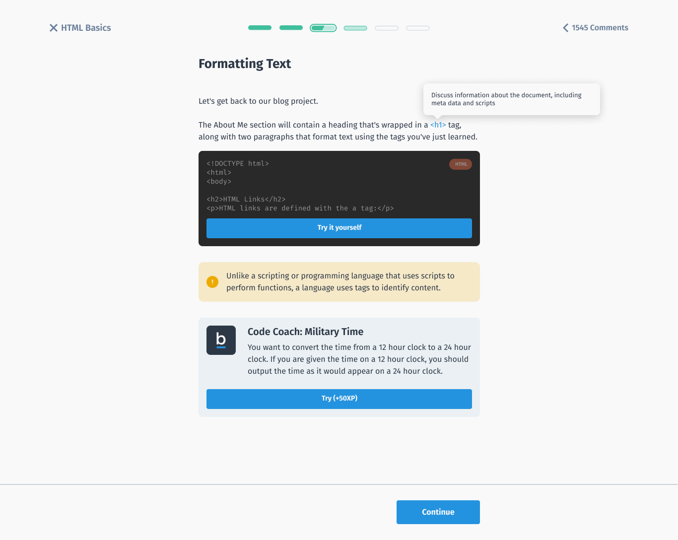
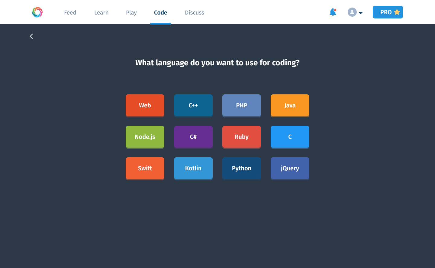
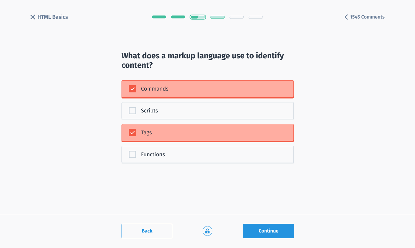
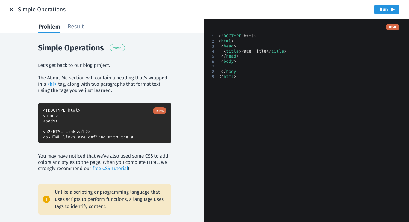
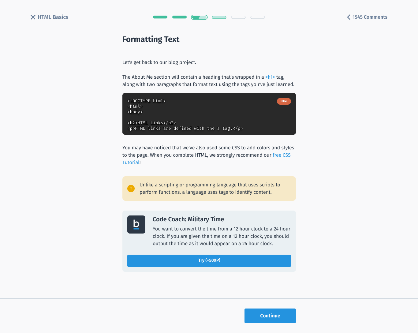
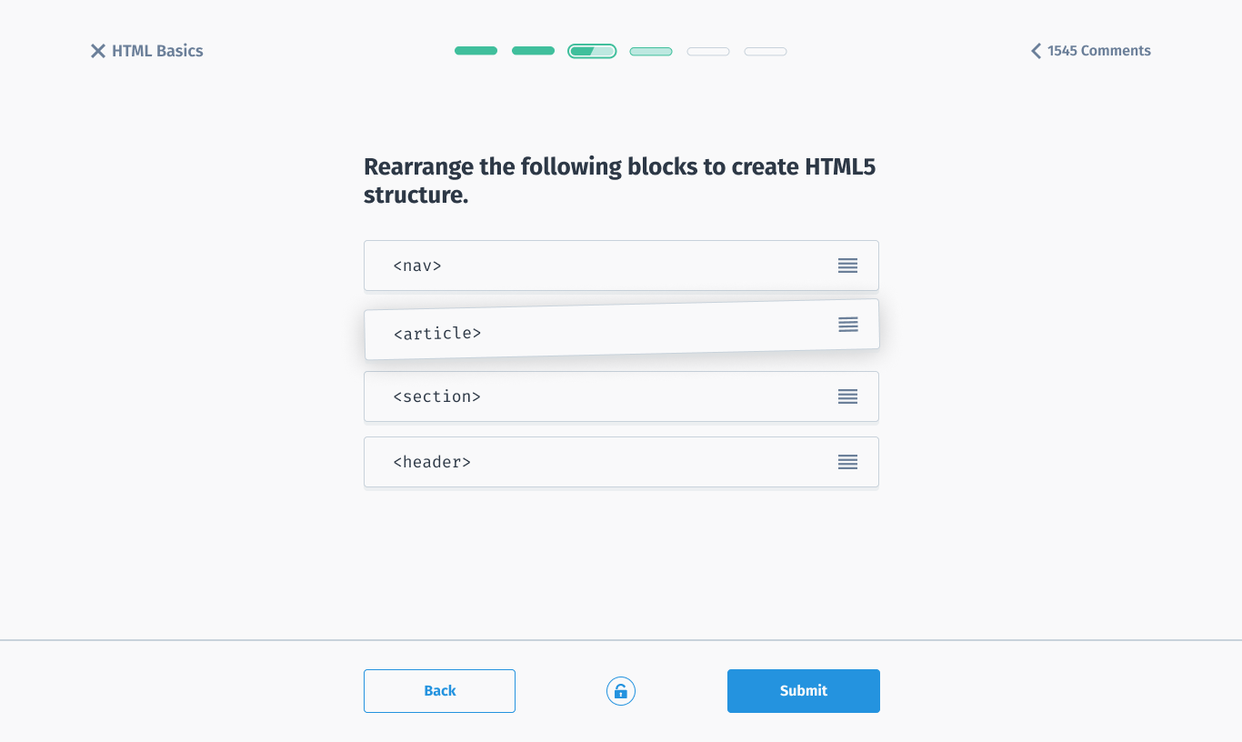
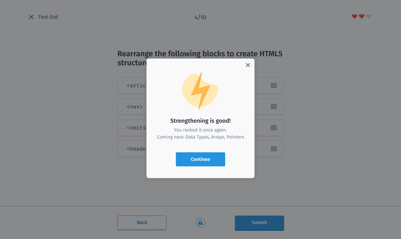
Overall, the redesign was a major step forward for the product, improving usability, functionality and overall appeal. By taking a user-centered approach focused on the unique needs of desktop browsing, the team created a web experience that's intuitive, user-friendly, and built for the modern web.