Forma Labs
An identity built from four simple shapes and one colour, for a studio that makes websites for small businesses in Armenia.
A studio for owners who have never had a website.
Forma Labs designs and builds websites for cafés, barbershops, flower studios and other small businesses in Armenia. I started it, and I designed the whole identity: the name's visual form, the logo, the colour and type system, the components, the website and the written rules behind them.
The people it speaks to run their business from Instagram and WhatsApp. A website feels technical and expensive to them. The brand had to feel careful and well made without feeling corporate or distant.
The challenge
Look careful and premium enough to be trusted with someone's business, while staying simple enough that a first-time buyer doesn't feel out of place.
Three languages, one voice
The brand lives in Armenian first, with English and Russian versions. The logo, headlines and numbers had to look like the same brand in every one of them.
From avatar to site
It had to hold up as a 32-pixel Instagram avatar, on a WhatsApp message, in a 9:16 ad and across a full landing page, without a separate version for each.
Calm, made of blocks, with one loud colour.
The direction is quiet on purpose: lots of white space, black type, big rounded shapes and pill buttons, with a single lime colour doing all the work of recognition.
“Forma” means form. A studio that gives a business its form online should look built, not decorated, so the identity is assembled from a small kit of geometric parts rather than drawn as an illustration. The same four shapes make the logo, the numbers in the steps, the edges of the call-to-action band and the app icon.
For layout I borrowed the grammar of modern product landing pages (a grey hero box, stat tiles, white cards with soft shadows, numbered steps, one dark section) because it reads as current and organised. The lime and the Armenian type keep it from looking like another software company.
Circle
The softest of the four. It opens the mark and sets the friendly, rounded tone the whole system follows.
Rounded square
Structure with soft corners: the shape of a screen or a card, which is what the studio makes.
Quarter-circle
Half straight, half curve. It turns the corner and gives the mark its movement.
The dot
The only lime block, sitting inside a ring. This is the lab: the small part that makes the rest work.
Four shapes on a grid. Nothing drawn by eye.
The mark is a 2×2 grid: a circle, a rounded square, a quarter-circle and a ring holding the lime dot. Every curve comes from one radius, so the shapes belong together at any size.
Switch between the views to see how it's built. The grid and its 3-unit gutter keep the four parts from merging at favicon size. The radii are related by halves and doubles, which is why the mark feels even without any one shape dominating.
Four cells, one gutter.
Each shape fills a 24-unit cell on a 52-unit square, with the same 3-unit gap between all four. The gaps are part of the logo: at small sizes they keep the shapes from melting into one blob.
One logo, three grounds, two alphabets.
The wordmark is bold lowercase “forma” with “labs” set small in a pill. The pill is the only part that changes: black with lime text on white, lime with black text on black. On lime everything turns black and the dot becomes a ring, so the colour is never placed on itself.
The Armenian lockup, “ֆորմա լաբս”, uses the same weight and rhythm, so a customer who sees both reads them as one name. Below 96 pixels the wordmark drops away and the mark works alone.
Lime is a fill. Never a line.
One brand colour, Forma Lime, on a neutral system of ink, surface and white. Recognition comes from the lime; everything else steps back.
Lime on white has a contrast of 1.25:1, so it can't be used for text, icons or thin lines. I turned that limit into the system's main rule: lime is always a filled shape with black on it (13.5:1), or it sits on black. It keeps every page accessible and makes the colour appear in large, confident blocks, never as small decoration. The 70 / 20 / 10 proportion stops it from taking over.
Do · black on lime, lime on black
13.5:1 contrast. Lime is always a fill with black on it, or it sits on black.
Don't · lime on white
1.25:1, unreadable. Never lime text, icons or thin lines on a light background.
One display face for Armenian and Latin.
Montserrat Armenian covers both alphabets, so the logo, the headlines and the prices look identical whether the page is in Armenian or English. It's set bold with tight tracking (−4%) to echo the compact, blocky mark. Body text uses Noto Sans Armenian and Montserrat, both chosen for clean, readable Armenian at small sizes on a phone.
The scale below uses real lines from the site, because the type has to work with long Armenian words, not with placeholder text.
Montserrat Armenian
Logo, headlines, big numbers. Bold, tracking −4%.
Noto Sans Armenian
All Armenian text and interface, 400–700.
Montserrat
Latin text and numbers, 400–700.
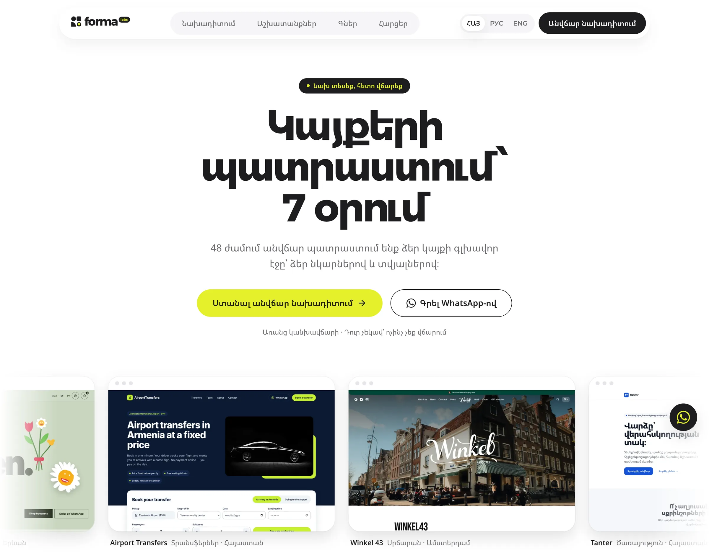
Կայքերի պատրաստում՝ 7 օրում
Websites, ready in 7 days
Տեսեք ձեր կայքը՝ նախքան վճարելը
See your website before you pay
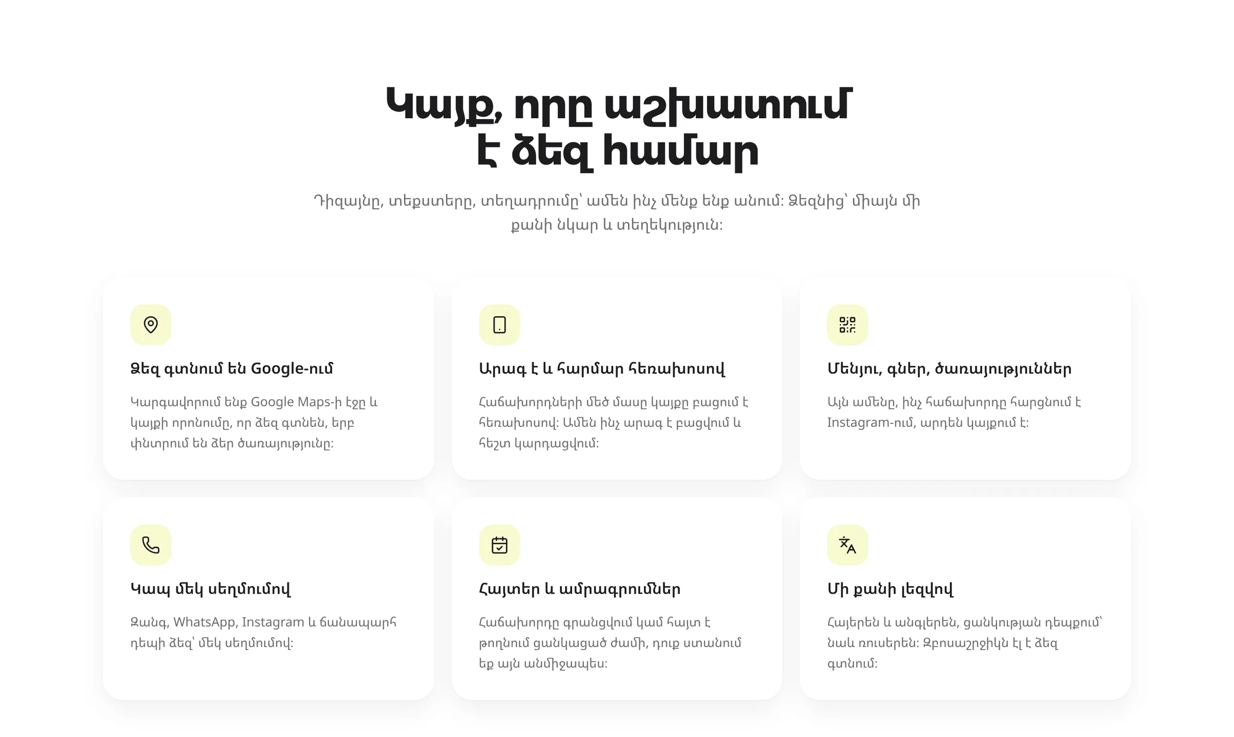
Կայք, որը աշխատում է ձեզ համար
A website that works for you
Ձեզ գտնում են Google-ում
People find you on Google
Դիզայնը, տեքստերը, տեղադրումը՝ ամեն ինչ մենք ենք անում։
Design, copy, launch: we do all of it.
The logo's shapes, reused as interface.
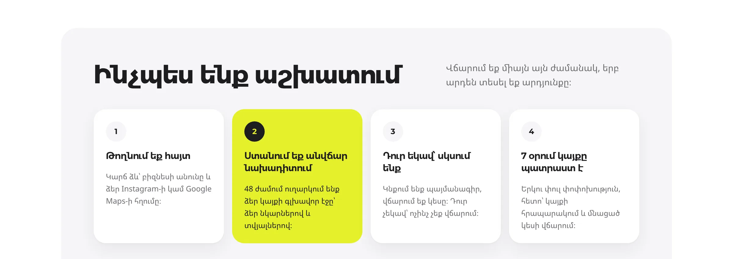
Beyond the logo, the identity is a small set of parts that repeat: pill buttons, circle numbers, white cards lifted by shadow, the scalloped lime band and the cursor tags.
Each one comes from the mark. The circle becomes the step number. A row of circles becomes the scalloped edge of the lime band. The rounded square sets the 24-pixel card radius. The cursor tags (a pointer with a name like “Անի · Սրճարան”, Ani · Café) are the one illustrative touch: they show real kinds of owners, which tells visitors who the studio is for before they read a word.
Depth without lines
Cards are separated by soft shadow, never borders. With one colour and black type, outlines would make the pages look like a form.
One accent per view
There is one lime action on each screen. A visitor always knows what the next step is.
The band as a signature
The scalloped lime band appears once per page, before the footer. It's the most recognisable element after the logo.
Words are part of the system too.
The audience doesn't know web terms, so the brand never uses them. Copy is short, warm and polite (the formal “դուք”), and it describes what the owner gets, not what the studio does. These are real lines from the site.
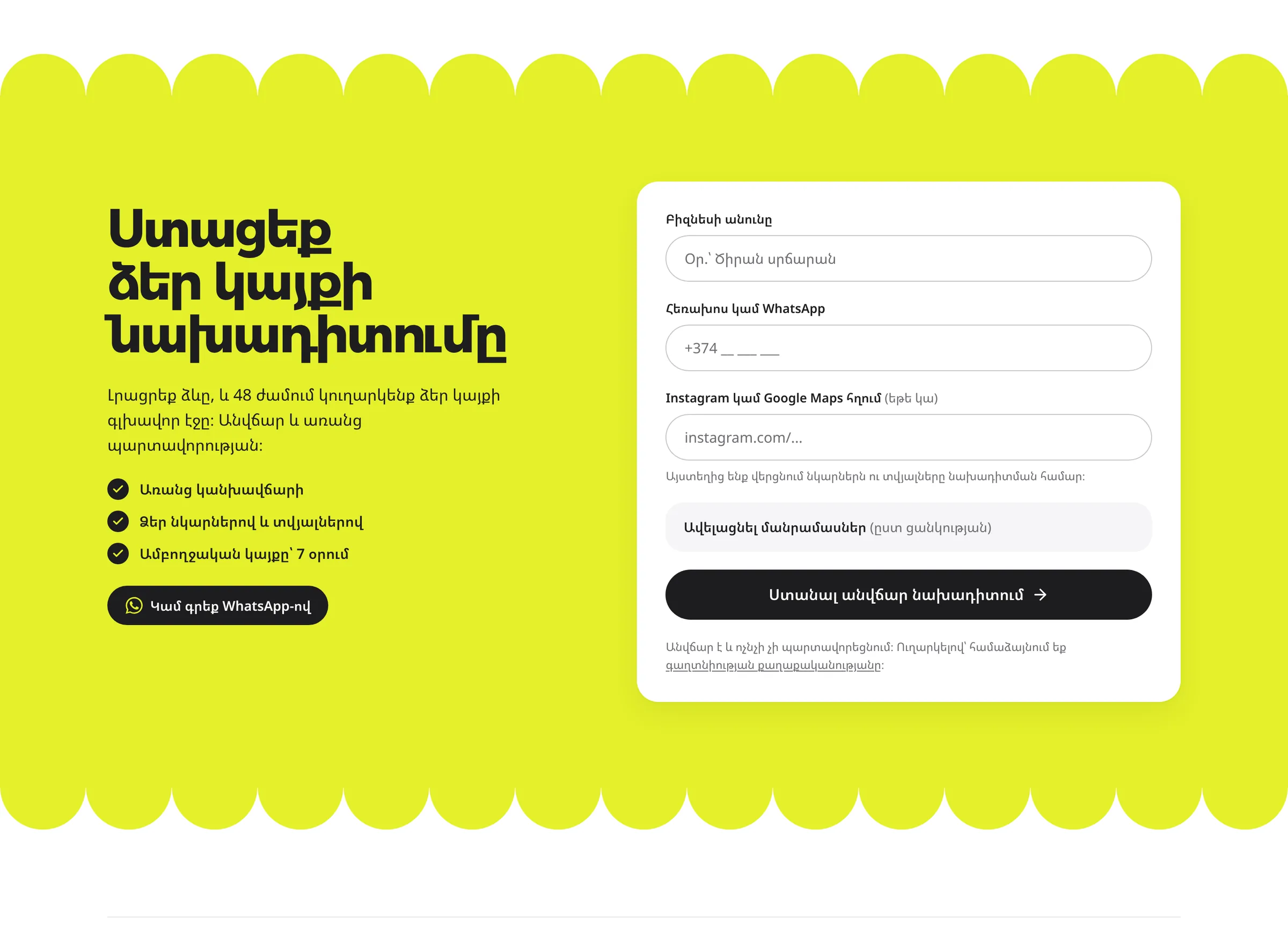
The website is the brand at full size.
formalabs.art is where the identity does its job. I designed and built it as the system's first and most complete application.
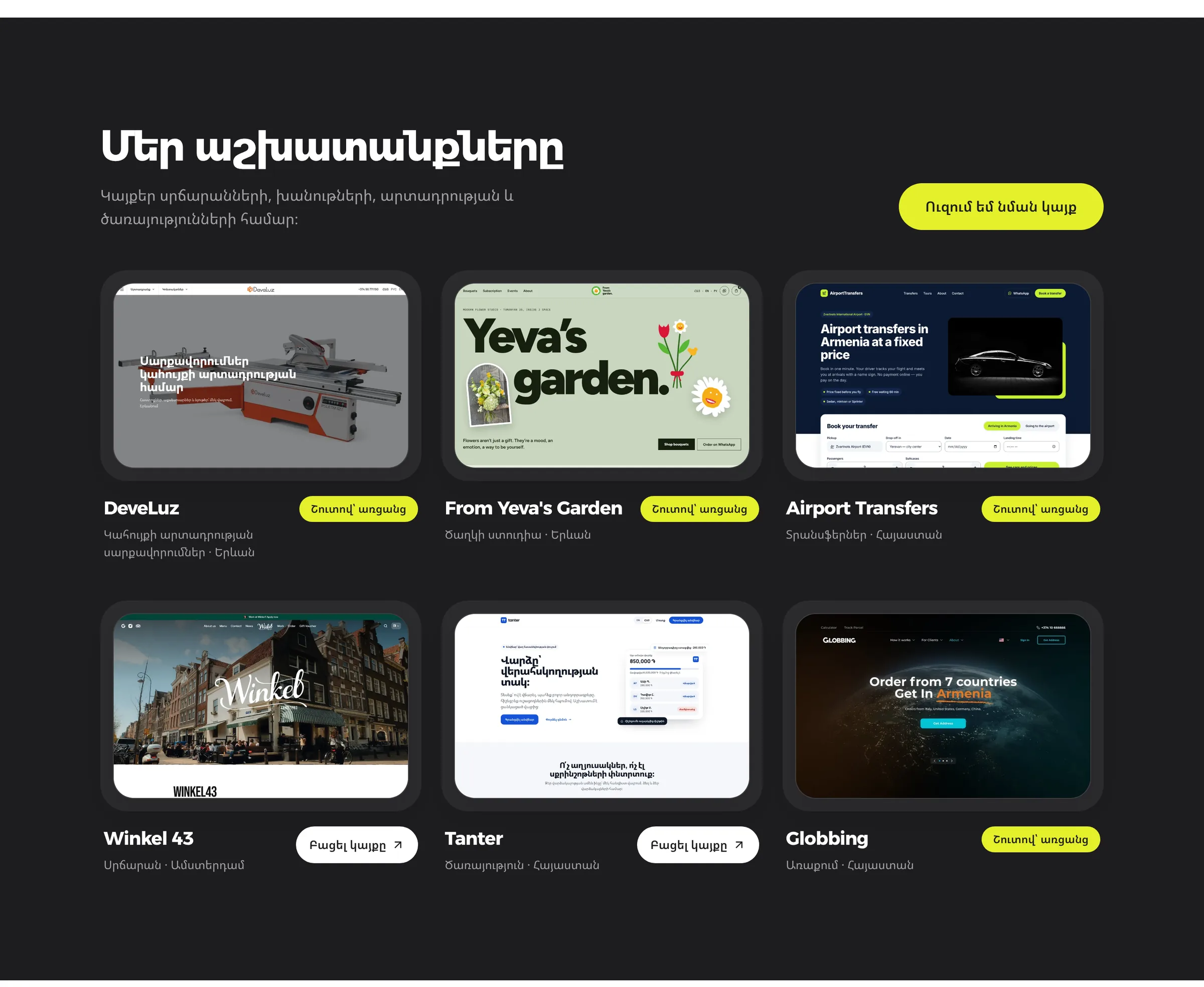
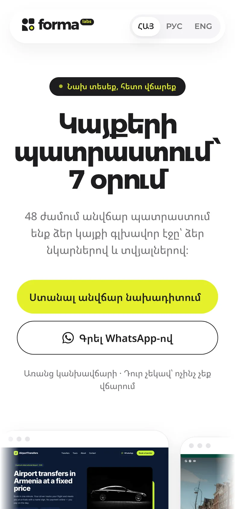
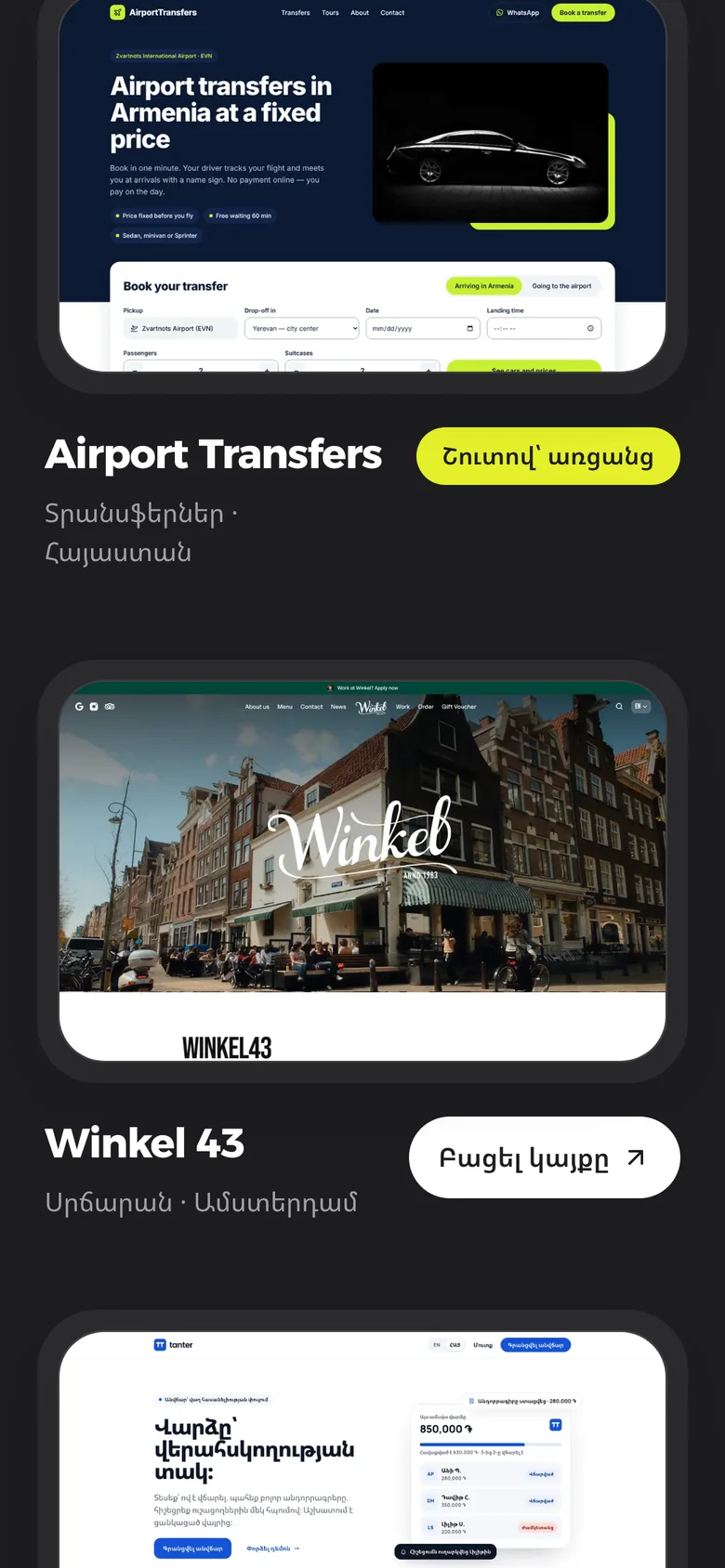
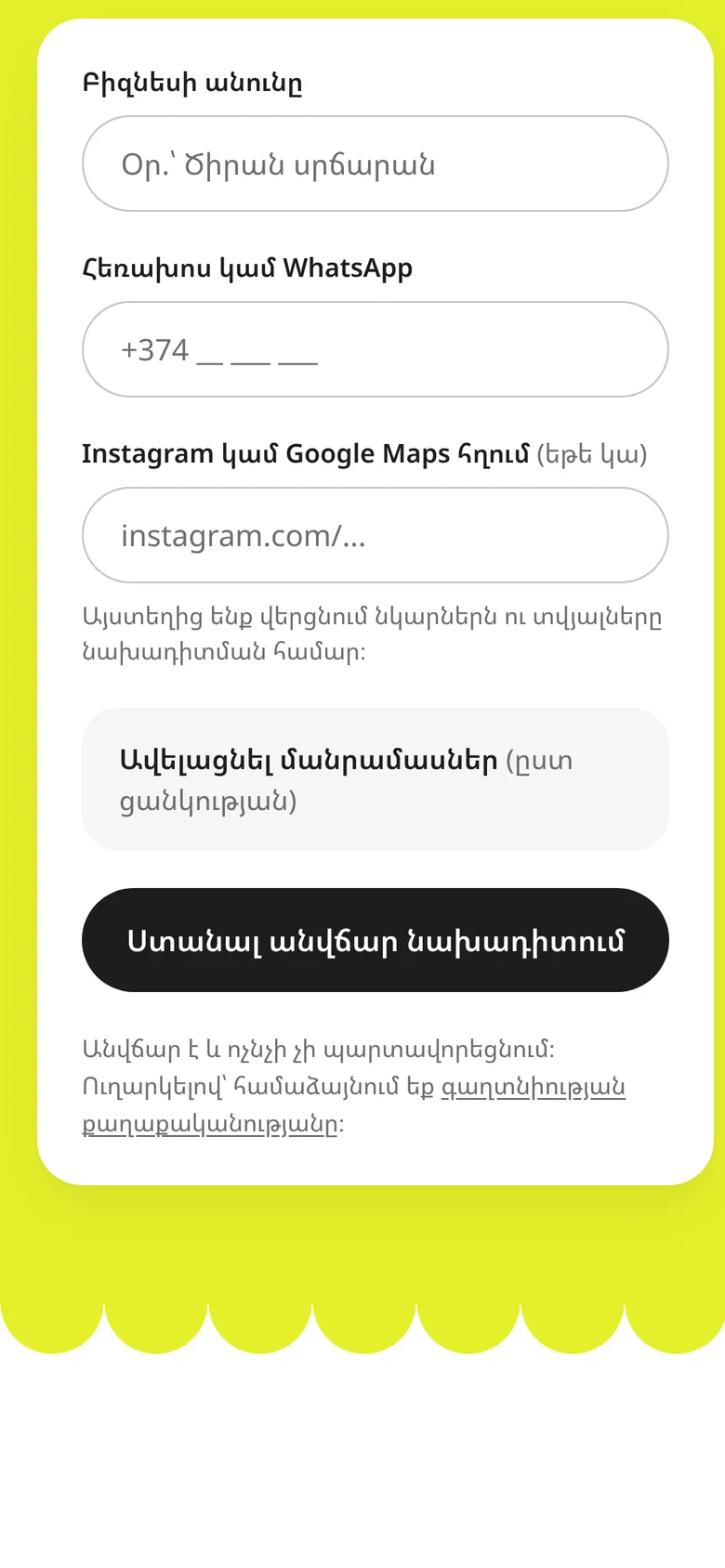
The page follows one order: what you get, how it works, the work, the offer. Each section uses a different part of the kit, so the page has rhythm without new styles: the grey hero box, white feature cards, the numbered steps panel, the one dark section for the work, and the lime band for the form.
Phone first
Owners share the link from Instagram and WhatsApp, so the page is designed for the phone first. Everything stacks to one column, buttons go full width, and the display type drops from 64 to 40 pixels without changing weight.
Three languages
Armenian, Russian and English share one layout. The display face keeps headlines consistent; only the body font changes with the script.
Built from the system
The site's styles come straight from the tokens in the guidelines, so a new page or a client preview inherits the brand without being redesigned.
The same kit, at every size.
I tested the identity on the places a small studio actually shows up: a business card, an Instagram profile, a window sticker for clients' shops and the WhatsApp message that tells an owner their preview is ready. Each uses the system as it is. Nothing here needed a new rule.
հետո վճարեք
Written for designers, and for the AI that builds the pages.
The rules live in one document: colours, type scale, spacing, radii, shadows, logo use, every component and a page recipe in a fixed order.
I wrote it to be read by two audiences. A designer can follow it, and so can the AI tools I use to build (Lovable and Claude Code), which load it before every change. Rules like “lime is always a fill” and “no borders on cards” are written as plain, testable sentences, so the brand stays consistent however fast new pages are made. Three excerpts:
A small system that holds up everywhere.
Four shapes, one colour, one display face and a handful of rules. That's enough to carry the brand from a favicon to a full website and a video campaign, in three languages, without a single one-off design.
Visit formalabs.art